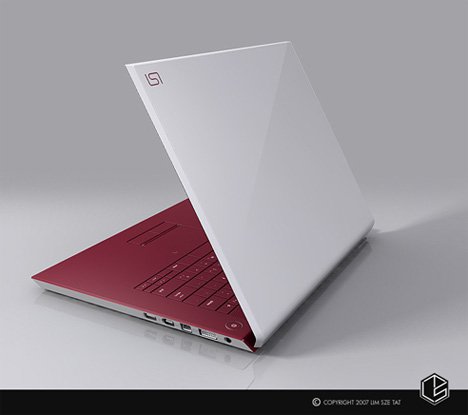
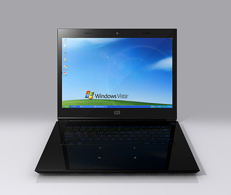
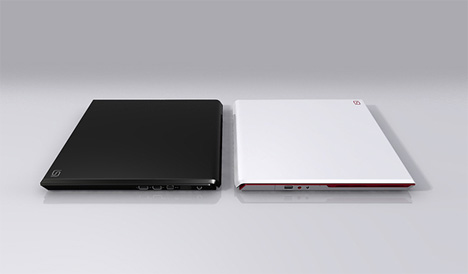
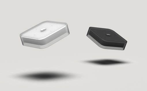
Right now the in thing with notebook computers are clean lines, and minimal design features. The Purity Notebook takes that to the extreme but manages to throw in a few of its own unique touches like the high lacquer finish. Nevermind the very Macbook Pro-like keyboard, it’s for the Windows crowd.
Designer: Lim Sze Tat
Hey there is nothing wrong with looking like a Mac, doesn’t every computer want to?
I like the white with maroon.. very nice..
Beautiful, sadly that thing is going to be a ding and scratch magnet just like the Apple portables.
I am going to have to say there are too many things similar in this design to a macbook and a macbook pro meshed together. I don’t feel like it is very inspired design (other than it isn’t for the mac os), but instead it is more like it is a modified design.
What are yu talking about? I can’t see one important thing what’s on a MacBook and not on any other modern notebook.
By the way, it says Vista on the background but it the look of the OS is XP.
Actually in first place this notebook is very stylish
… by first sight that’s how the mind of the designer where working while … obviously the absence of strong borders, and how it looks once it’s closed remind the sintethic macbook design lines, but as mitsubishi and mercedes (.. if you haven’t noted, both makes triangles even if they mean diferent things…) you cannot guilt purity for to want to throw into the market a clear type of notebook, even though they look related, THE FACT IS THAT APPLE REACH SORT OF monumental pick in how do they think a portable device as that, THE ONLY ONE CAPABLE TO BEAT MAC IS THE FUTURISTIC VAIO, the one that’s holographic u know …
that’s it
i would like to buy how can i?
[email protected]
note book wrapper
Alas we will no longer inhabit the big blue marble, like yeast in wine vat having over run and despoiled our resources in a drunken orgy of cheap available energy. ,
greetings via the united states dude, you actually made my day with this habbo coins hack