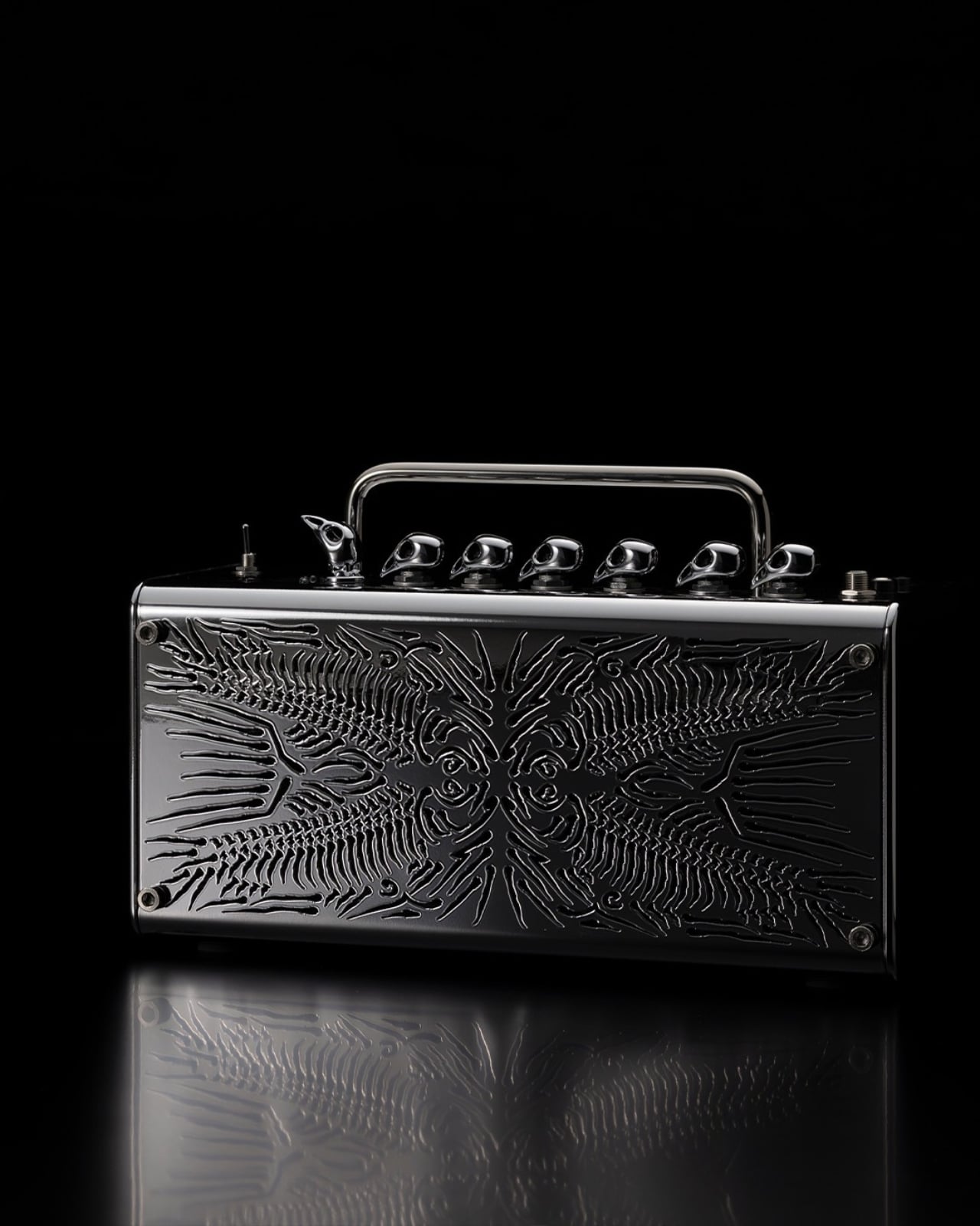
Somewhere between a fish market and Milan Design Week, a guitar amplifier became an animal. Yamaha’s HERRING, a concept piece by designer Koji Notomi, is based on the brand’s THR5 guitar amplifier, and it is one of those rare design projects where the idea is so clean, so quietly witty, that you almost feel like you missed something obvious the first time you looked at it. The joke, once you see it, is impossible to unsee.
The starting point was a question that most people never think to ask: where do design terms actually come from? The herringbone pattern is everywhere. You have seen it on jackets, hardwood floors, speaker grilles, and kitchen tiles. It is one of those visual shorthand patterns that has been repeated so many times it has practically lost its name. Notomi looked at it and wondered what would happen if you took that name literally. If a herringbone pattern is supposed to look like a fish’s skeleton, then why not make it actually look like one?
Designer: Koji Notomi
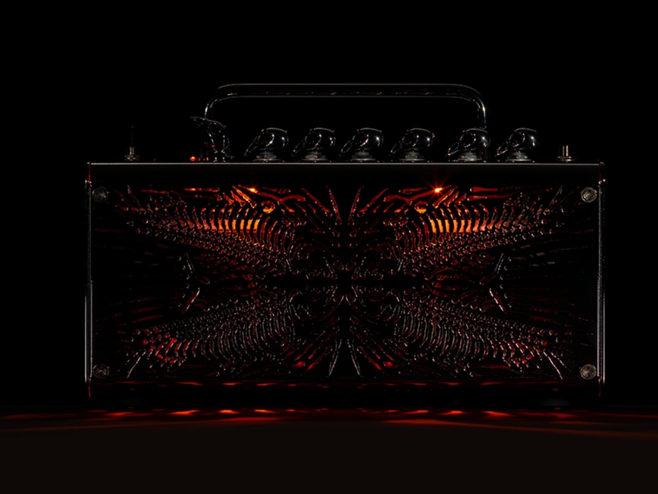
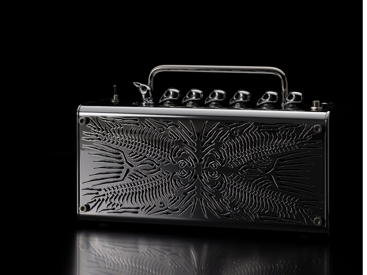
The answer became the front face of this amplifier. Notomi reportedly went to a fish market, bought a herring, dissected it, and drew its skeletal structure by hand before translating it into the final design. That part matters more than it might seem. It would have been easy to scan a reference image and apply it digitally, but the act of going to a market, handling the actual thing, and sketching it out by hand gives HERRING a different quality. You can feel the specificity in the final piece. The skeleton on the grille is not a decorative motif borrowed loosely from nature. It is anatomically observed, then mirrored and composed into something that functions simultaneously as a speaker cover, a relief sculpture, and a quiet act of homage to the fish it literally came from.
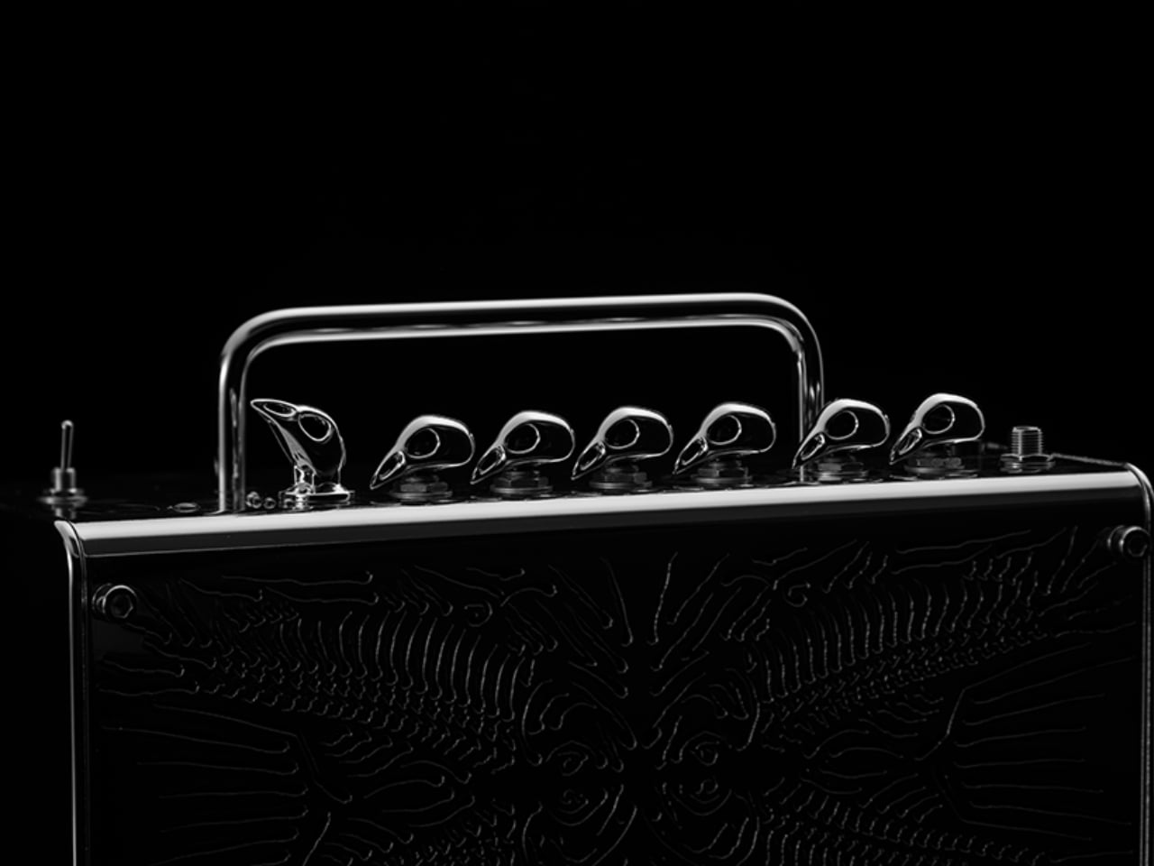
The knobs take the concept even further. In guitar culture, amplifier knobs with a pointed tip are commonly called “chicken-head” knobs. Notomi ran with that too. On HERRING, those knobs are exaggerated into sculptural bird-head forms that perch along the top of the amp like a row of tiny, knowing sentinels. Seen individually, they read as quirky hardware. Seen as a group, they complete the comedy of the whole piece without overpowering it.
That restraint is what makes HERRING work. It is a concept built on wordplay and zoological etymology, and it could have very easily tipped into novelty. It did not. The piece holds together because Notomi treated the humour as the entry point, not the destination. Visitors at Milan reportedly laughed when they noticed it, but quietly, the way you do when you feel like you have been let in on something rather than shown something.

There is also a broader observation baked into this project that I find genuinely interesting. Design language is full of terms borrowed from the natural world. Herringbone, chicken-head, dovetail, honeycomb, butterfly joint. We use these words constantly, and most of us stopped noticing the images inside them a long time ago. These names stuck because they once captured a visual truth, but over time the metaphor fades and the term becomes pure vocabulary. HERRING reverses that process, pulling the name back through its own etymology until the thing named and the thing itself become the same object. It is a rare kind of conceptual clarity, and it takes genuine intellectual curiosity to arrive there.
Whether HERRING ever becomes a production piece is a separate conversation. As a concept model, it functions perfectly well as a provocation: a reminder that the objects around us carry linguistic history that almost nobody stops to read. Koji Notomi stopped, dissected it quite literally, and built something that rewards the kind of slow attention that most designed objects never invite. It is playful, yes. But it is also a genuinely thoughtful piece of design thinking, and those two things are not in conflict here. If anything, the playfulness is exactly what makes the thinking land.