You can tell how iconic a building is by A. How many people pose in front of it, but more so by B. How many magnets/keychains get made with the building on it. Paris has the Eiffel, NY has the Statue of Liberty, Agra has the Taj Mahal, and Sydney has the Opera House. Designed by Danish architect Jørn Utzon, the iconic multi-venue performing arts center was officially opened on October 20, 1973, becoming an indelible part of the city’s skyline with its modern expressionist style. This year (and month) marks the 50th anniversary of the Opera House and to celebrate it, the folks at Imagined Architecture decided to give it an AI-driven facelift. Here’s what the Opera House would look like if it were reimagined by some of the most legendary architects of our time.
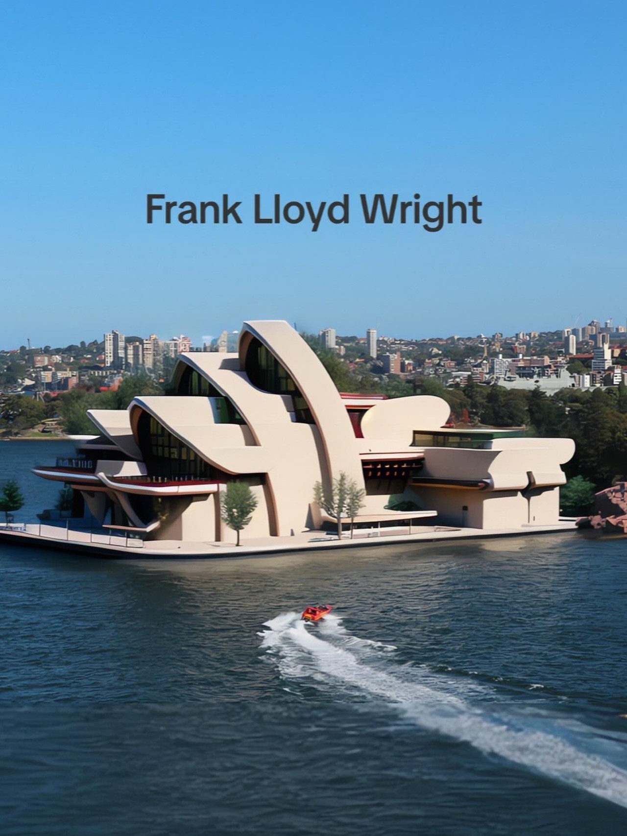
Probably one of the most famous architects of the 20th century, Frank Lloyd Wright is credited with pioneering the Prairie architectural style, where Wright believed that buildings should be in harmony with their natural surroundings and that architecture should be a reflection of the environment. Wright’s designs often featured low, horizontal lines, open floor plans, and integration of indoor and outdoor spaces. He also incorporated natural materials such as wood and stone and emphasized the use of natural light. Reinterpreting the Opera House in a Prairie style involved slightly modifying its character to change its overall expression. The resulting design has a simplistic appeal that feels like a combination of practicality and beauty. Sure, it doesn’t feel as wild as Utzon’s original design, but there’s an almost calming quality to it that goes well with the calming effect of good opera music!
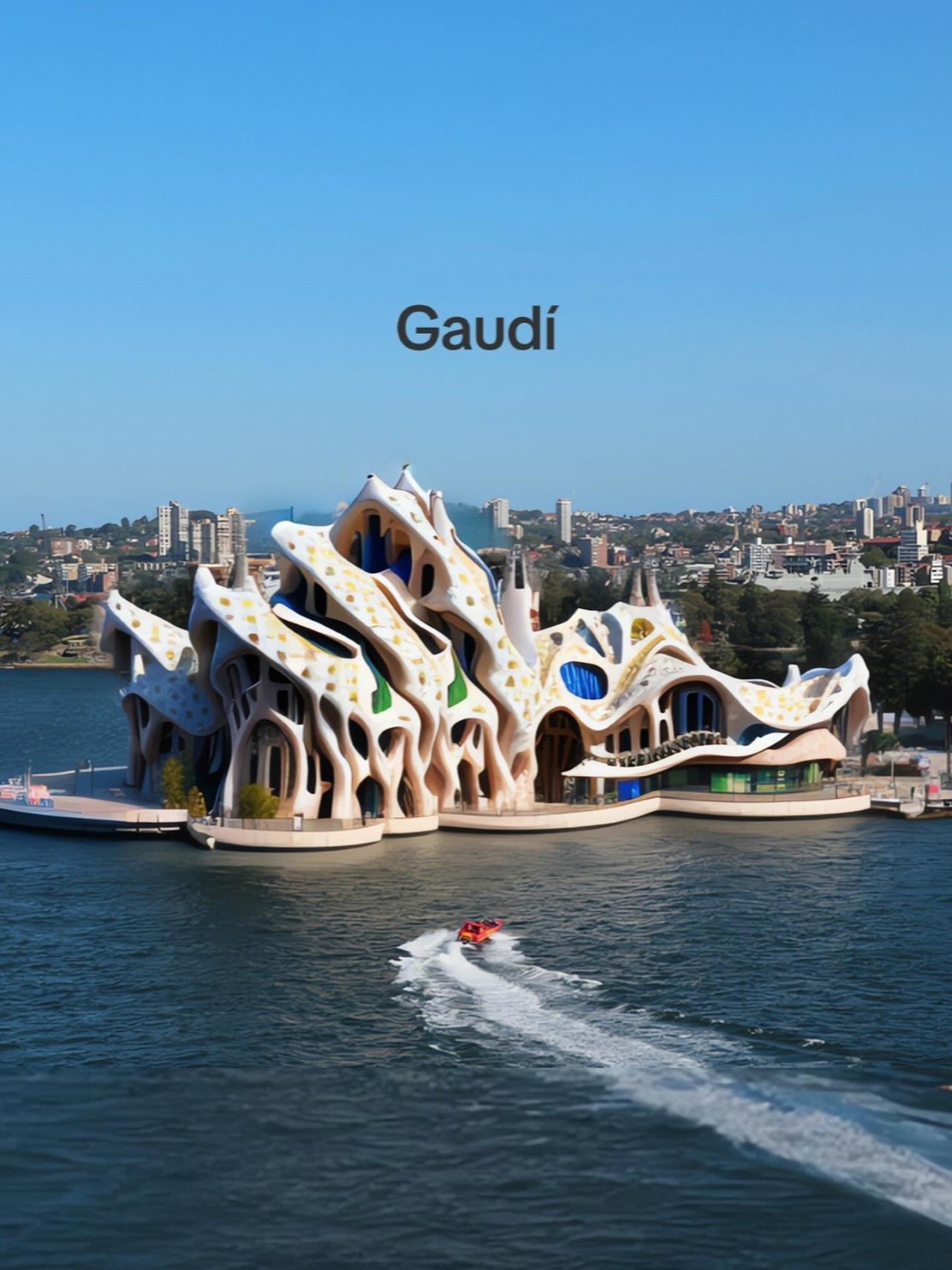
If Wright’s Opera House was calming, Gaudi’s is the complete opposite. This rendition takes on an absolutely wild Art Noveau flavor that’s well in line with the Spanish Architect’s design sensibilities. The Opera House is hyper-organic, bordering on kitsch, with the rejection of the laws of geometry. There’s not a single straight line here or even a geometric one – everything about this AI-generated redesign feels incredibly organic to the extent of looking unnerving. Unlike Wright, Gaudi aimed to make his art evoke a strong reaction – either positive or negative. I’d say this redesigned Opera House definitely nails that.
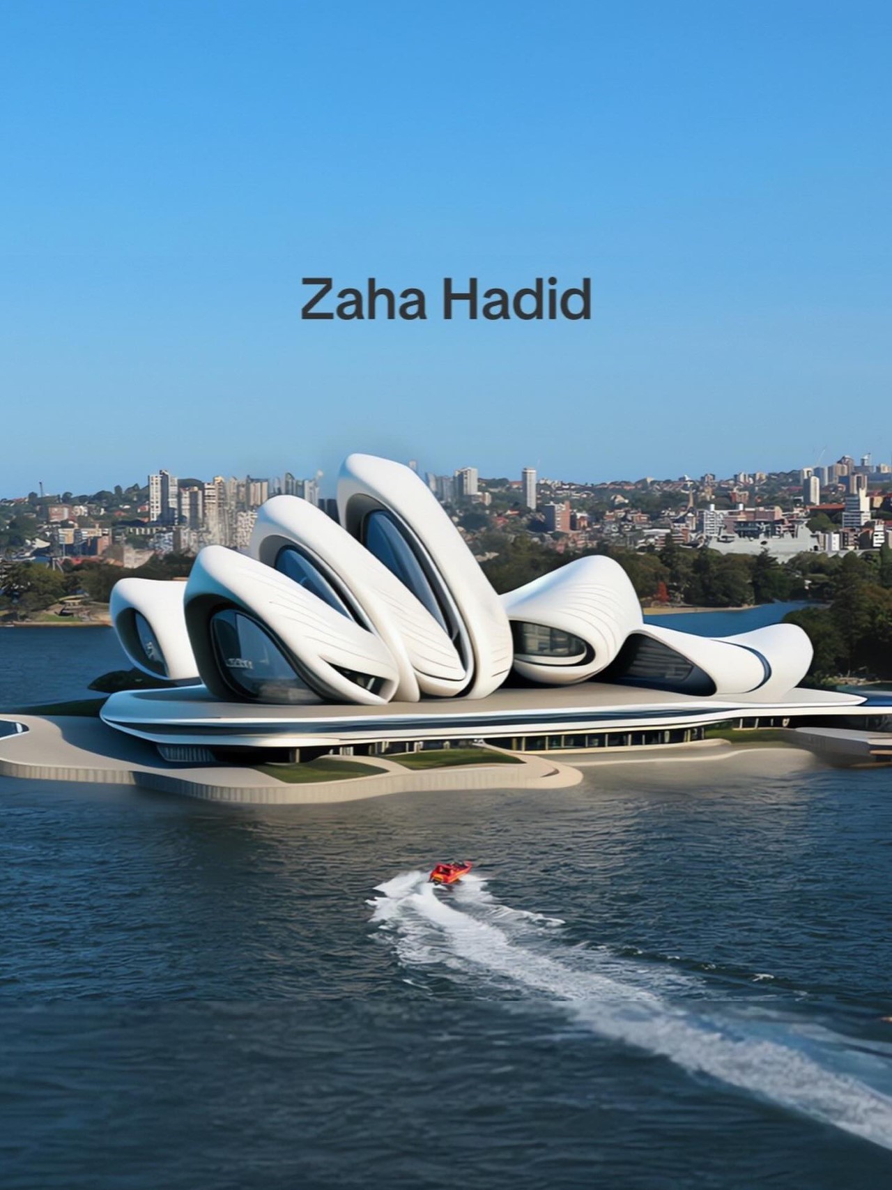
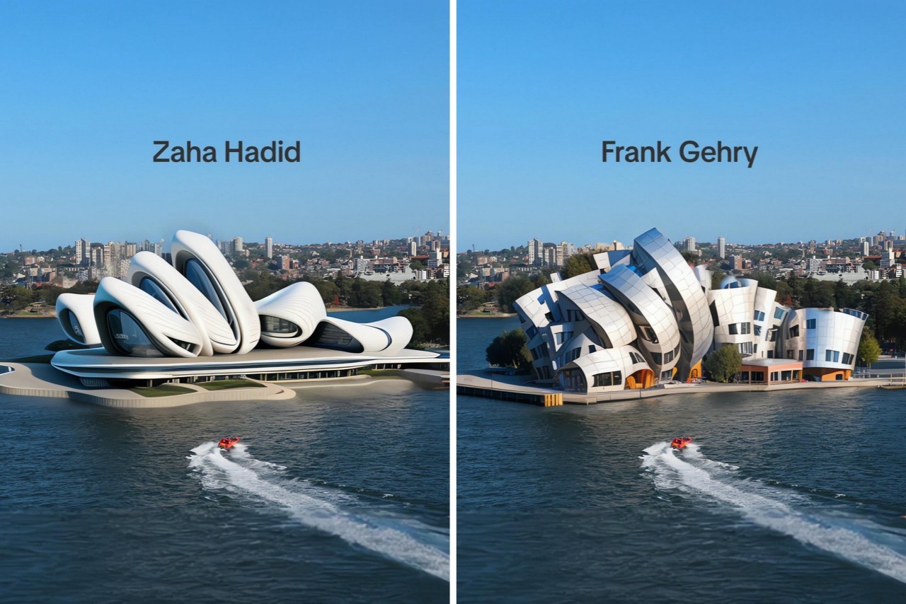
While we’re on the topic of organic, there’s no ignoring Zaha Hadid, the “Queen of the Curve”. Hadid’s style can be described as futuristic, dynamic, and sculptural. She often incorporated fluid lines, curves, and organic shapes into her designs, creating buildings that appeared to be in constant motion. This rendition of the Opera House borrows from Hadid’s work on the Heydar Aliyev Center in Azerbaijan. The Opera House’s ‘fins’ get a curvaceous makeover, with the end result looking organic, bordering on alien!
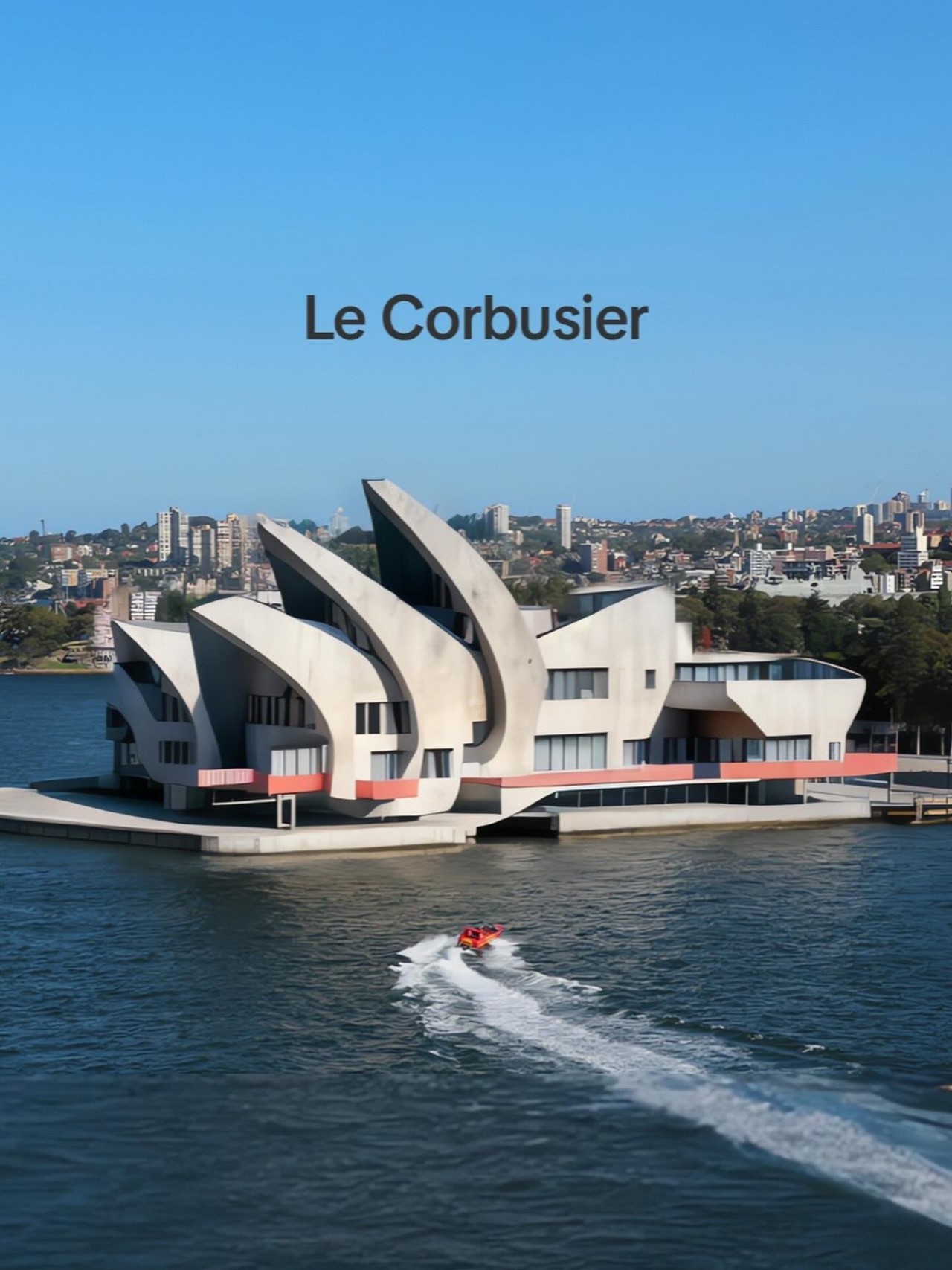
The Opera House gets a modern brutalist makeover with this AI interpretation of lauded Swiss-French architect and designer Le Corbusier. He developed a unique architectural style that emphasized functionality, rationality, and the use of modern materials and techniques. This unique reinterpretation of the Opera House feels the most similar to the original, but opts for concrete facades and running horizontal ‘ribbon’ windows along the base and sides to provide ample light and a panoramic view to the people inside. The curved concrete facade is a unique touch because it doesn’t fall completely in line with brutalist functionality-driven principles. Instead, it has a sense of rawness emerging from the inherent artistry, creating a rather novel aesthetic.
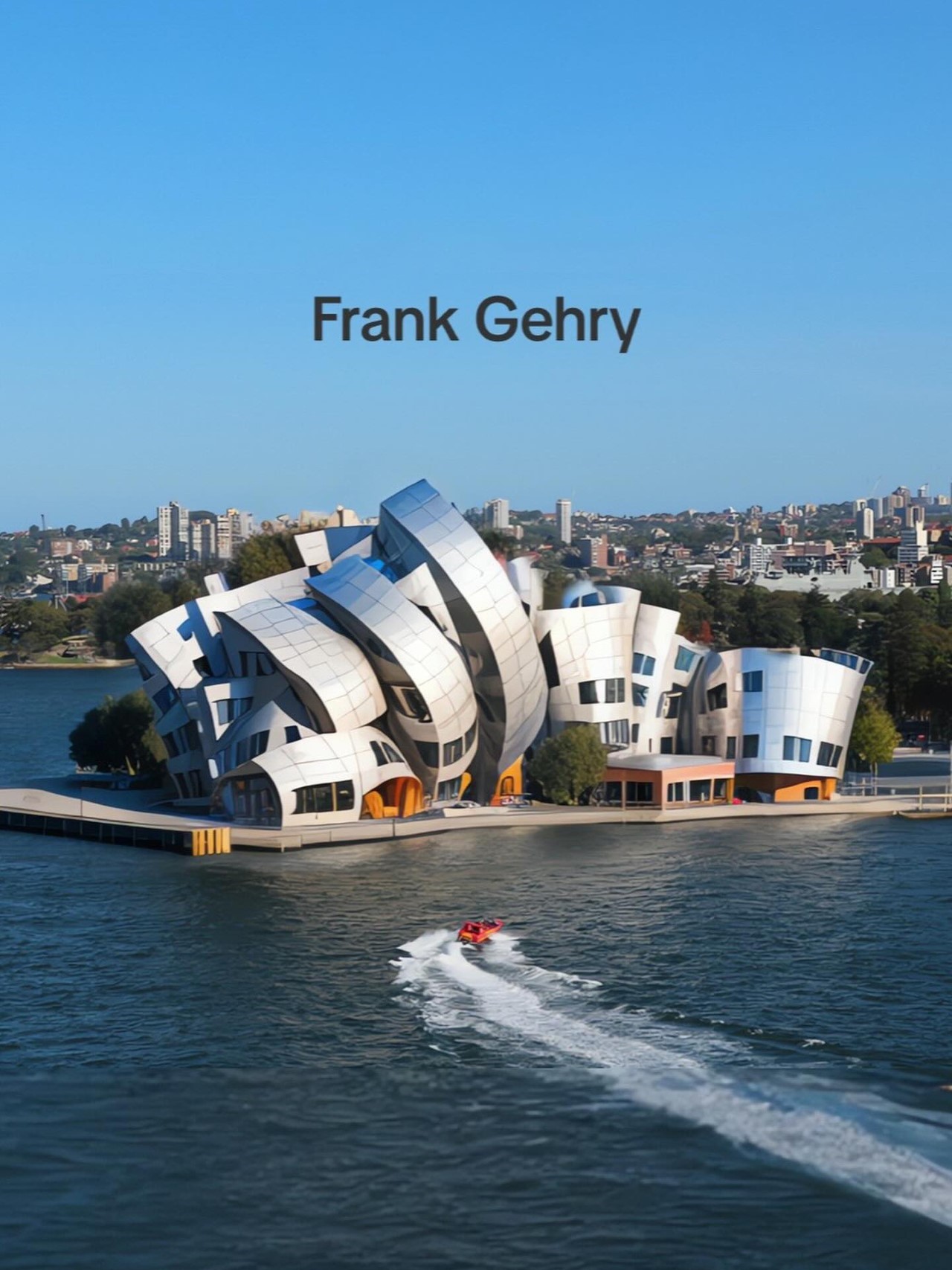
If the Opera House and the Bilbao Guggenheim had a baby, this is precisely what you’d get. A rather literal interpretation of Frank Gehry’s styles, the AI decided to give this Opera House redesign a curved metal facade quite similar to Gehry’s work on the Walt Disney Concert Hall, the Vitra Museum, and the Guggenheim Museum. The building gets clad with curved metal sheets, creating a unique appearance that reflects light and its surroundings in a variety of ways. Gehry’s post-modernist work was probably the inspiration for this AI, which is why this particular redesign feels as iconic and eye-catching as the original.
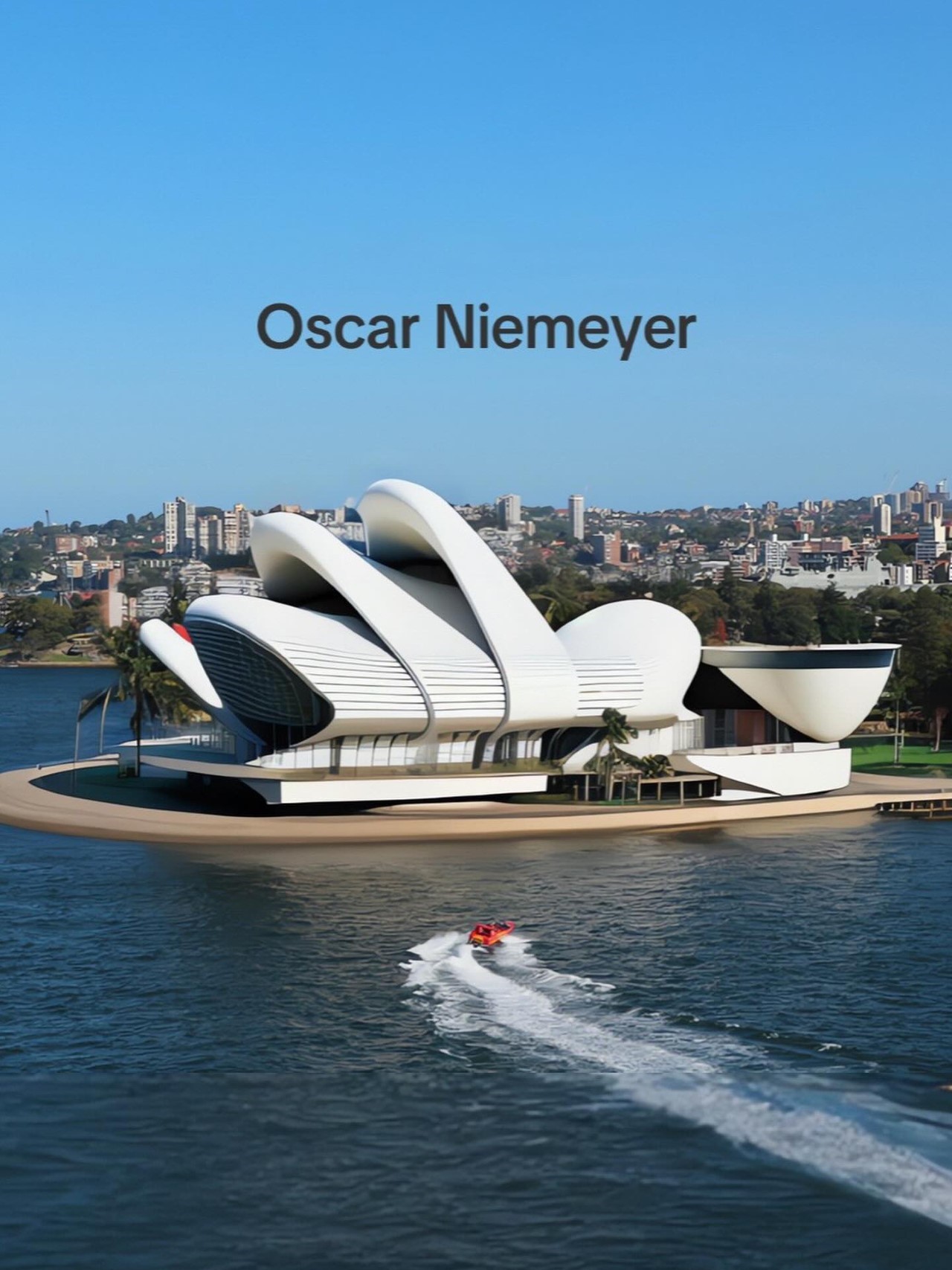
Known for his modernist take on architecture, Brazil-based Oscar Niemeyer’s designs were characterized by flowing curves, bold forms, and the use of reinforced concrete. Niemeyer believed in the social and political potential of architecture and aimed to create buildings that were not only functional but also visually striking and symbolic… and this image above does just that. The facade is given a soft, almost sea-glass-like redesign that feels calming because of the visual continuity. Layered elements pay tribute to the original, with the use of white on the exterior in classic Niemeyer style.
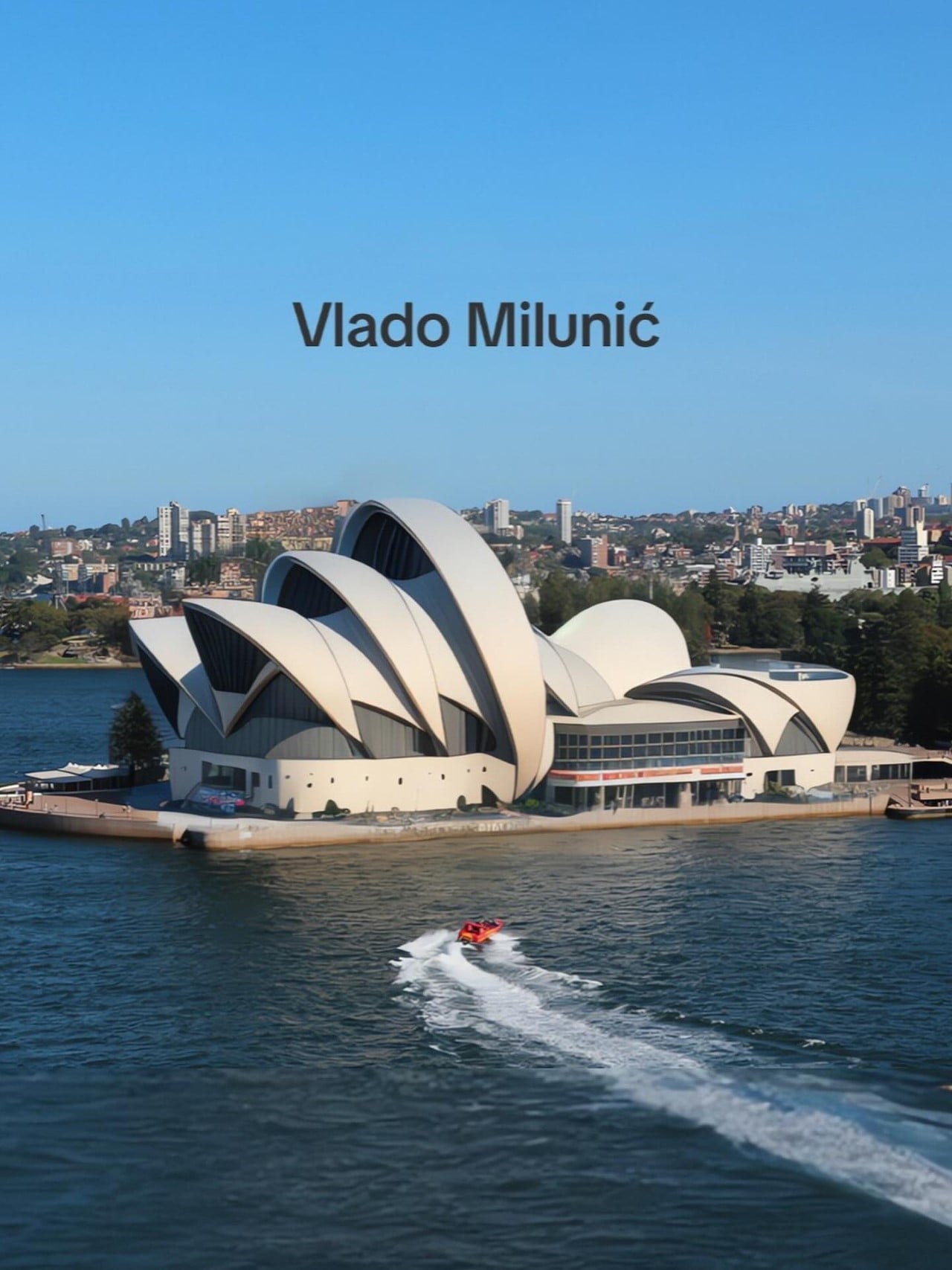
Although Milunić is best known for his collaborative work on the Dancing House with Frank Gehry, the Czech architect (who sadly passed last year) is known for his contemporary and innovative architectural style. Milunić’s work is a part of the deconstructivist movement, which emphasizes unconventional forms and fragmented geometries, featuring bold and expressive shapes, asymmetry, and a sense of movement – all features that already are highlights of the current Opera House. It’s no wonder that this AI image looks the closest to the original because it immortalizes those very ideas of fragmented geometries and unconventional forms that come together to create something uniquely appealing.
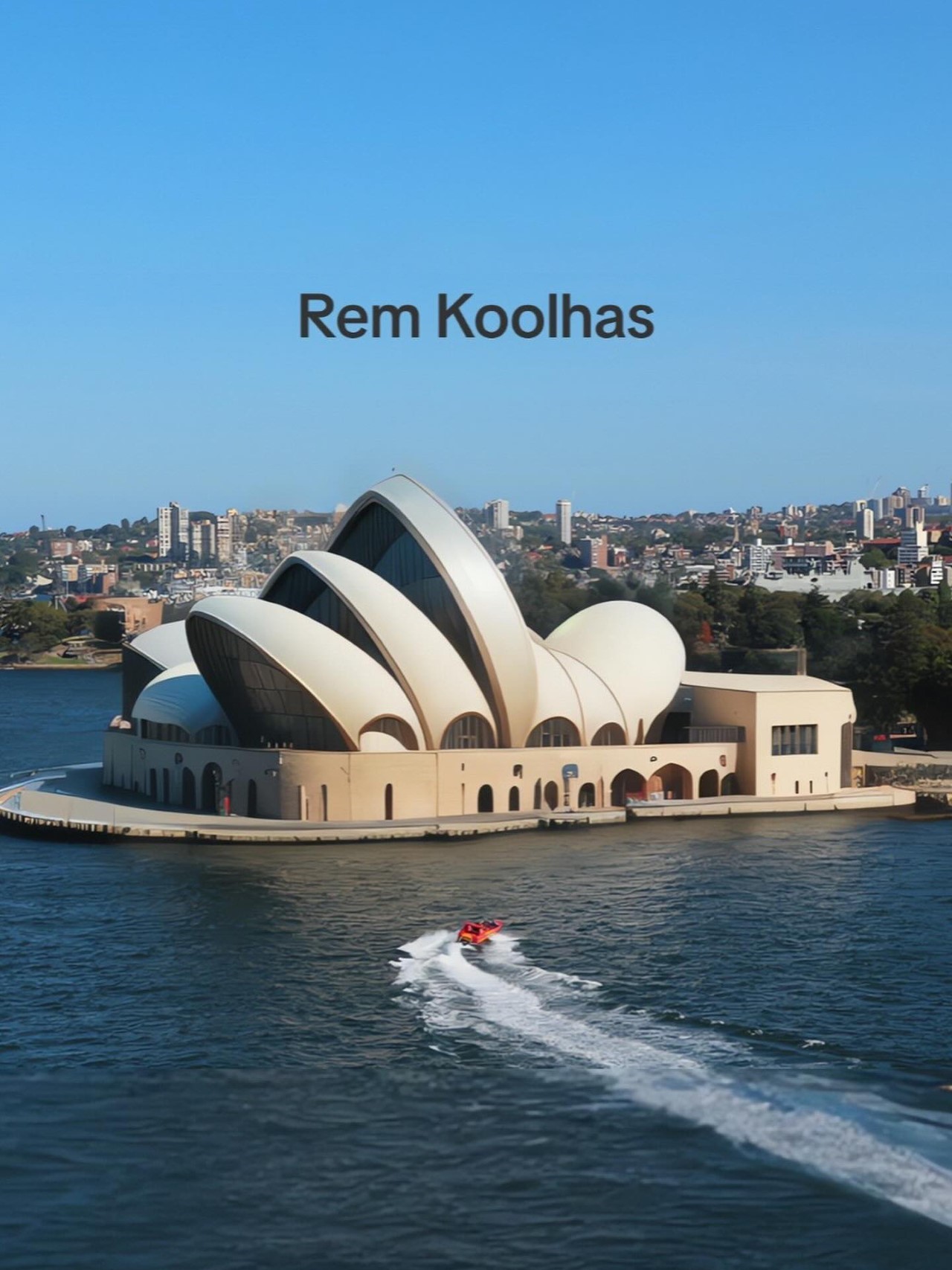
Renowned Dutch architect and urban designer, Rem Koolhaas is known for his avant-garde and innovative architectural style. His architectural approach is characterized by a combination of bold and unconventional design elements, in lockstep with the deconstructivist style. It does feel like this particular AI image is the least like his past works because of its bulbous forms as opposed to Koolhaas’ love for impossible geometries… however, the building does take some amount of inspiration from another similar establishment in Taiwan – the Taipei Performing Arts Center which Koolhaas worked on too. The TPAC building’s iconic element was a hovering sphere emanating from the center of a building, and for what it’s worth, the uniqueness of this Opera House feels not too dissimilar!
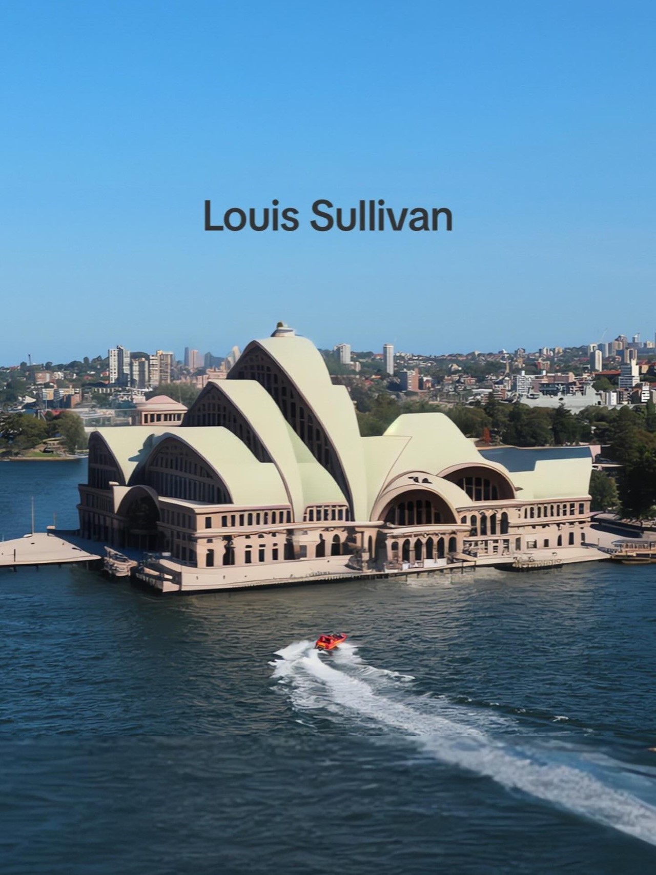
Probably the only architect on this list with their own style, America-based Louis Sullivan is best known as the father of modernism in architecture, with his work referred to as following the “Sullivanesque style”. One of Sullivan’s key principles was the idea of “form follows function,” which meant that the design of a building should be based on its intended purpose and function. He believed that the exterior of a building should express its internal structure and function, and that ornamentation should be used sparingly and only when it served a purpose. Sullivan’s work can be seen all across the streets of Chicago, with their bold architectural masses that had intricate detailing that borrowed from classical architecture. The combination of classical and modernist can be seen here with this Opera House that looks like a grand old building from the turn of the 20th century – as iconic as a massive railway station or a big museum or government building.
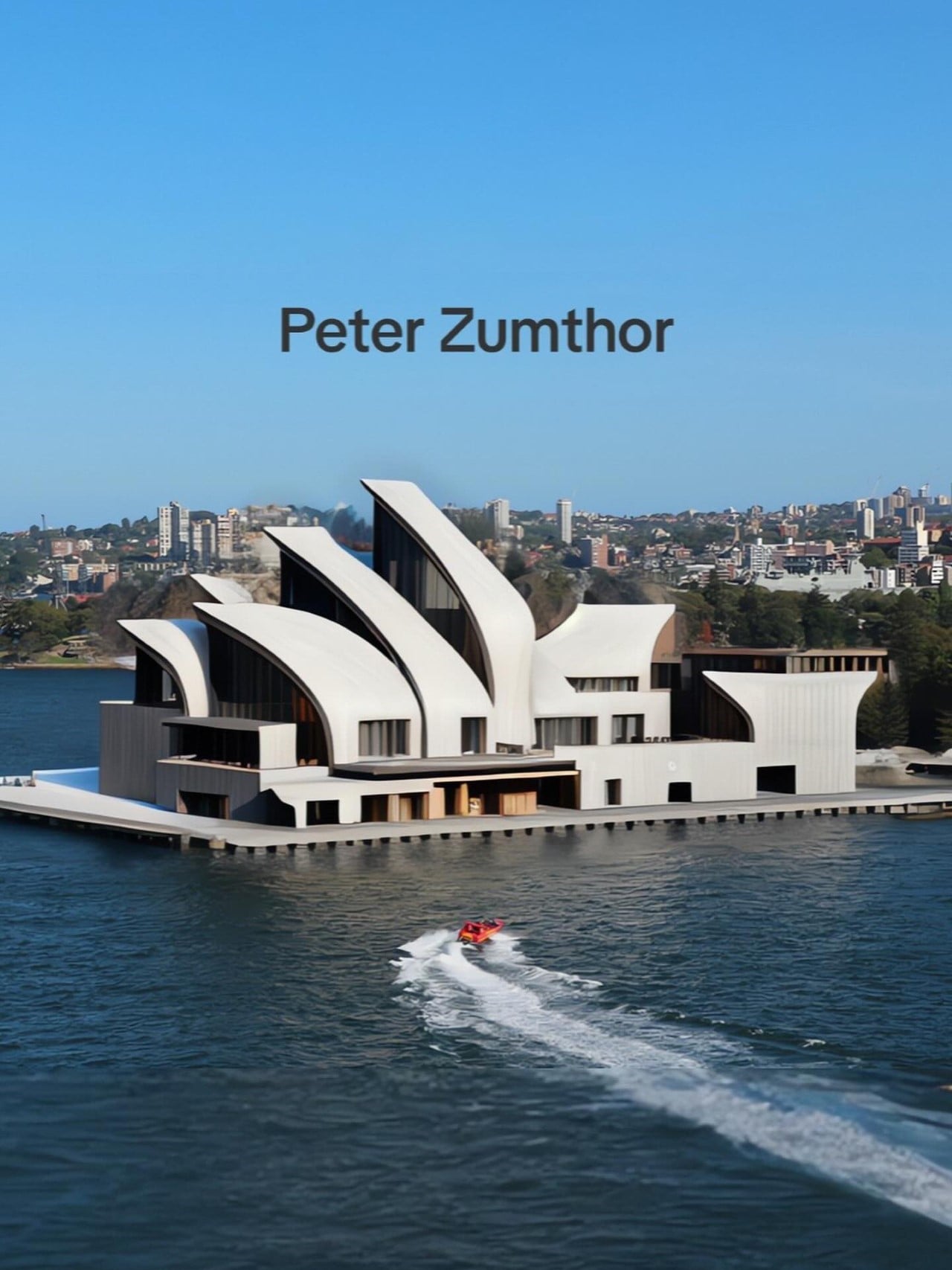
Switzerland-based Peter Zumthor is lauded for his minimalist and poetic approach to architecture. His style is characterized by a strong emphasis on materials, craftsmanship, and the sensory experience of space. Zumthor’s buildings often feature simple, clean lines and restrained use of ornamentation – features that can all be seen in this rendition of the Opera House. There’s beauty in this redesign’s form, but the beauty comes from how Zumthor (or the AI) chooses to reinterpret the original design. The entire form’s cleaned up, given a much more minimal makeover but still retains the Opera House’s character.