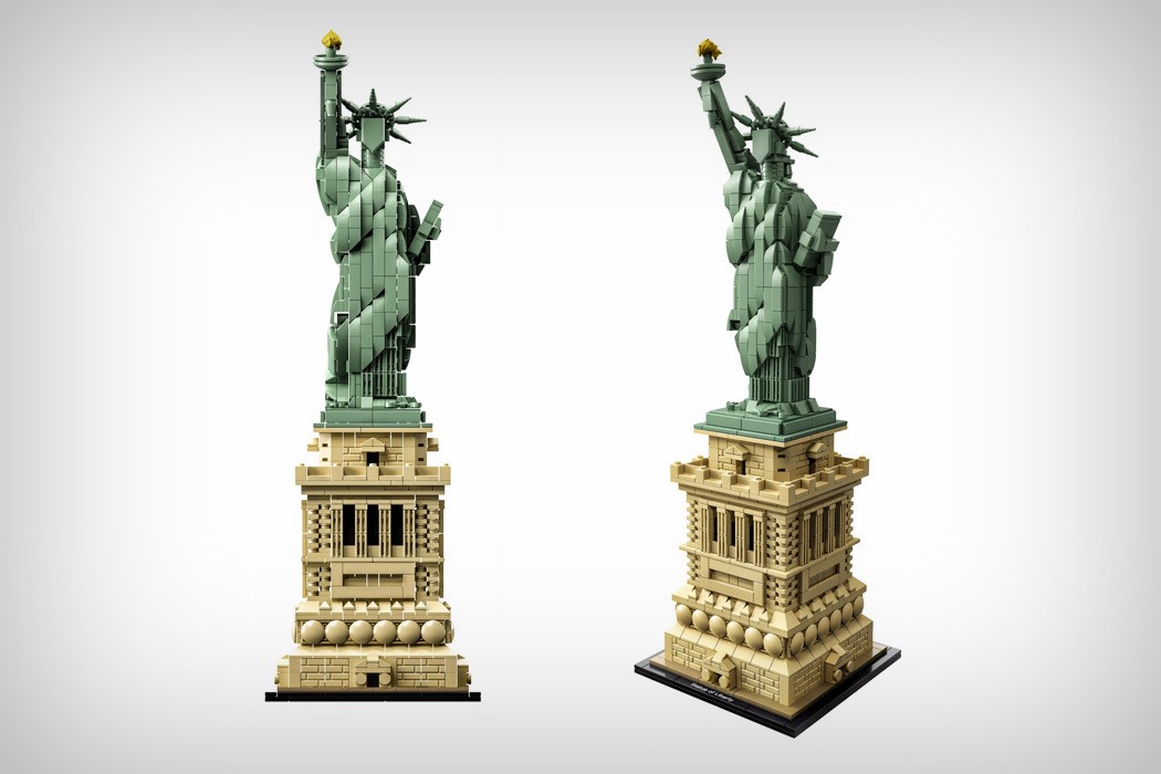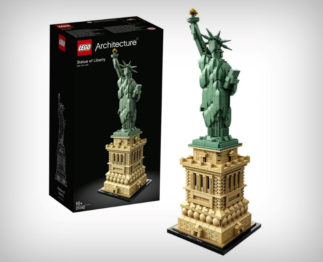
I’m absolutely floored by Lego’s latest release, the Statue of Liberty… a part of their architecture line. There were a lot of ways they could go about creating the statue… ranging from a low-res pixelated style, to a style inspired by their Lego figurines, to something as minimal as this, but the design they unveiled feels much more like an aesthetic awakening than just another product release. With a beautifully simplified design, the Statue of Liberty turns organic details into rather satisfyingly geometric ones, staying true to the original, yet being Lego-ish and unique in their own right. Take for instance the pentagon-shaped face, a detail that I can’t get enough of. It’s unlike Lego to show faces without the eyes, mouth, and a discernible expression, but the way Lego executes it in this particular case feels like it captures the very essence of the monument, recognizing the fact that sometimes blatant copying means foregoing one’s opportunity to create something new and unique. Even the folds in the statue’s robe are interpreted differently, in a way that feels eye-catchingly original yet does enough to signify the folds in cloth. Unlike Lego’s automotive series, the Architecture series aren’t accurate detail-for-detail replicas, but rather they build on your memory of having seen them. You appreciate the fact that they’re essentially the same, but different… and for sure, beautiful! Great job, Lego… on not just building toys, but also an aesthetic of your own!
Designer: LEGO