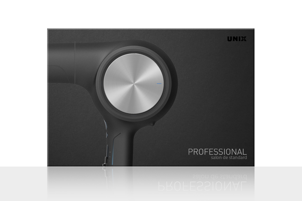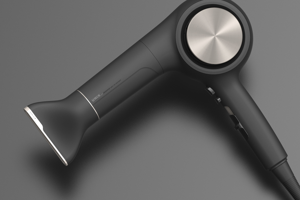
This here, is the Professional Hair Dryer, by Andy Kim. It does look professional, doesn’t it? It looks cutting edge, honestly.. It doesn’t look A. Inexpensive, and B. Like it would fail. Why’s that though? Let’s break down what exactly makes products look premium.
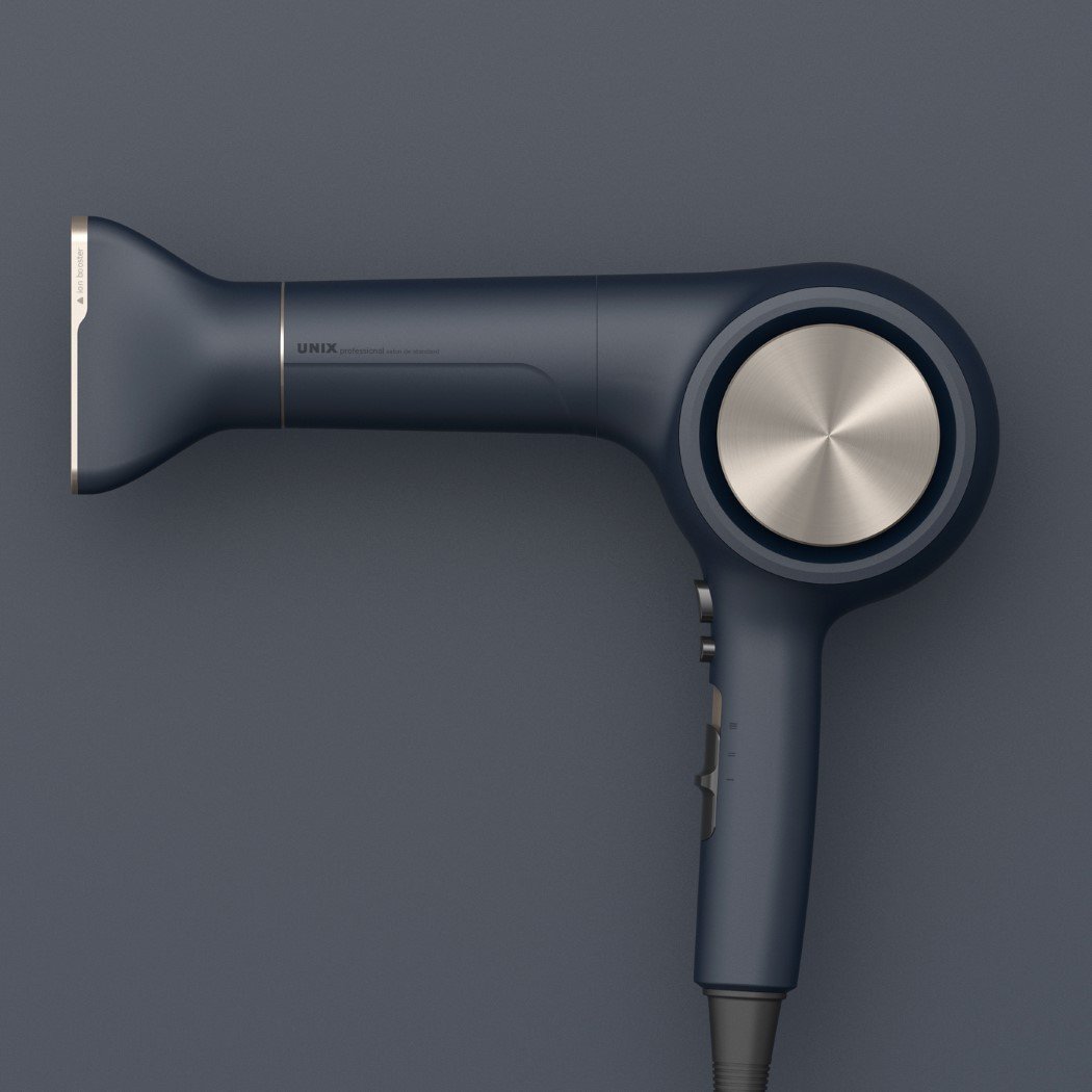
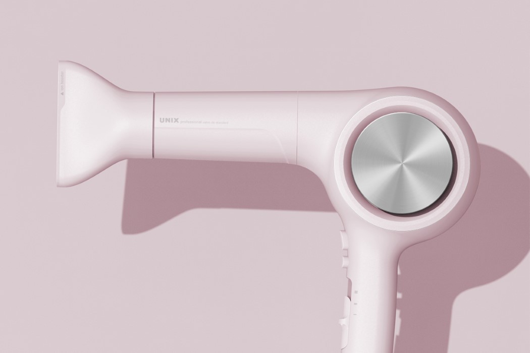
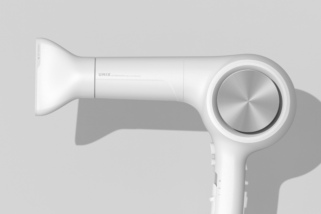
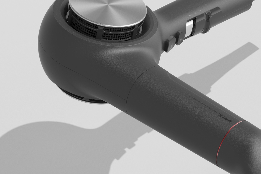
For starters, the matte body works well against the hair dryer’s simple shape. Simple shapes and matte go along pretty well, whereas complex contours look good with a gloss finish (take cars for instance). To balance the matte reflections, you’ve got a swirled metal disc on the side. Metal, obviously, is synonymous with a more premium experience. Look at metal versus plastic phones as an example. Plastic is a material of mass production. Metal, not as much… making it feel more exclusive. The radial reflections coming from the spun metal just give your eye some good, controlled reflections to look at. On a matte body, the reflections off the disc are welcome, and stand out like a work of art on a blank canvas. Lastly, and most importantly is the palette. The hair dryer does a wonderful job of selecting colors that just work. The black and white ones are classic, while the navy blue and golden combo give the product a royal feel. The shade of pink works well too, given that hair dryers are usually used by women… but the exact pastel hue seems to be a derivative of the rose-gold trend found in today’s technology.
All these reasons combined are what make the Professional Hair Dryer look truly, well…professional!
Designer: Andy Kim