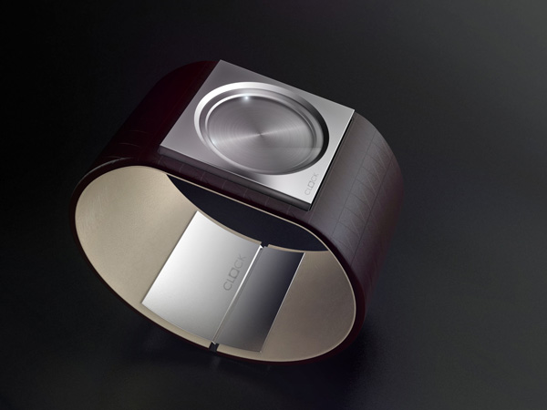
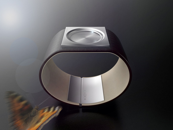
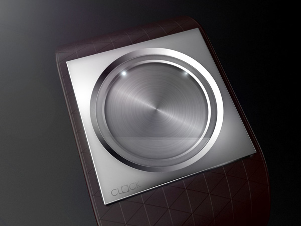
The minimalist (and somewhat perplexing) Less is More timepiece finds harmony between analog and digital; square and circle. The wearer reads the time similar to an analog clock by observing a pair of esoteric LEDs, one large and one small, that revolve around a circular disc in the center of the square face.
Designer: Felix Runde
Not so sure about this one. The lights are too small.
Simple and beautiful. Tint the glass to cut down on wash-out from ambient light and you have a very nice piece. Slight learning curve for the user in determining which light is hours and which is minutes, but I really like this concept.
This seems pretty useless to me.
Less can be beautiful, but
very nice,elegant slim design. the only thing i would change,is having the name on the watchfront,which detracts (imho) from the minimalist look. having it on the buckle/clasp is enough. and a black or silver leather strap would be a nice addition. nicely sculpted.
wery nice. good job 🙂
and its possible to buy this watch?
I like reading an article that can make people think.
Also, thank you for permitting me to comment!