Look, we’ve all been there. You walk into a room and wonder if the air freshener is actually working or if it’s just sitting there like a decorative paperweight. CONECTO’s Air Perfume, designed by superkomma, decided that was an unacceptable user experience. So they built something that literally shows you what’s happening and it’s kind of genius.
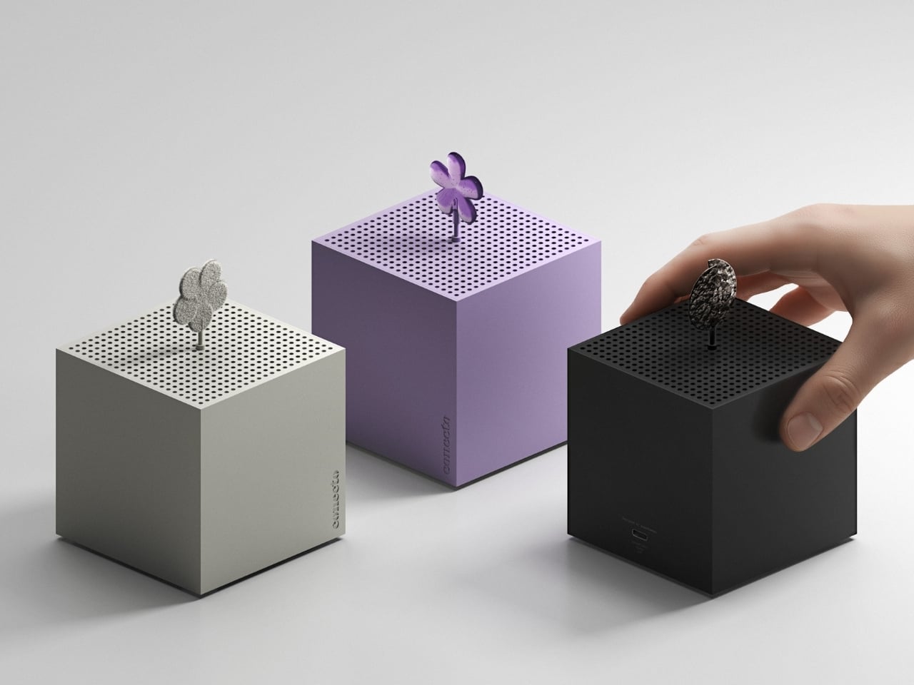
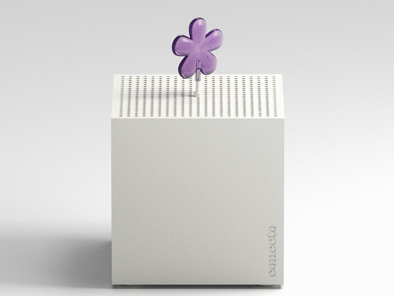
Here’s the thing about most air fresheners: they’re boring. They either plug into a wall looking apologetic about their existence, or they’re aggressively branded cylinders you hide in a closet. The Air Perfume takes a completely different approach. It’s a minimalist white cube that you’d actually want on display, but that’s just the beginning of what makes it interesting.
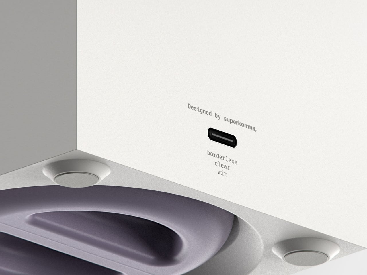
Designer: superkomma
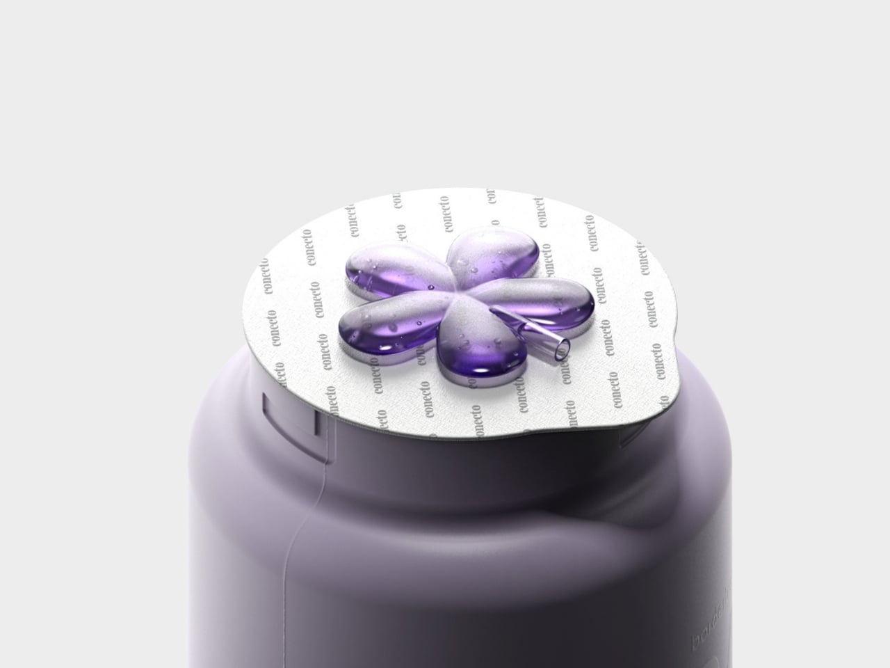
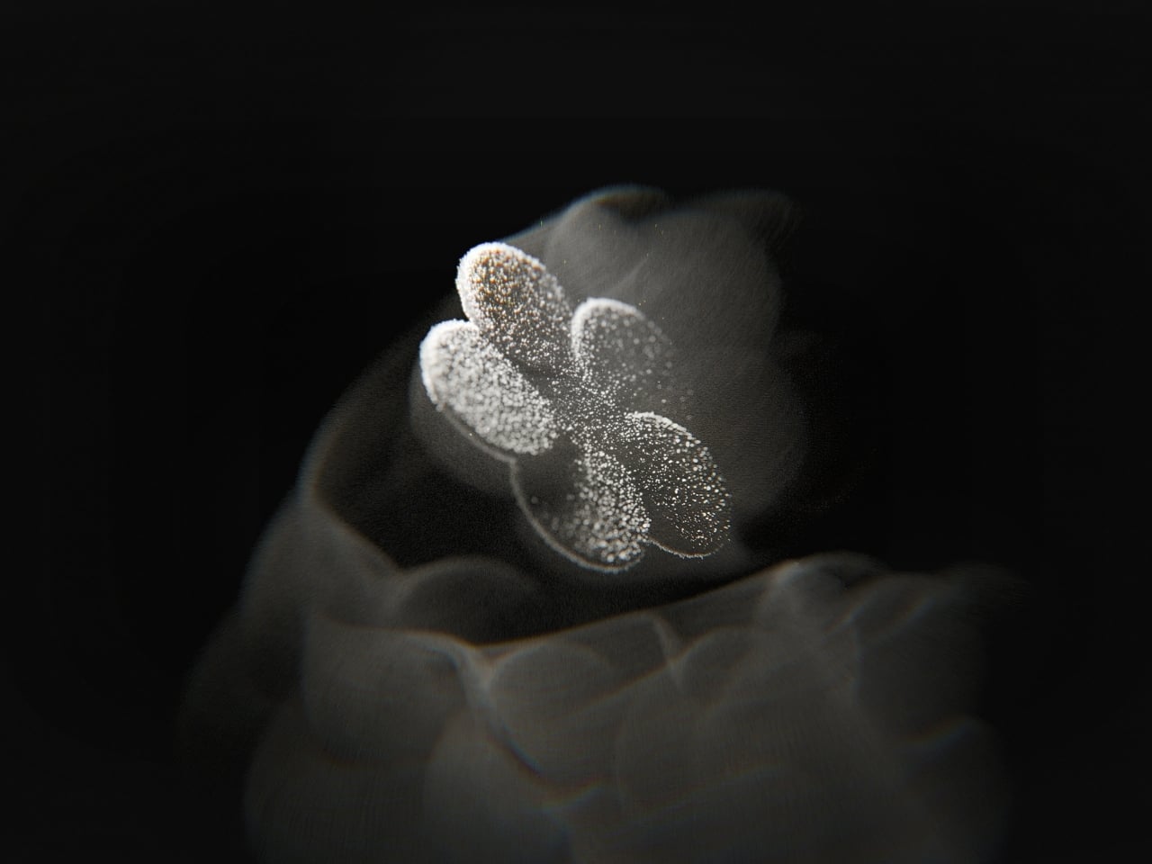
The real innovation here is how superkomma approached the fundamental question of user interface. Instead of adding a screen or LED indicators (which would have been the obvious tech solution), they made the fan itself part of the visual language. When the device is running, a fragrance symbol attached to the fan blade spins along with it. You can literally see your scent in motion. It’s one of those ideas that feels obvious once you see it, which is usually the mark of genuinely thoughtful design.

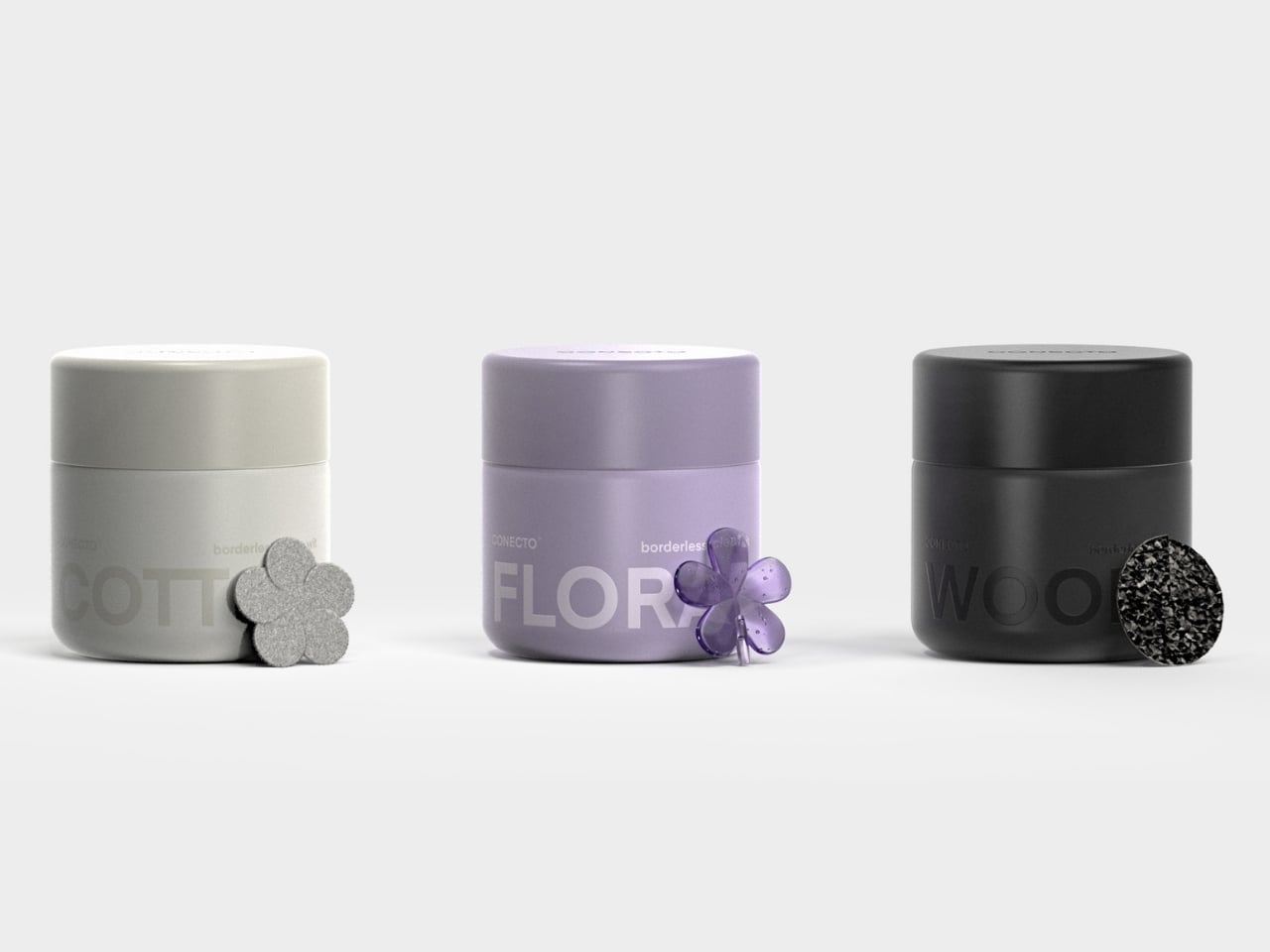
CONECTO offers three signature scents, and each one gets its own symbol inspired by the fragrance’s character. Cotton gets a soft, cloud-like shape. Floral is represented by a delicate flower silhouette. Woody has a circular, organic form reminiscent of tree rings. These aren’t just decorative choices. They’re visual shorthand that connects your sense of smell with something you can see, creating a more complete sensory experience.

The execution is refreshingly simple. The fragrance cartridge slots into the bottom of the cube. The corresponding symbol clips onto the fan. When you turn it on, the symbol rotates, dispersing the scent while giving you immediate visual feedback that the device is working. No guessing, no checking your phone app, no wondering if you remembered to replace the cartridge three months ago. It’s all right there, spinning in front of you.
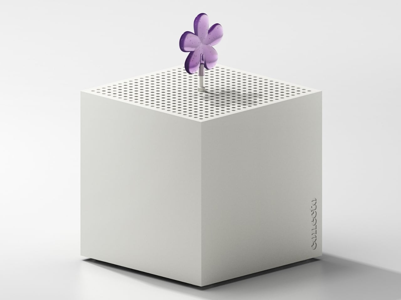
What’s particularly smart about this design is how it handles the aesthetics of functionality. That pure white cubic body could fit into literally any space without clashing. It’s the kind of neutral that works whether you’ve got a minimalist apartment, a maximalist studio, or something in between. But it’s not trying so hard to disappear that it becomes forgettable. The rotating symbol adds just enough visual interest to make the device feel alive and intentional.
The system also addresses a real problem that most air fresheners ignore: they don’t actually eliminate odors, they just cover them up. Air Perfume combines its fragrance delivery with legitimate deodorizing performance, which means you’re not just masking that gym bag smell with artificial flowers. You’re actually dealing with it. There’s something refreshing about design that doesn’t overcomplicate things. In an era where every device wants to connect to your smartphone and collect data about your scent preferences, Air Perfume just does its job with style. The rotating symbol isn’t controlled by an app or programmed with different speeds. It’s just physics and clever design working together.
Superkomma has created something that sits at an interesting intersection of product design, user experience, and visual communication. It’s functional enough for the practical minded, beautiful enough for design enthusiasts, and clever enough to make tech nerds appreciate the elegance of an analog solution. The device proves that sometimes the best interface isn’t digital at all. Sometimes it’s just a spinning flower that tells you everything you need to know at a glance.