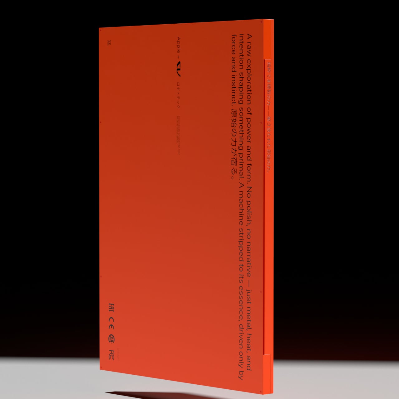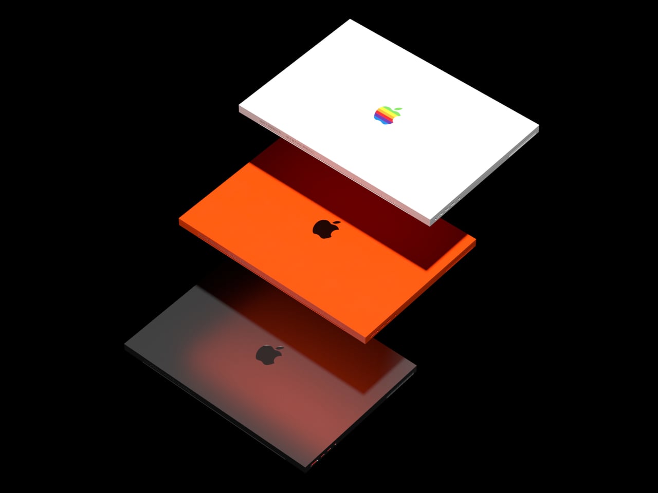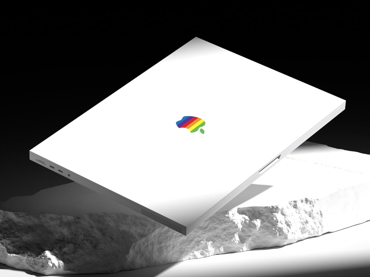

Laptop shopping can get rather repetitive when even very different machines wear similarly restrained metal shells. MacBook Brutal explores an alternative, keeping the familiar clamshell layout while replacing soft transitions with squared edges and conspicuous industrial details. Inspired by brutalism and industrial design language, it gives the familiar laptop a more assertive character without pretending to introduce new technology.
Closed, the body reads as two rectangular slabs, with straight sides and corners that make little effort to disappear. A recessed opening at the front interrupts that rigid outline, giving the lid a place to be lifted. The effect is architectural without becoming a bulky prop, closer to a cut panel than the softened shell you might expect to pick up.
Designer: Braz de Pina
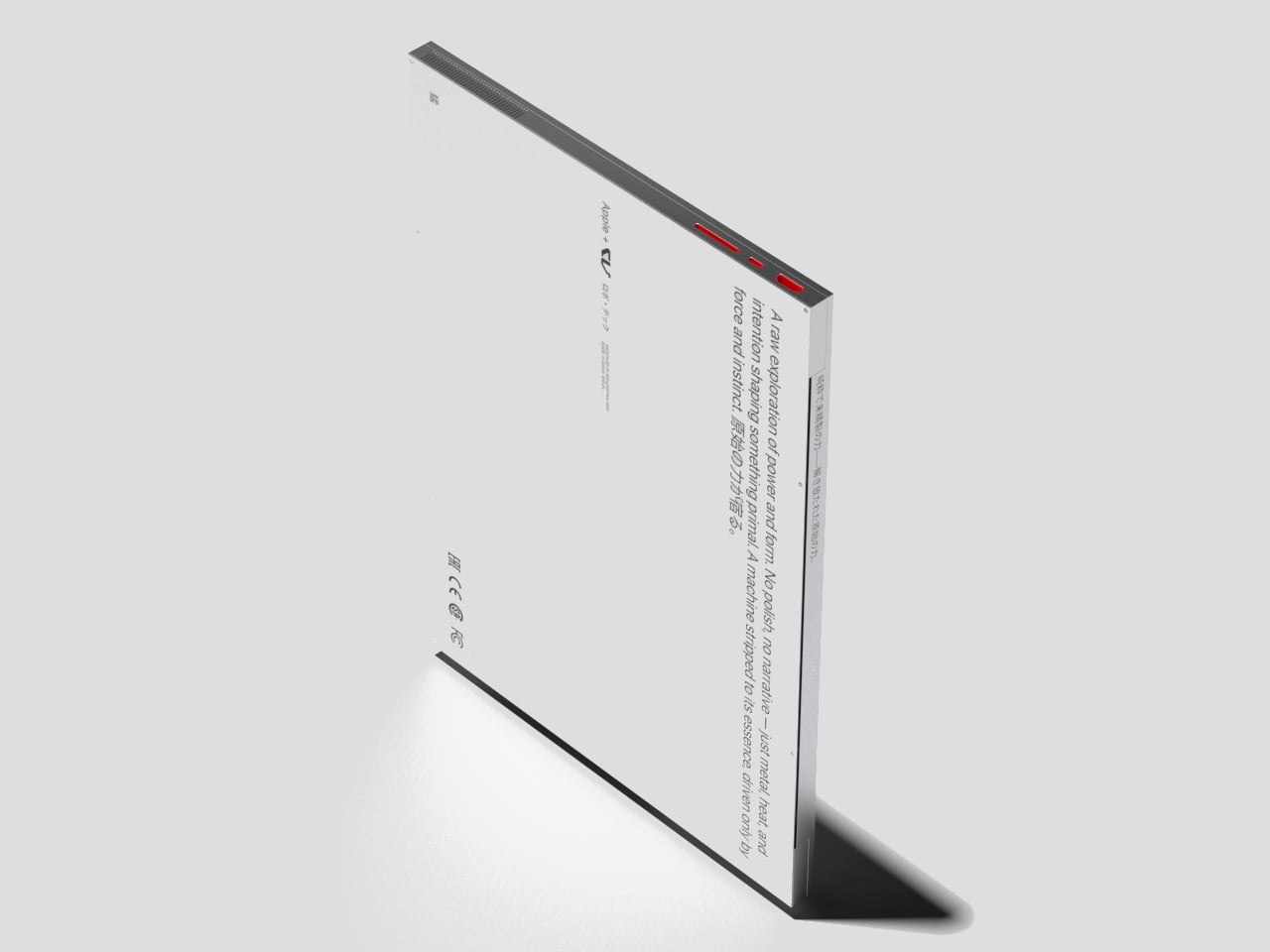
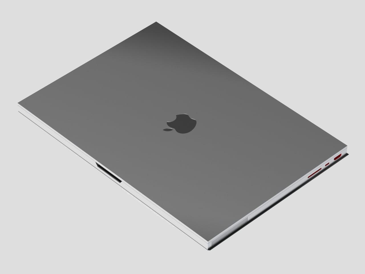
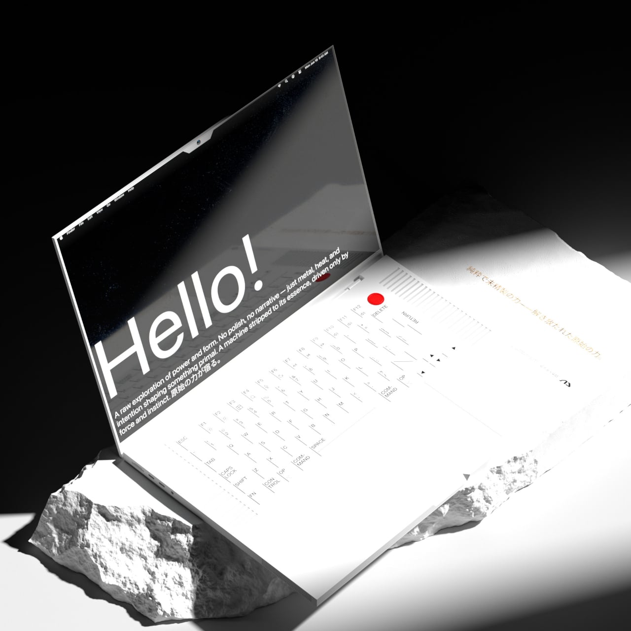
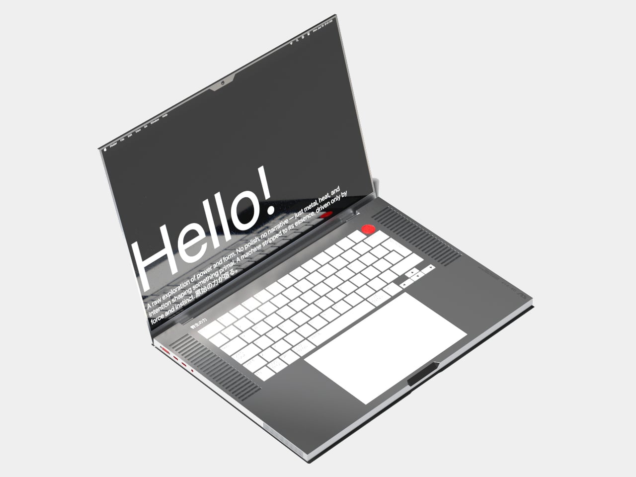
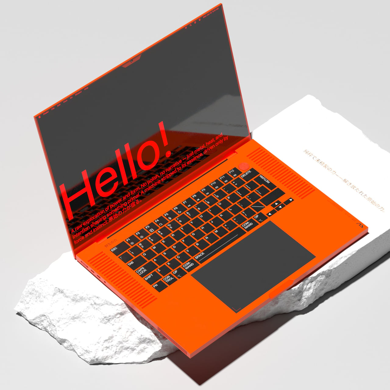
Opening it reveals a keyboard that treats its lettering as part of the decoration. Labels such as SPACE and RETURN are written out prominently, while COMMAND breaks across two lines. The large rectangular trackpad below keeps the working layout familiar. You could recognize where to start typing without understanding the aesthetic reference, although those unusually arranged legends might take some getting used to.
Of course, the detail you’re likely to notice first is the circular red control above the keyboard’s right corner. Against all those rectangles, it looks almost borrowed from a piece of workshop equipment. Its placement and color easily suggest that it’s the power button, perhaps coupled with Touch ID. As a visual choice, though, it gives the otherwise orderly layout a very obvious focal point.
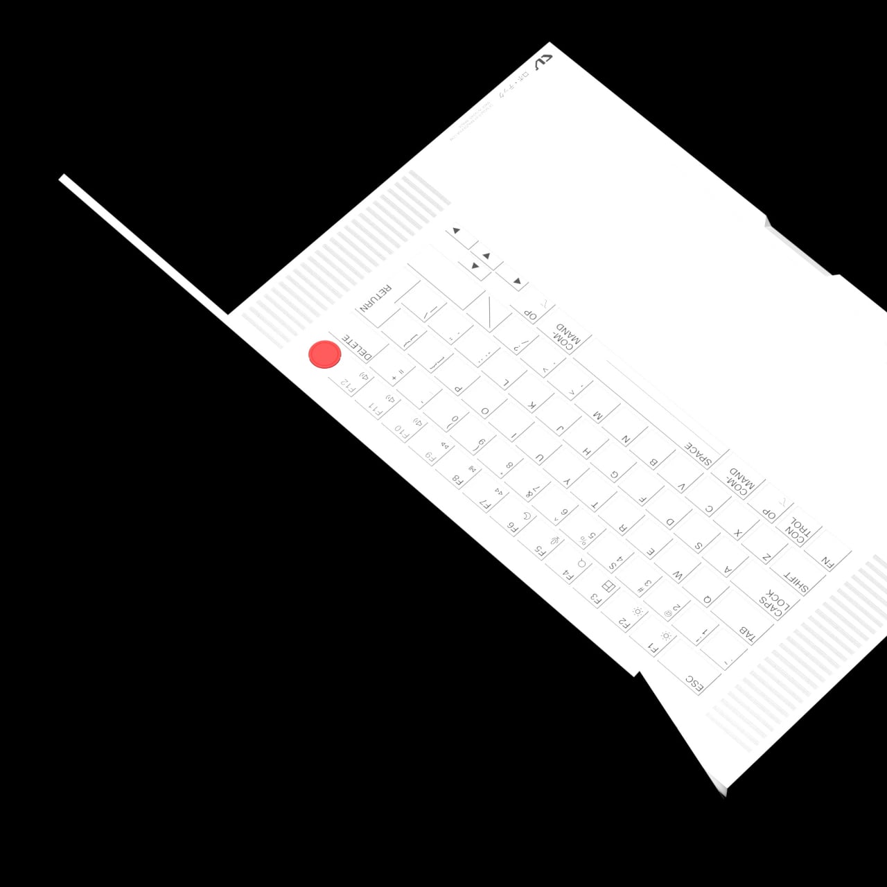

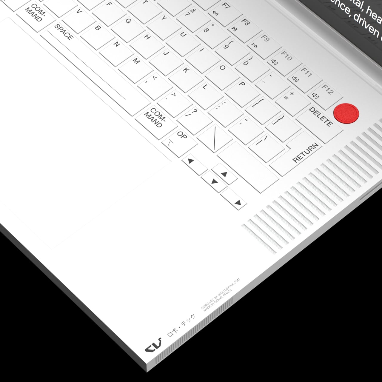
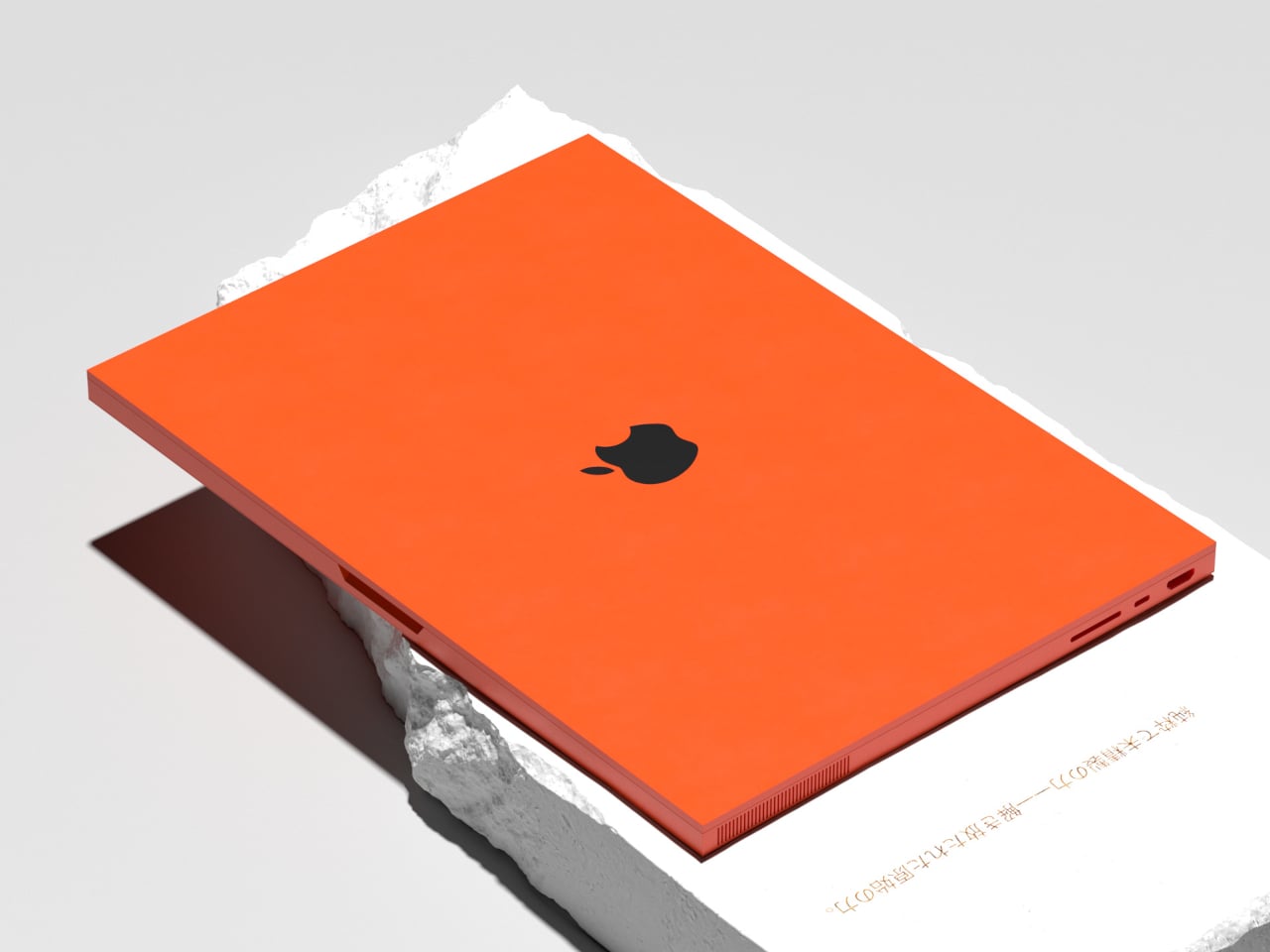
Long banks of parallel slots for the speakers flank the keys, extending that equipment-like character across the deck. More openings run along the sides, where contrasting port interiors make the connections conspicuous. Together, they suggest a machine that isn’t embarrassed about its mechanical side. They also keep the broad deck from feeling completely blank, giving the hardware itself a decorative role without covering every surface in graphics.
The color choices make that approach more playful than the name might suggest. White puts the iconic rainbow Apple emblem on its back, while a dark gray version contrasts its body with white keys. Orange takes the whole idea somewhere much louder, using black keys and a dark trackpad. It’s the sort of computer you wouldn’t confuse with somebody else’s in a shared studio.
The project cites Dieter Rams as an influence, which makes the mixture of restraint and assertiveness worth considering. There aren’t elaborate curves or layers of ornamental trim, but the shapes left behind demand attention. Minimalism here doesn’t mean trying to become invisible. It means limiting the ingredients, then letting a sharp outline or a single red circle do a disproportionate amount of work.
Looking industrial doesn’t automatically make a laptop tougher, of course, nor does it guarantee ergonomics. The angular edges, for example, raise questions about comfort when resting your wrists or carrying it around. MacBook Brutal is more convincing as an exploration of character than engineering. Taking it into a meeting would make an impression; typing through that meeting would need testing.