
The carrying handle on Jess Wiseman’s CHEKT board is the detail that makes the design click for me. Chessboards have an awkward domestic life: leave one out and it claims a chunk of your table; put it away and playing becomes another thing to unpack. CHEKT’s board design considers that friction through a clear enclosure with a handle, while giving the familiar checkerboard a visual personality closer to a desk accessory than a formal game set.
It also addresses a smaller, relatable problem: choosing a board usually means committing to one look. The supplied images show four transparent shells with different graphic treatments, suggesting a way to change the board’s appearance without replacing the underlying object. That’s a more interesting proposition than another beautifully finished slab. I like objects that leave room for your taste to change, especially when they’re likely to spend as much time sitting around as being used.
Designer: Jess Wiseman
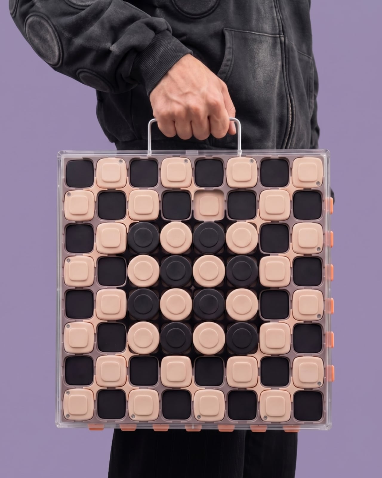

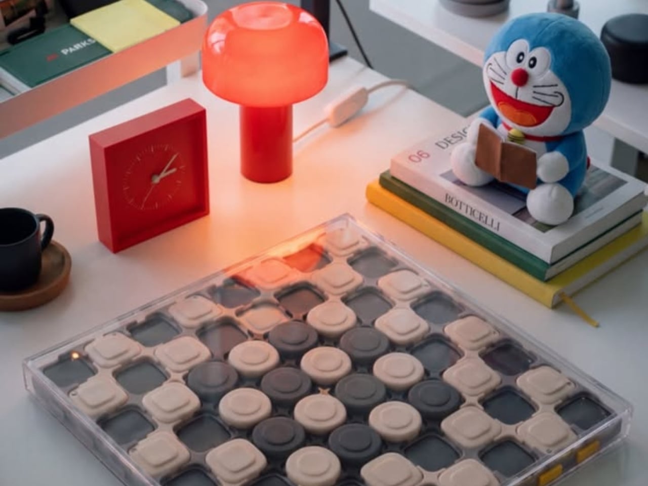
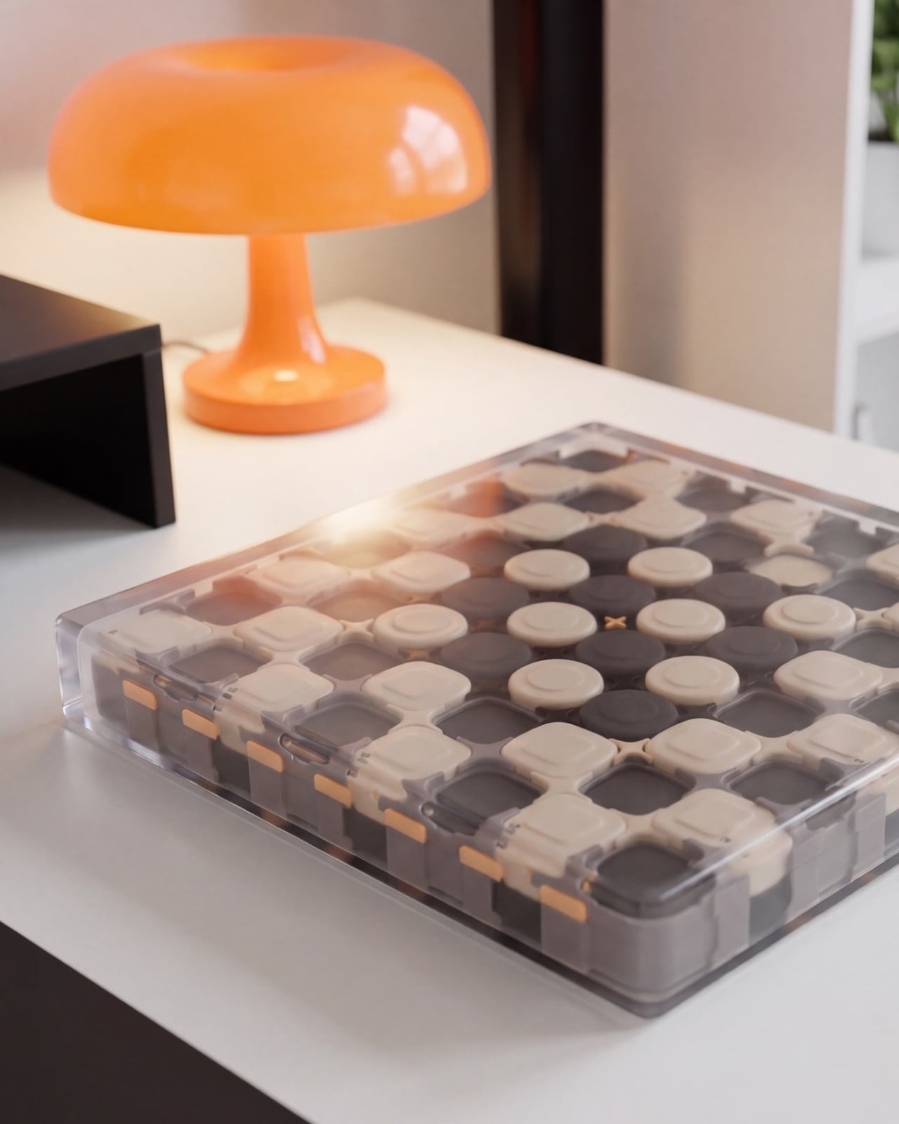
Underneath those shells, CHEKT has an eight-by-eight grid of black and pale peach forms. Rounded corners soften the geometry, and the raised surfaces make it look almost like an oversized keyboard. Circular details occupy the middle area, while square forms dominate elsewhere. The images don’t establish what those individual components do mechanically, so I wouldn’t call them buttons or switches. Visually, though, they give the board depth and rhythm that a printed checkerboard doesn’t have.
The clear outer enclosure makes those layers visible rather than hiding them behind a finished exterior. Small orange details along the edges interrupt the black-and-peach palette, and the slim, silver-colored handle gives the whole thing a faint briefcase quality. It’s playful without relying on a novelty shape. Sitting on a desk beside an orange mushroom lamp in one image, the board looks quite comfortable sharing space with objects chosen for their appearance.
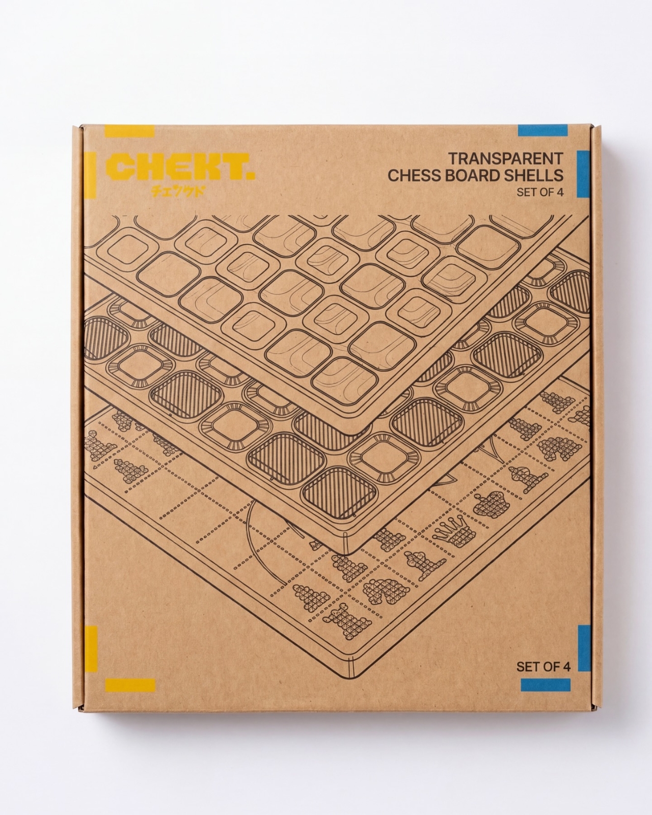
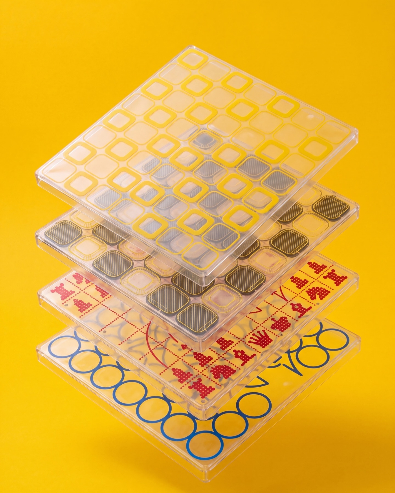
The shell graphics are where the design becomes especially expressive. One uses yellow outlines around the squares, another introduces dark diagonal hatching, and a third has red, dot-built chess-piece illustrations. The fourth features large blue circles and angular linework. They offer different degrees of visual busyness, which matters. A graphic you enjoy looking at across the room might be less welcome when you’re trying to read a complicated position. I’d probably start with the quieter option.
One image shows a hand wiping drawn red arrows from the illustrated shell. That suggests a useful secondary role as a surface for working through moves, explaining a position, or marking an idea before clearing it away. It’s an appealing detail for casual learning because the discussion can happen directly over the board. The specific writing tools and surface compatibility aren’t established here, but the pictured interaction gives the transparent layer a purpose beyond changing the color scheme.
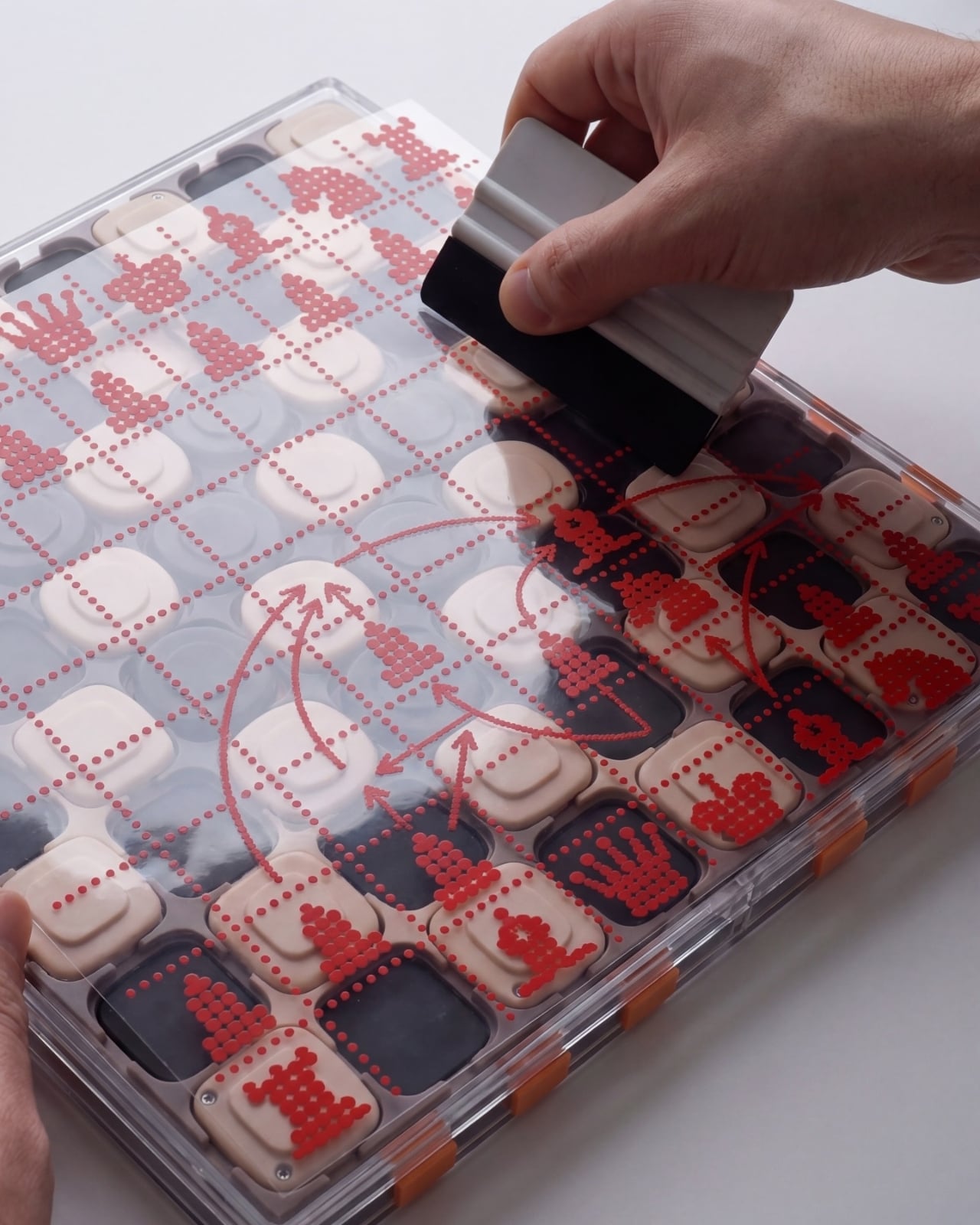
That ability to annotate is arguably more compelling than making a chessboard resemble a collectible gadget. You can imagine two people tracing a possible move rather than trying to explain everything through gestures. It wouldn’t replace learning the rules or recognizing positions, but it could make that conversation easier to follow. For me, this is where the graphic design starts earning its place: the surface becomes something you can use, not merely something to admire.
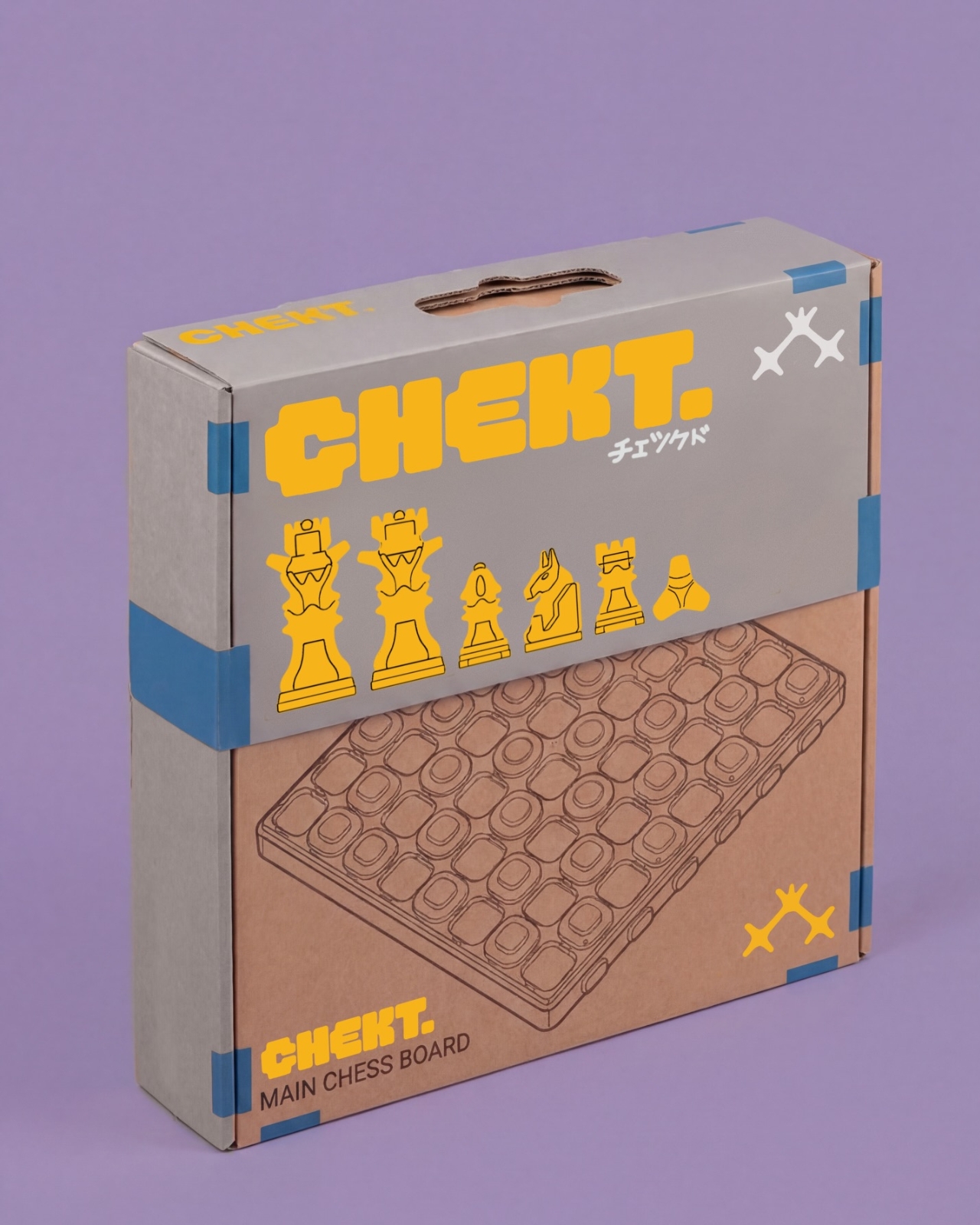
The packaging carries the same attitude. Oversized yellow CHEKT lettering, blue corner accents, chess-piece drawings, and diagrams of the layered board give the boxes a lively, almost hobby-kit character. The shell package explicitly labels its contents as a set of four, making the customization idea legible before anything is opened. I appreciate that clarity. Attractive packaging is more persuasive when it helps explain what the object is, rather than asking the branding to do all the work.
I’d still want to know how the shells attach, how easily their surfaces scratch, and whether the added graphics complicate play. Those answers would determine whether CHEKT feels practical rather than merely photogenic. But the design’s appeal is already clear: it gives a familiar game a place in a less formal room, with an appearance that doesn’t have to be permanent. A chessboard you can carry, customize, and potentially draw on offers several reasons to take it off the shelf.