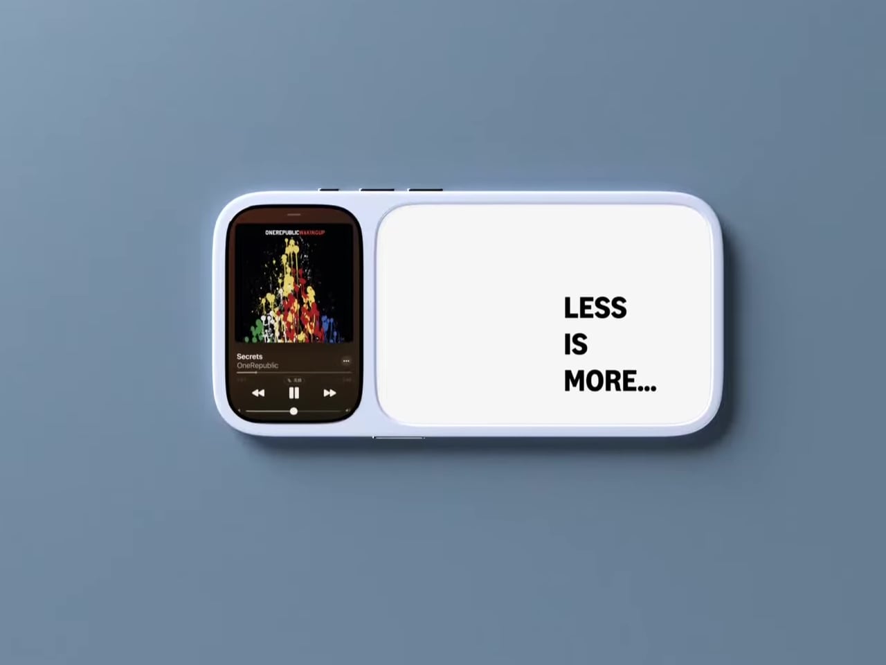
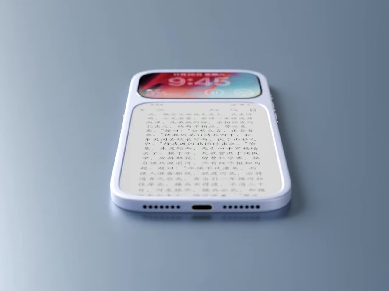
Modern phones have turned into pocket TVs, huge OLED slabs that are great for video and games but terrible for focus. Most E Ink phones go to the opposite extreme, either dropping color screens entirely or putting an E Ink panel on the back while keeping a full-size color display on the front. This dual-screen concept tries a different take, stacking both screens on the same face, with a small color LCD above a larger monochrome E Ink panel.
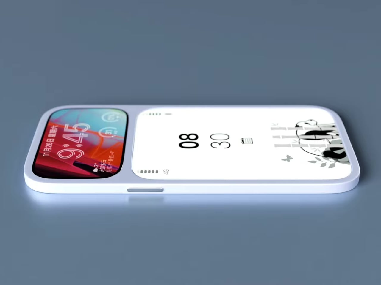
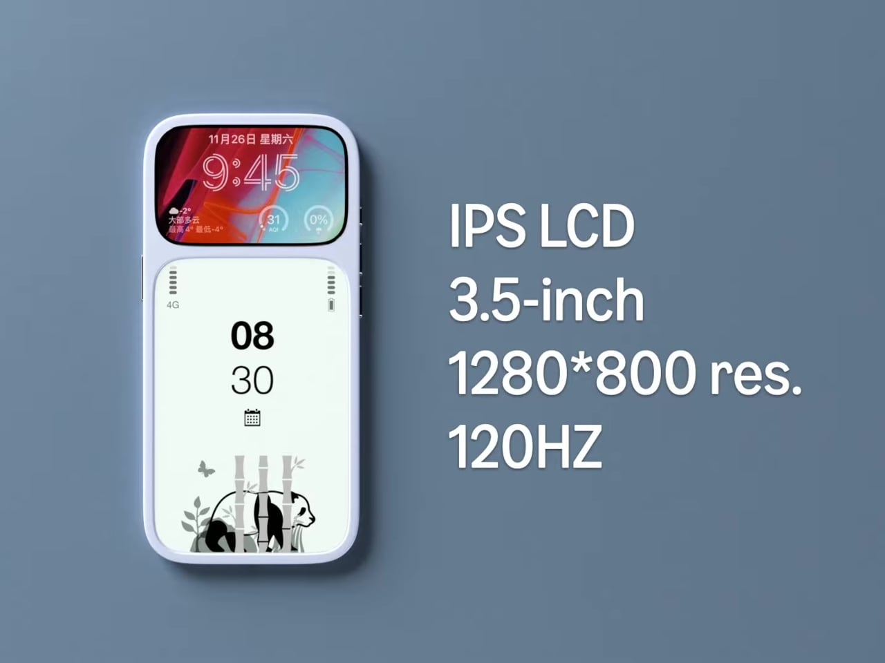
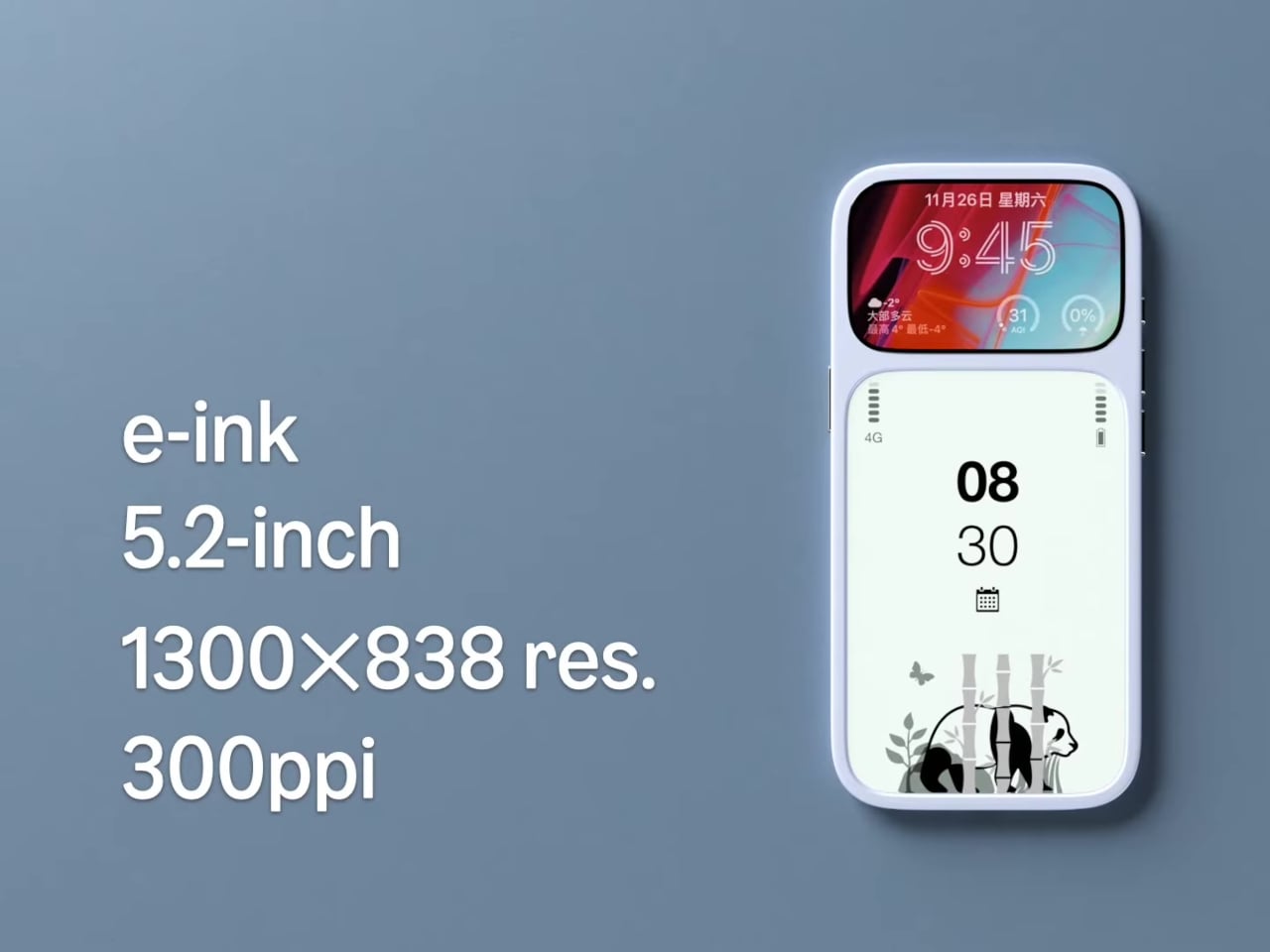
The basic layout is a 3.5-inch IPS LCD at the top and a 5.2-inch E Ink panel below, both on the front. The numbers are 1280 × 800 resolution at 120 Hz for the LCD and 1300 × 838 at 300 ppi for the E Ink. The clear back with a single camera and simple branding quietly signals that this phone is not chasing the usual multi-lens, all-screen spec race, instead treating the front as a composition of two very different surfaces.
Designer: Mechanical Pixel
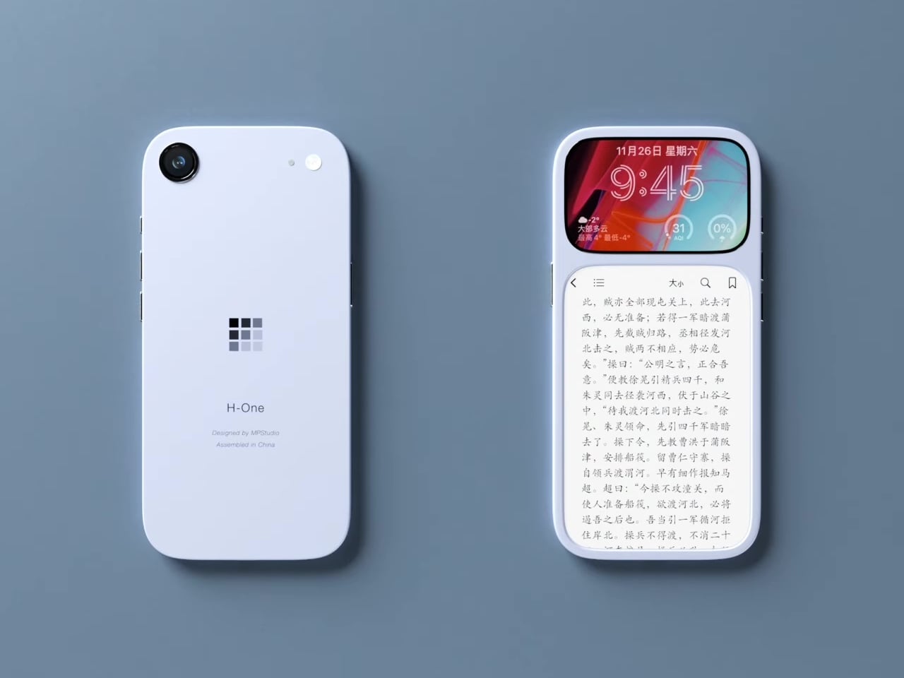
The smaller LCD becomes the “burst of color” zone for time, notifications, music controls, and quick interactions, while the larger E Ink area is reserved for reading, notes, and simple widgets. This creates a hardware-level hierarchy; the calm, monochrome screen is where you spend most of your time, and you consciously move your attention to the smaller, brighter panel when you really need it, which changes the default state of the device from hyperactive to quiet.
The obvious pros are less visual noise, better eye comfort, and potentially much better battery life. E Ink only draws power when it refreshes, so a reading-first layout means the phone can idle for long stretches without burning through charge. For people who mostly message, read, and check calendars, the big E Ink panel could handle most of the day while the LCD stays off or in a low-duty role, extending runtime significantly.
The trade-offs are nothing to scoff at, though. A 3.5-inch LCD, even at 120 Hz, is not ideal for immersive video, complex productivity apps, or touch-heavy games. UI designers would need to rethink layouts for that smaller window, or accept that some tasks are better on a tablet or laptop. The E Ink panel’s slower refresh also limits it to taps and page turns, which is fine for reading but not for fast, gesture-driven interfaces that rely on immediate visual feedback.
This concept uses hardware to enforce a kind of digital minimalism. Instead of relying on focus modes and grayscale filters, it bakes the idea into the front of the phone, a big, calm screen for reading and a small, hyperactive one for everything else. For people who like the idea of a phone that nudges them toward books and away from endless feeds, that stacked layout feels like a surprisingly sharp design argument, where the very shape of the device encourages a different relationship with what lives on it.