Colors, for Pantone, are their entire life. They’re literally what the company’s foundation rests on, and I’m sure people who work at Pantone are extremely passionate about the intricate nuances of hues, shades, tints, balance, saturation, palettes, pigments, HEX codes, or any of the jargon associated with colors… but colors, for Pantone, also present an incredibly lucrative business model (the company was valued at $180 million in 2007); and therein lies the massive problem.
Another year, another hue, more merchandise…
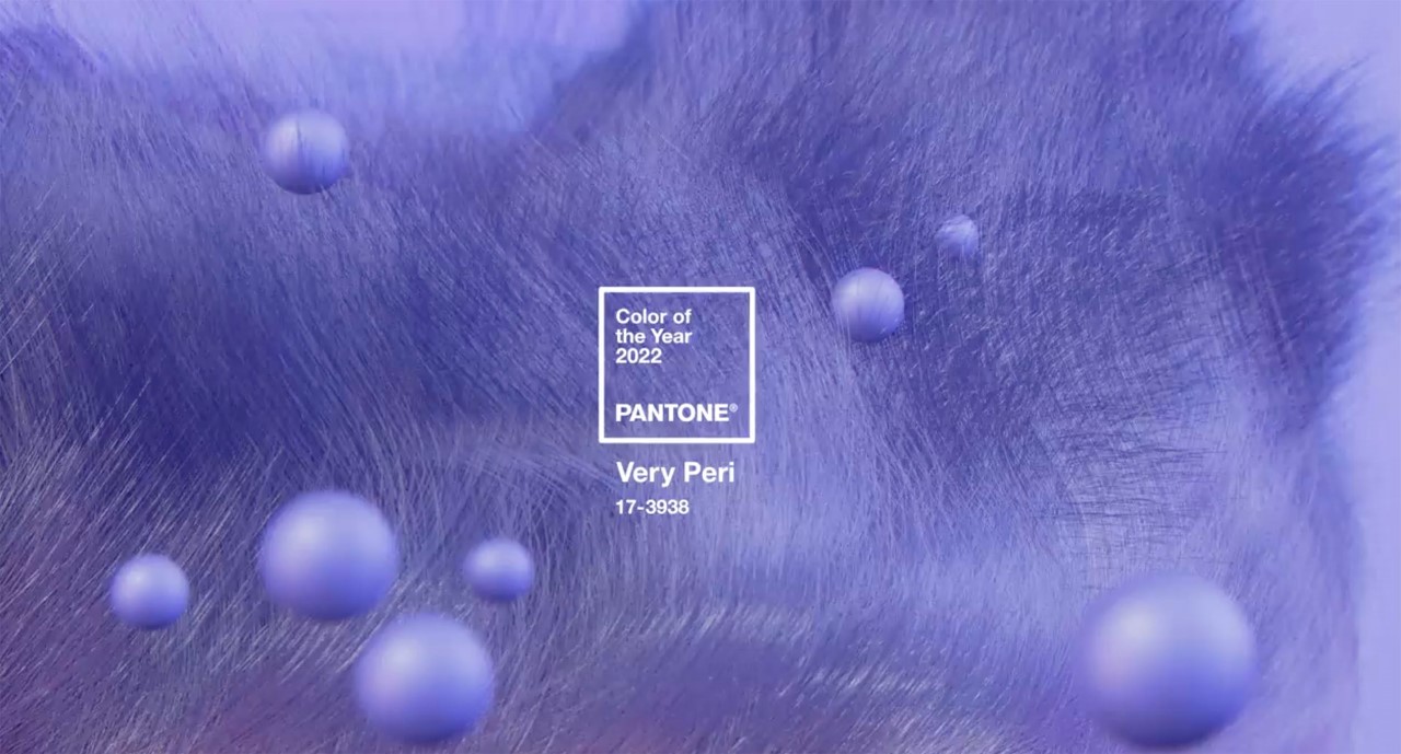
Pantone unveiled its Color Of The Year 2022 this week – a fine shade of “dynamic periwinkle blue hue with a vivifying violet-red undertone” called Very Peri, meant to represent humanity embracing an “altered landscape” after an intense period of isolation, and “opening up to a new vision as we re-write our lives”. The tradition dates back to 2000, in a practice that Pantone conducts with representatives from various nations’ color standards groups. Every December, Pantone unveils its new color for the year moving forward, effectively instructing creatives and companies around the world of what their experts believe should be the new year’s palette. Creatives will base their designs off the colors, fashion industries will market new collections based on these palettes, and companies will push out merchandise with Pantone’s licensed hues to a hungry audience in what can best be described as a coordinated market effort to create demand and to fuel a cycle of consumerism… the kind of consumerism that conveniently renews each year and is associated with art and creativity so it feels less market-ey and more art-y. Cyclical consumerism is bad, but art is good… so the results lie in a massive gray area (Gray was ironically one of the colors of the year for 2021).
A brief history of the Pantone Color of the Year
Words from a Quartz article in 2019 perfectly sum up Pantone’s selection process: “Pantone’s color prediction is, in part, a self-fulfilling prophecy”. The selection of a hue isn’t based on an empirical survey or an analysis of a running trend. It is, for the most part, selected by a committee through creative intuition and debate, following which, the color is then propagated by an elaborate marketing campaign. It’s no coincidence that as soon as Pantone announces a Color of the Year, like clockwork, companies release merchandise in the same hue. Pantone doesn’t predict a trend, it simply orchestrates it. “Months before the unveiling in December, it enters into licensing agreements with various companies—from nail polish to hotel suites”, the Quartz article points out. “Suddenly, the color of the year is everywhere.”
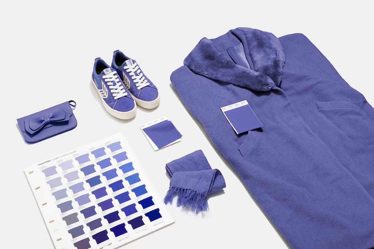
The idea is absolute genius, since it creates anticipation, injecting excitement into an otherwise boring color business… After all, it’s not like Pantone is constantly “inventing” new colors – colors have existed for millennia – although the Very Peri hue is new to Pantone’s catalog and was specially developed for the year 2022 (former editor-in-chief of ELLE Decoration UK, Michelle Ogundehin, has some strong thoughts on this year’s choice of color). The issue, however, is that you can’t possibly pre-emptively hype a color’s prominence into modern culture. Even a “global authority on color” can’t possibly make a hue go viral… society is much more complicated than that. It (sometimes) works for fashion, but not colors. Although both act as channels for expression and communication, fashion is personal and subjective… colors, however, are much more universal. This also opens Pantone up to further scrutiny when the color “doesn’t work out”. Pantone picked a shade called “Greenery” as its Color Of The Year for 2017, a year when California saw massive wildfires; its color pick for 2019, Living Coral, seemed quite foot-in-mouth when the Great Barrier Reef Outlook Report of 2019 predicted a grim future for corals off the coast of Australia.
What the Color of the Year really symbolizes… for Pantone, and for everyone else.
Each year, the Color of the Year is announced amid fanfare, along with a press release from Pantone that provides a lengthy explanation of what the new hue of the year is supposed to represent. However, the Color of the Year means two very different things to both Pantone and us, the consumers of color. For Pantone, the Color of the Year represents an annual effort to ‘market’ a color and earn revenue based on merchandise and licensing… for us, however, the color represents what Pantone tells us, and almost inevitably, like a fortune cookie message gone wrong, the events of the year can prove to be Pantone’s very undoing. Chosen to represent”optimism”, the year 2021’s colors, Illuminating Yellow and Ultimate Gray, came at a time when numerous countries experienced the deadly blows of the Delta variant wreaking more havoc in the pandemic’s global second wave, while others experienced great political and economic turmoil, and the entire world suffered the wrath of a supply chain crisis that experts estimate will last well into 2024. Colors are a business for Pantone, but for us humans, they’re still powerful vessels for moods, feelings, and emotions.
That’s where the somewhat foolish idealist in me raises objections. The term “Color of the Year” in itself sounds misleading. It isn’t like a Best Actor award, or Sportsman of the Year award, where accolades are given based on performance or a track record. Contrary to what the phrase is ideally supposed to represent, it’s less of a color of the year and more of a trend or guideline of the year. The choice of color is predictive, rather than reflective, and that’s where the problem really lies because you can predict trends, you can’t predict emotion. What the color tells us to feel for the entire year can sometimes wholly differ from what we end up feeling for the entire year. The symbolic message of optimism behind 2021’s Illuminating Yellow and Ultimate Gray would be painfully ironic to a Palestinian or an Afghan or a Uighur.
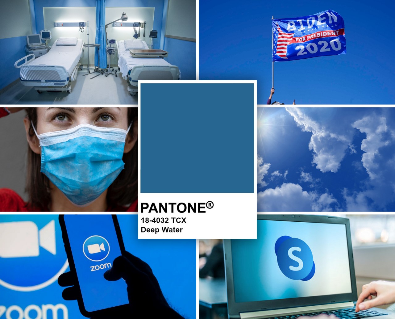
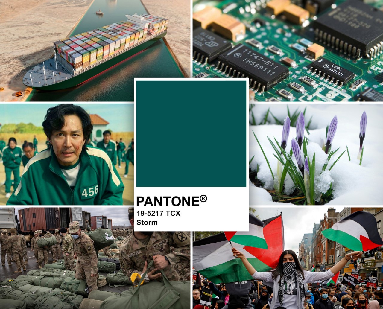
In retrospect, here’s what the real Colors of the Year looked like for 2020 and 2021, based on headlines and global sentiment.
2020 – Pantone Deep Water – Hospital Beds, Surgical Masks, Clearer Skies, Democrat Victory, WFH Softwares.
2021 – Pantone Storm – Ever Given, Chip Shortage, Squid Game, Greenery in the Arctic, Afghan Withdrawal, Palestine Protests
Things get tougher when the symbolism of the Color of the Year ends up being more literal than metaphorical – like in 2017 when Pantone chose ‘Greenery’ as their Color of the Year, or 2019 when they settled on ‘Living Coral’. In these cases, colors aren’t representative of a global mood or zeitgeist but are quite literally taken from nature, making the hollowness of the entire yearly charade much more apparent. One could argue buying a Living Coral edition of the 2019 Google Home Mini did absolutely nothing to raise awareness for coral bleaching, nor did it actually materially help the conditions of marine life in any way. Not that it’s Pantone’s job to fix the environment or heal the corals in the first place, but what is it if not ‘color appropriation’? Like cultural appropriation, ‘color appropriation’ is nothing more than borrowing a color and its emotional aspects and marketing it for economic gain.
The solution? More Color, Less Capitalism…
At the risk of sounding like a hypocrite, I don’t believe in getting rid of the Color of the Year. As ultimately meaningless as it may be in the long run to most of the population, it’s still a fun little annual exercise that, at least for the creative community, gives us a little excitement and sparks our inspiration/imagination once a year. That aside, maybe it’s time Pantone devises a new, more publicly inclusive way of picking their yearly colors instead of relying on an out-of-touch boardroom of executives and marketing heads. Maybe that way, the colors will actually mean something to us all, rather than being a woke marketing effort to broadcast messages of ‘hope’, ‘positivity’, and ‘exploration’ while companies make money off merchandise that’s only good for that particular year. The Pantone Color of the Year has the potential to be much more meaningful and impactful than simply being a revenue stream for global corporations… or conversely, embrace it for what it currently is and rebrand it to the Pantone “Trend Prediction of the Year”.
How about fixing it from a media perspective? After all, design, culture, and news websites like ours play a significant role in pushing these trends and their subsequent products. Truth be told, the reality probably won’t change unless Pantone decides to change first. It’s still in our nature to fawn over delicious hues and color palettes (because our aesthetic-driven minds are trained to), and as a blog, we’re still required to report on the intersection between design and news, which means blogs like ours will continue to showcase designs drenched in Pantone’s Very Peri. That being said, the purpose of this piece is to reflect on the 2-decade practice and propose a better way forward with the hope that Pantone realizes that the powers and capabilities of the color spectrum lie much further beyond being simply drivers of consumerism.
[This is an Editorial. The views, opinions, and positions expressed in this article are my own.]