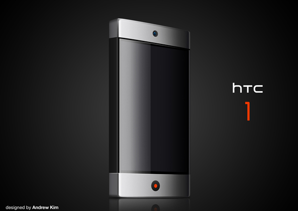
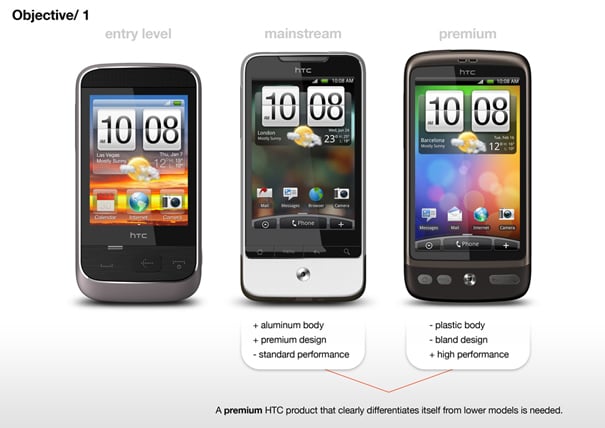
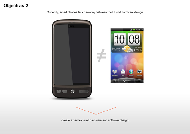
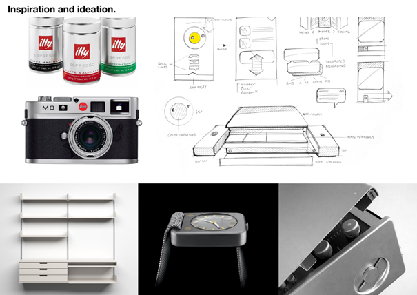
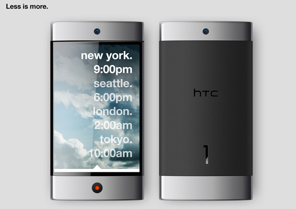
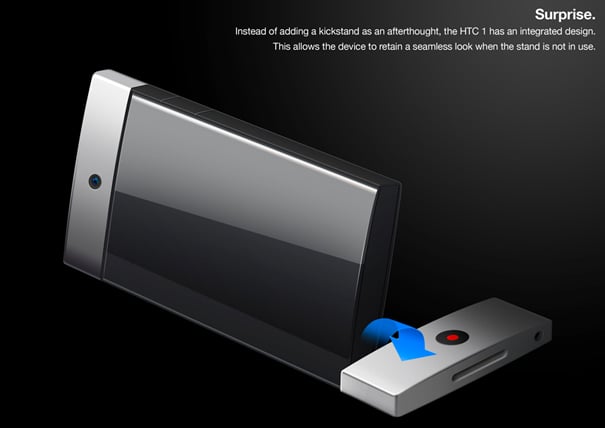
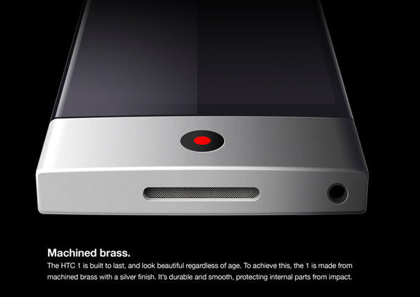
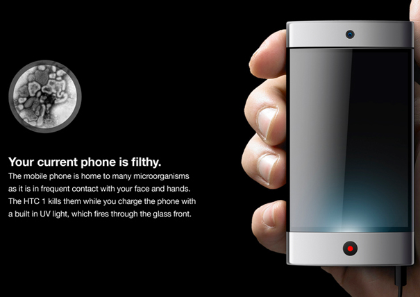
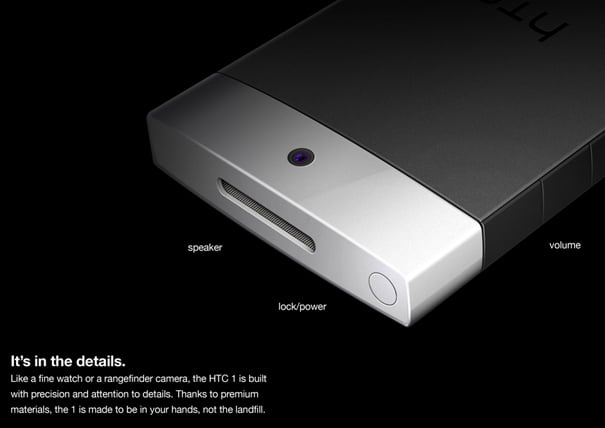
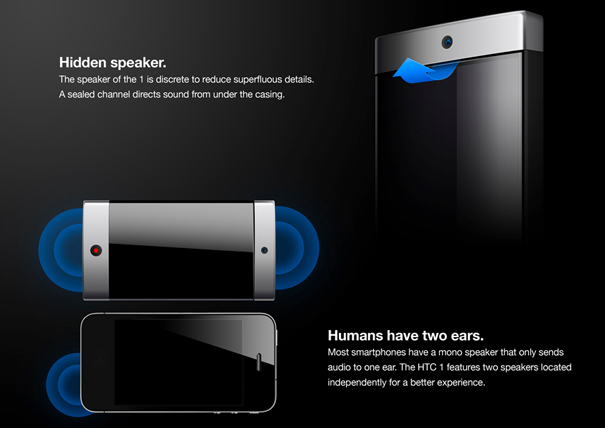
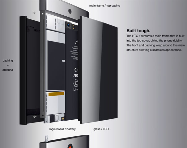
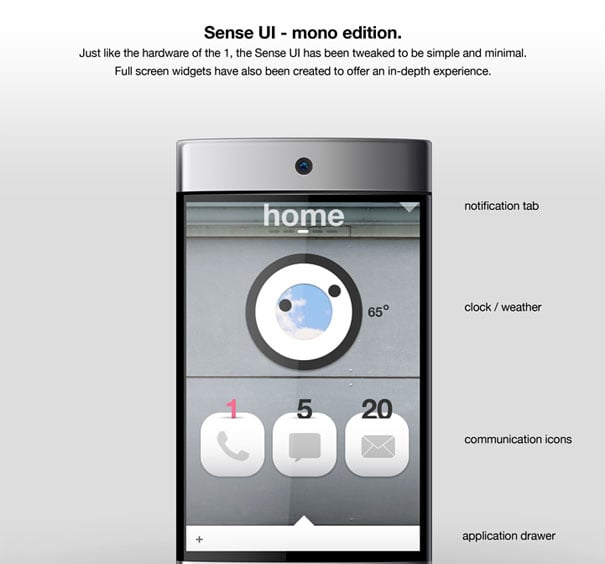
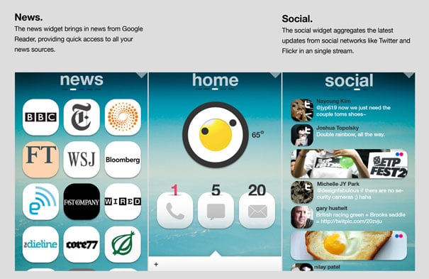
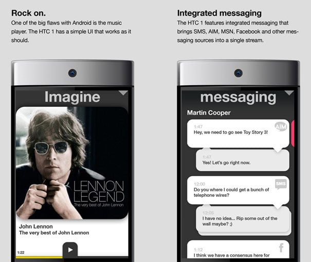
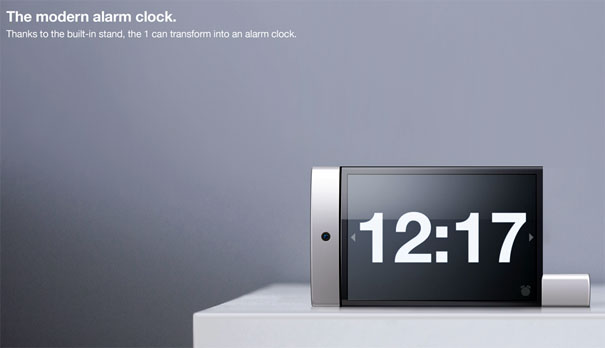
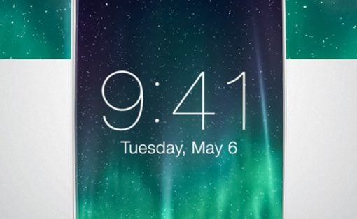
AKA how simple can you design a mobile phone? Pretty darn simple. Designer Andrew Kim had a qualm with the HTC group, that being the fact that there’s no real perfectly simple way to differentiate between lots of “lower-end” phones and “premium models”, especially in the HTC line. So what’s he do? He simplifies. Don’t you see, everyone, we’re in the age of simplicity! The age of graphic design perfection, where the Bauhaus school of design handed us down the square shapes, so perfect in proportions that it took us 50 years to accept it! Here’s the “HTC 1.”
The Bauhaus was and is a graphic design (and industrial design, and lots of different kinds of design) school that pushes functionality. No frills! They used to go so far in that school to design chairs that people collect their old chairs as art pieces, never to be sat upon!
Yes, we are really in that age now, one where perfection must be achieved through simplicity. And Kim has a masterpiece right here. Look at this wonderful phone! Today’s phone world is all about the power on the inside and yes, as Kim completely understands, the flawlessness on the outside.
NOTE also how Kim uses an Apple sensibility when writing copy for his design images, but using Helvetica instead of the font Apple employs (Myriad). How very interesting!
Designer: Andrew Seunghyun Kim
