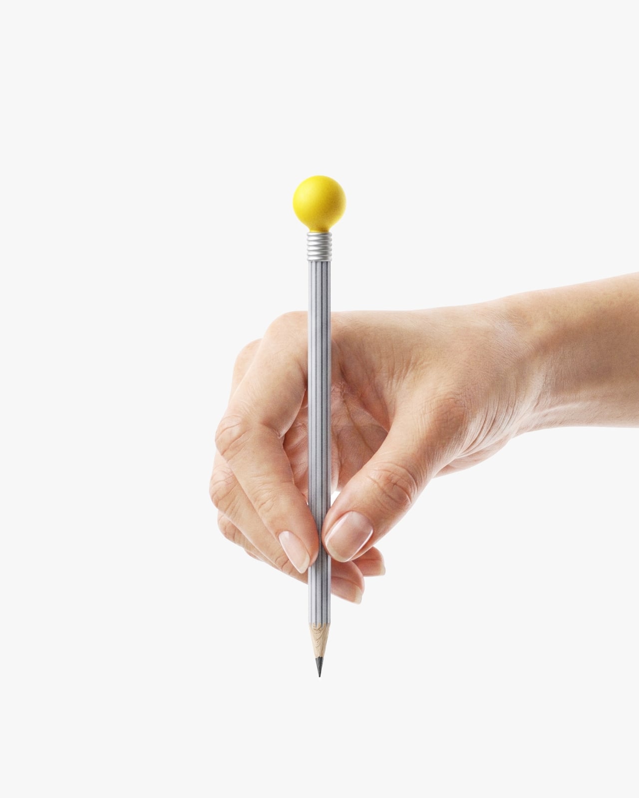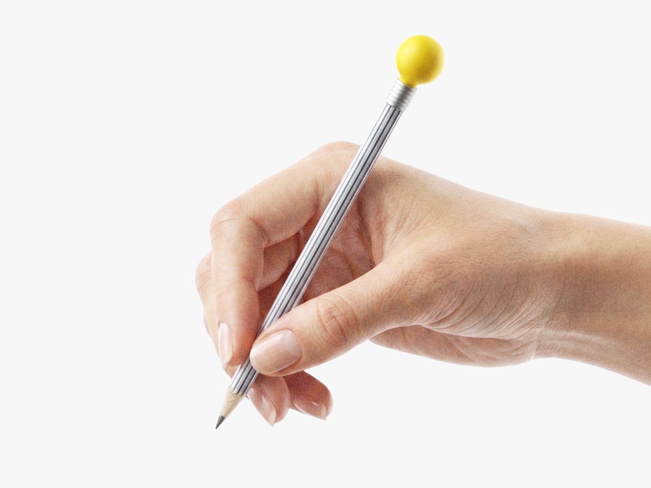

If you’ve ever sat down with a blank notebook and a good pencil and felt your brain finally slow down enough to actually think, you already understand what Korean design studio QSEODESIGN is getting at with their IDEA Pencil. This concept design just makes that feeling visible.
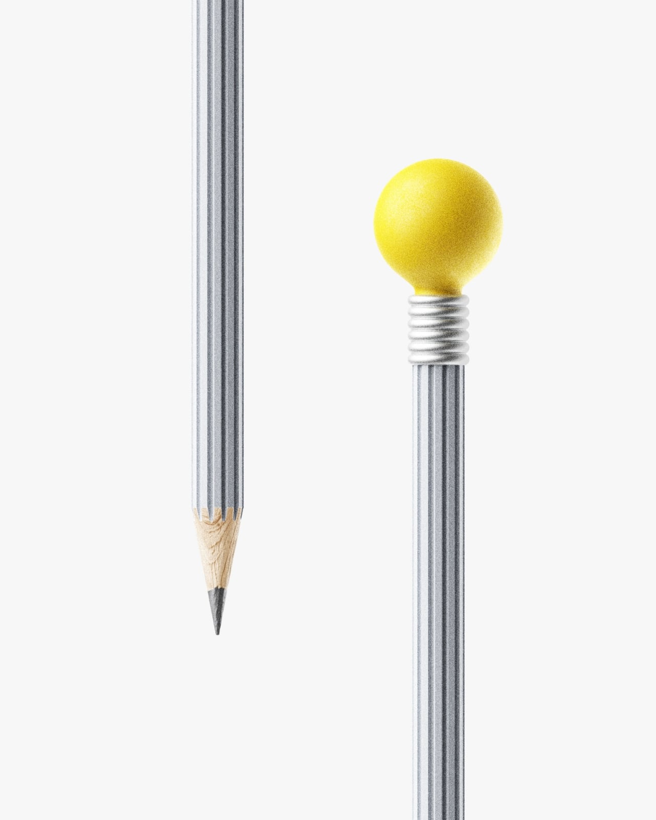
The idea is elegantly simple: a pencil designed to physically embody the act of having an idea. The body is shaped from an extruded gear form, a visual metaphor for the grinding, turning, iterative process of refining a thought. The eraser at the top? Shaped like a light bulb. Not in a cheesy, clip-art way, but with real restraint and intention. That little light bulb eraser is doing a lot of conceptual heavy lifting, referencing the universal symbol for the “aha” moment while sitting at the one end of the pencil most associated with second-guessing and starting over. It’s sharp design thinking and a quiet bit of wit in one object.
Designer: QSEODESIGN Studio

QSEODESIGN is the studio of MinGyu Seo, a South Korean industrial designer trained at ArtCenter College of Design in Pasadena, one of the most rigorous product design programs in the world. Based in Daegu, South Korea, his studio has a consistent aesthetic DNA: minimal, considered, grounded in quiet observation. Whether he’s designing watches or furniture, the approach doesn’t change. The IDEA Pencil fits exactly into that lineage. It doesn’t shout. It doesn’t over-explain. It simply presents an idea about ideas, and trusts you to get it.
What makes the concept interesting beyond the form is the framing. QSEODESIGN positions the IDEA Pencil specifically as an analog alternative to the digital keyboard. That choice of words feels deliberate, almost defiant, and I think it speaks to a broader tension a lot of us feel right now. We spend most of our hours typing, scrolling, prompting AI to generate things for us, and somewhere in all of that, the physical act of writing something by hand has started to feel almost transgressive. Reaching for a pencil instead of a laptop is a small rebellion, and designing a pencil that looks like it belongs in that rebellion is a smarter product position than it might seem.
There’s also a conversation happening right now in design and tech circles about whether we’ve overcomplicated our tools for thinking. The analog revival isn’t nostalgia for its own sake. Whiteboards covered in Post-it notes, sketchbooks, index cards on a wall, these are still the methods that show up in every serious creative and innovation process, from architecture studios to screenwriting rooms. The pencil hasn’t been improved upon as a thinking tool. It just got aesthetically neglected. The IDEA Pencil argues, persuasively, that even the most humble everyday object deserves to be considered carefully.
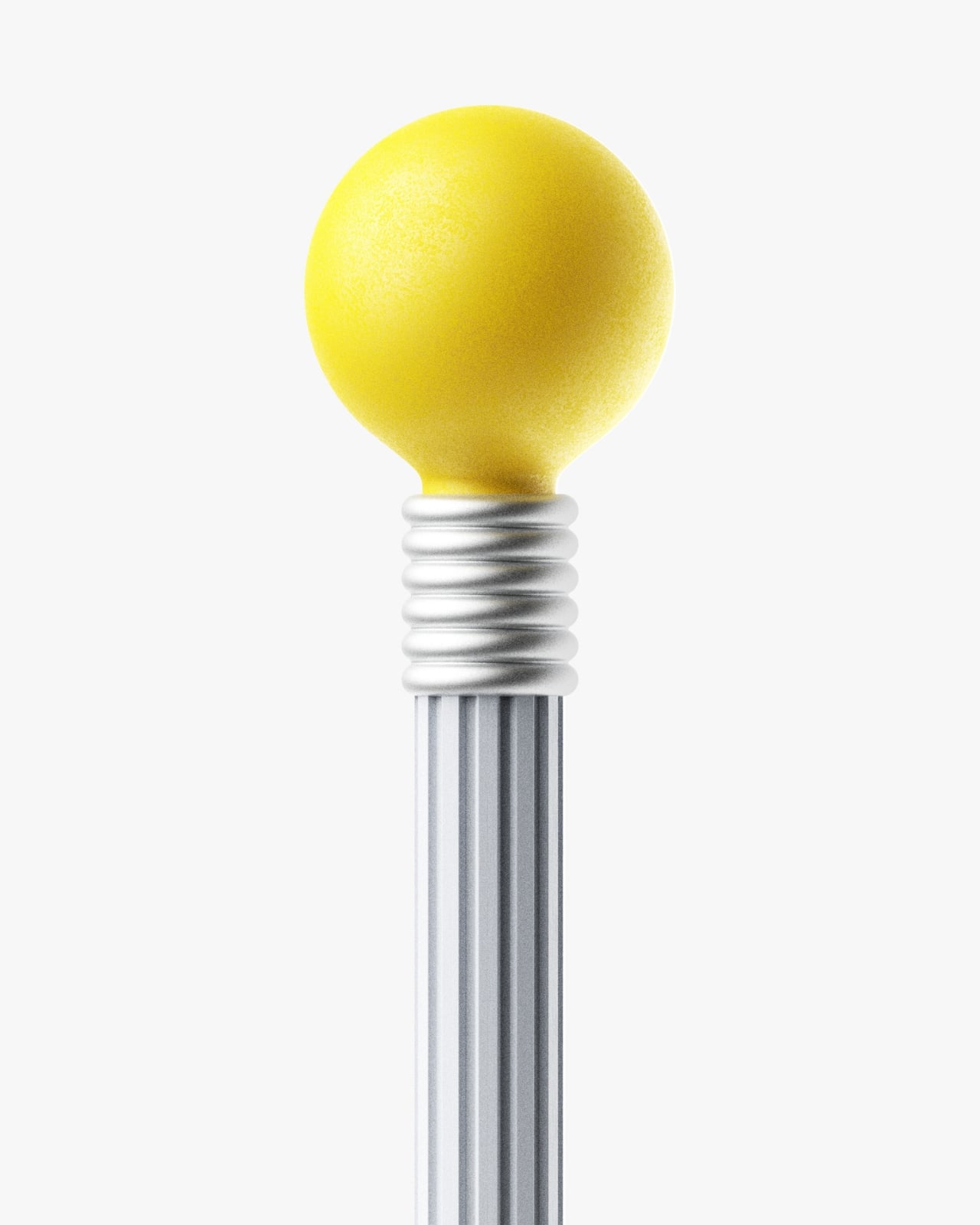
The packaging concept follows the same philosophy. QSEODESIGN describes it as elegant, minimal, and multifunctional, which sounds like standard design-speak until you remember that most pencil packaging is either a cardboard sleeve or a tin that gets repurposed as a button holder. When a studio extends its conceptual care all the way to the box, that’s a signal about how seriously the whole object is being treated.
I’ll say this clearly: the IDEA Pencil hasn’t reinvented what a pencil does. It still writes, still smudges, still snaps in your bag if you’re careless. But that was never the point. The point is that MinGyu Seo looked at one of the most ordinary objects on any desk and asked what it should look like if we actually thought about it. The answer he came up with is warm and smart and quietly joyful.
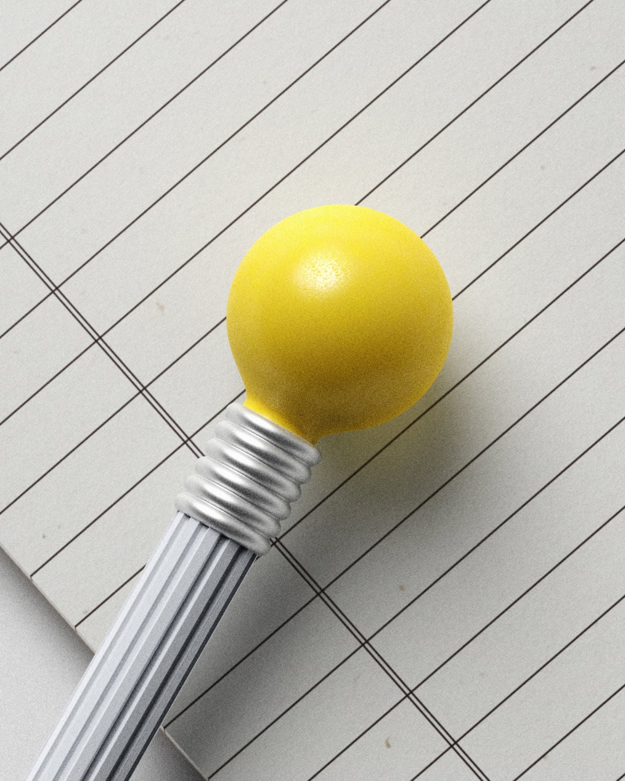
At a moment when most “innovative” products are competing for screen real estate or begging for a subscription fee, it’s worth pausing over a concept like this one, a studio putting serious thought into a pencil. The IDEA Pencil may still be a concept, but the argument it makes is already fully formed: the right design doesn’t just hold an idea. It looks like one.