
Over half of all Americans have a prescription, and 1 in 5 take medication multiple times a day. That’s not a niche demographic. That’s most of the people you know. And yet the objects we rely on to manage that medication have barely evolved. The standard pill organizer, bulky, color-coded, and tedious to sort, was designed for a countertop, not a life in motion.
Ashley Gyurich, an industrial design student at Western Michigan University, decided that wasn’t good enough. Her Spring 2024 project, Harmony Smart Pill Storage, started with a specific and underserved user in mind: the active person, the traveler, the one who is always moving and always managing. Someone who loves new experiences, prioritizes health, and takes medication throughout the day to manage ongoing conditions. Someone for whom every existing option falls short in some fundamental way.
Designer: Ashley Gyurich
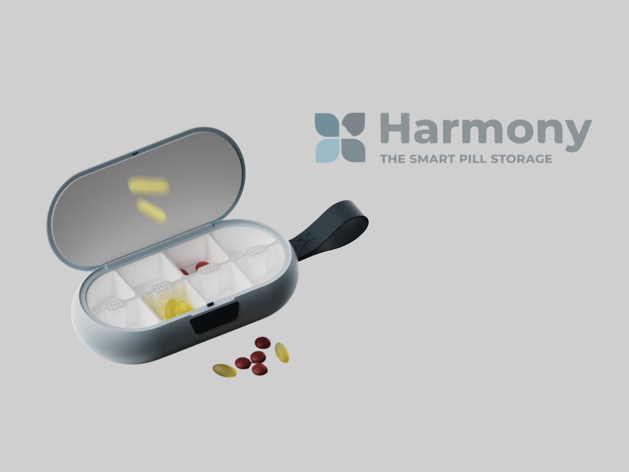
The problem, as Gyurich mapped it, splits cleanly into two camps. Alert-style dispensers handle the notification side reasonably well, but they’re too large for travel, complicated to set up, and require tedious weekly sorting. Travel pill cases go the other way: compact and easy to open, but with no alert system and limited capacity. Both solve part of the problem while ignoring the rest. Harmony sets out to address it whole.
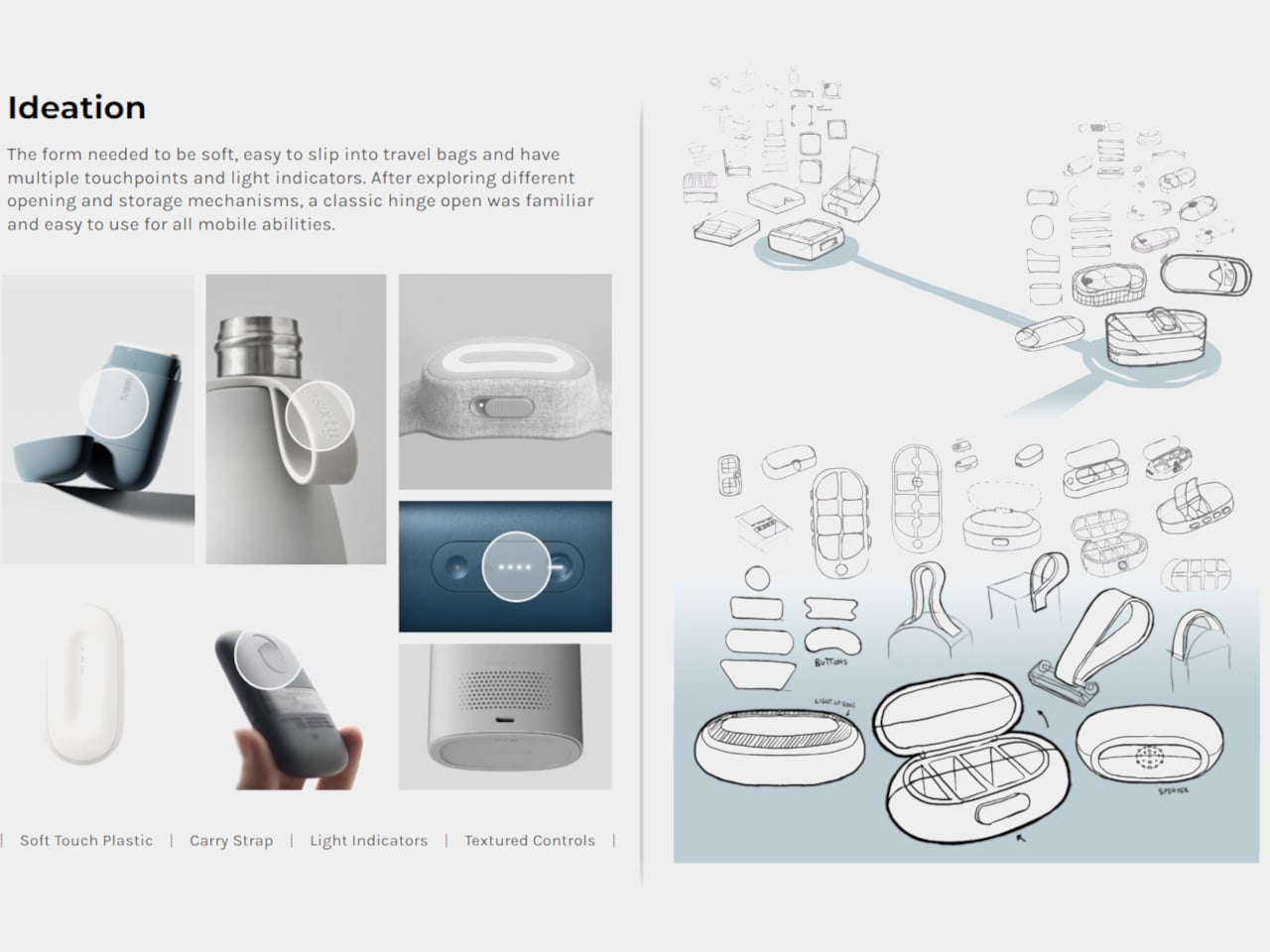
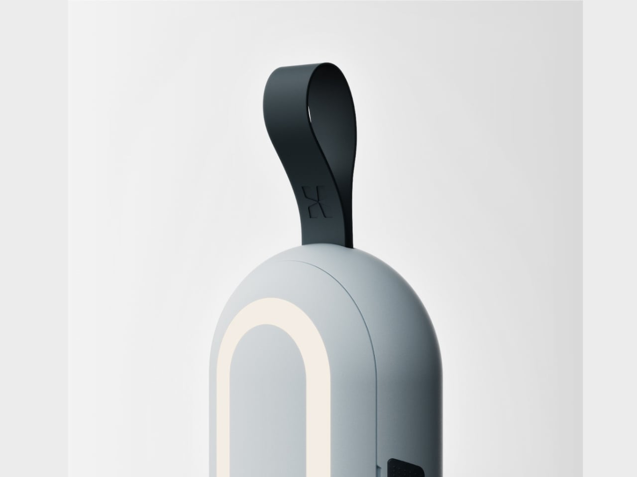
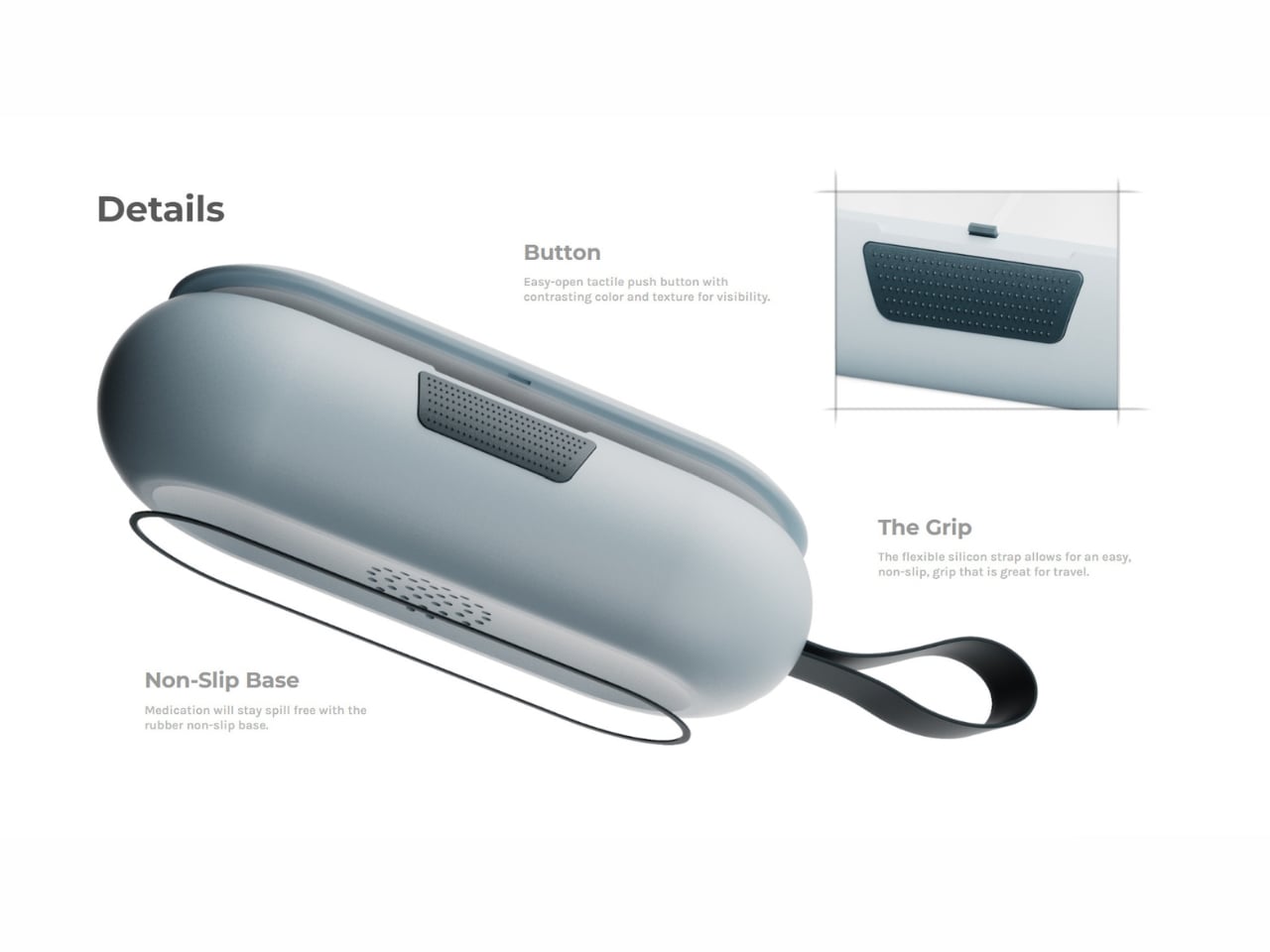
The result is a compact, clamshell-style organizer with eight compartments, a classic hinge opening, and a soft blue-gray body made of soft-touch plastic. It fits into a travel bag or clips onto one via a flexible silicone carry strap, and its rounded, tactile form feels closer to a premium tech accessory than anything you’d find in a pharmacy aisle. The easy-open push button sits on top with a contrasting color and texture for visibility, and a rubber non-slip base keeps things stable and spill-free when the case is open. The whole object communicates the same idea: designed for your hands and your bag, not a medicine cabinet.
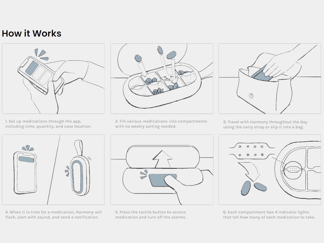
The three-part alert system is where the design earns its “smart” label. When it’s time to take a medication, Harmony responds on three fronts at once. A pulsing light ring on the top of the case flashes visually. Speakers on the bottom play an audible alert. A digital notification goes out to all connected devices. You can be on a flight, mid-workout, or back-to-back in meetings, and Harmony still finds a way to reach you. Once you’re ready, you press the tactile button to access your medication and silence the alerts. Each compartment also has four indicator lights that show exactly how many of each medication to take, removing any guesswork from the process.
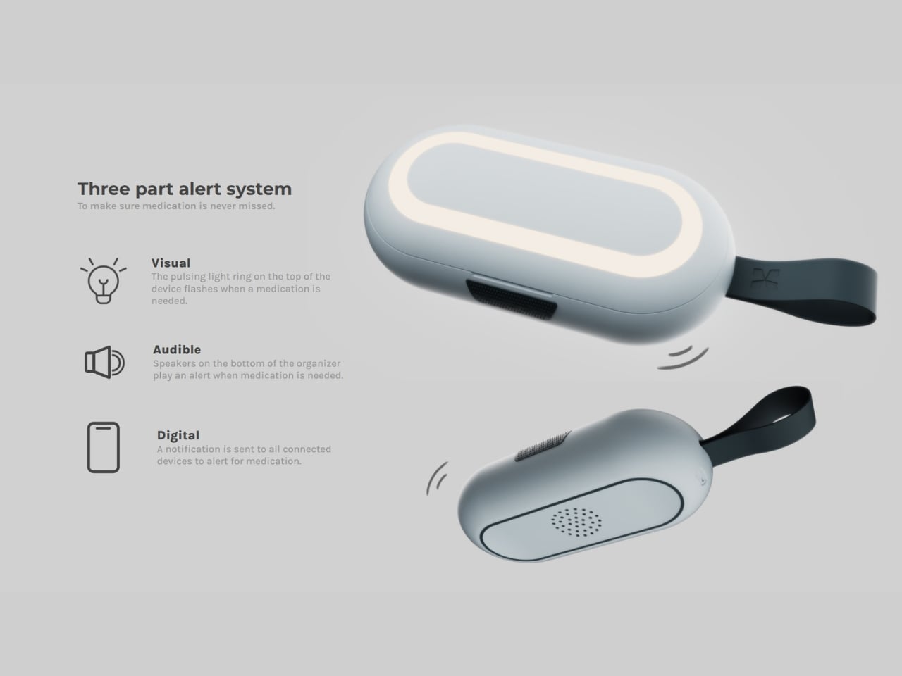
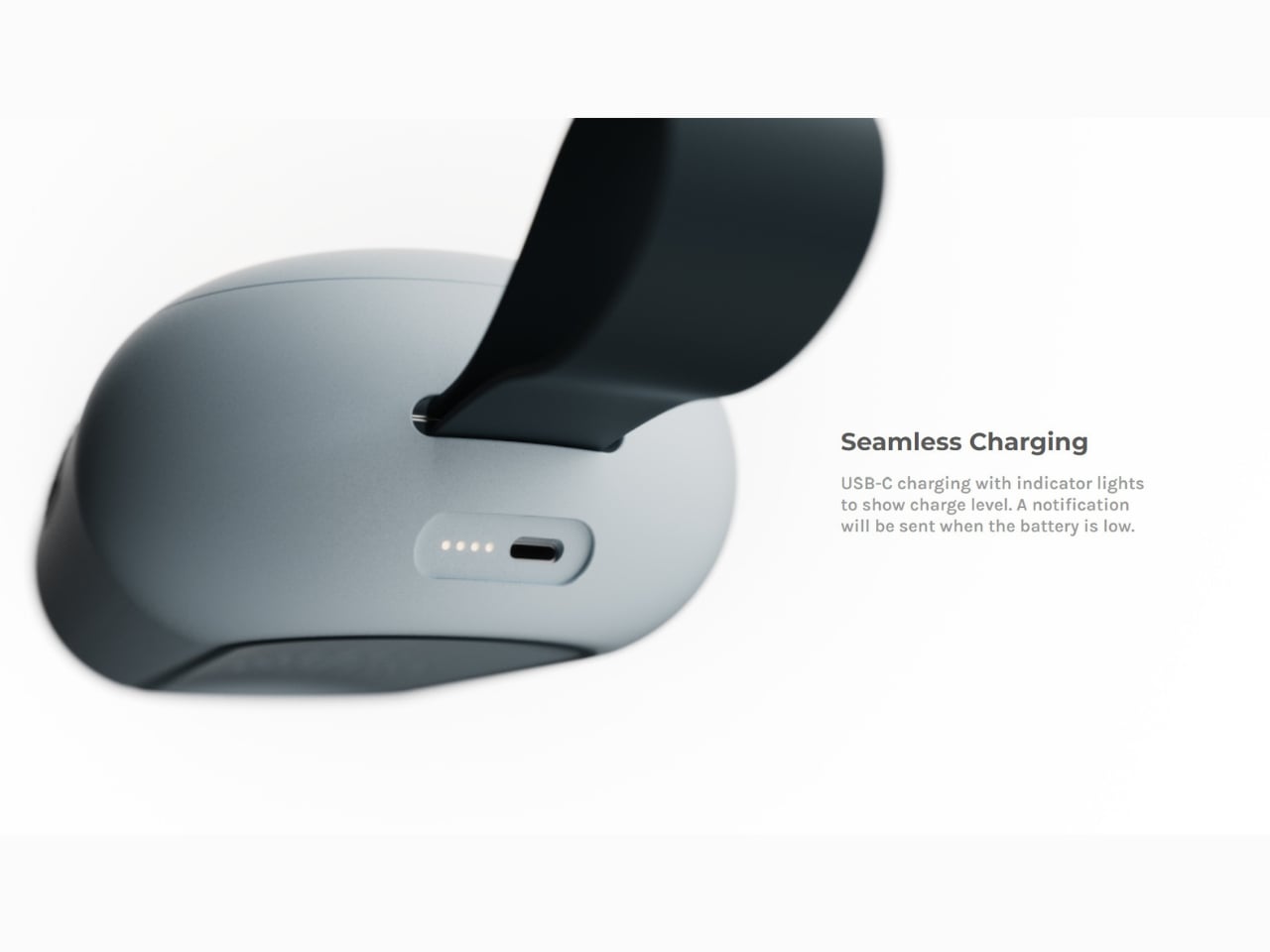
Setup runs through an app, where you log medications including time, quantity, and case location. No weekly sorting ritual, no day-labeled slots to fill in order. Fill the compartments however works for you, and the system keeps track. USB-C charging with indicator lights handles the power side, and a notification alerts you when the battery runs low, so the device is never quietly dead when you need it most.
Gyurich’s design philosophy starts with a single question: why? Not just how a product functions, but why it should exist in the form it takes, and whether that form actually serves the person using it. For Harmony, the answer kept pointing back to the active user, the one whose day doesn’t pause at a fixed time for medication management. That specificity of focus is what separates a thoughtful design from a product that technically works but never gets used.
Medication nonadherence is a genuine and documented problem. Most of the design attention in the space has gone toward clinical or institutional solutions rather than personal ones. Harmony is a rare piece of consumer health design that meets the user where they actually are, somewhere between the airport gate and a packed schedule. It belongs in your bag, on your desk, and in the larger conversation about what everyday health tools can and should look like.