
World Cup fever is still very much here and while most brands scramble to slap national flags on whatever they can find, adidas Originals and BAPE® took a very different road. Their latest collaboration for FIFA World Cup 2026 doesn’t just dress you for the occasion. It makes a case for why football culture and street culture were never really separate to begin with, and it does so through some of the most deliberately designed pieces either brand has produced together.
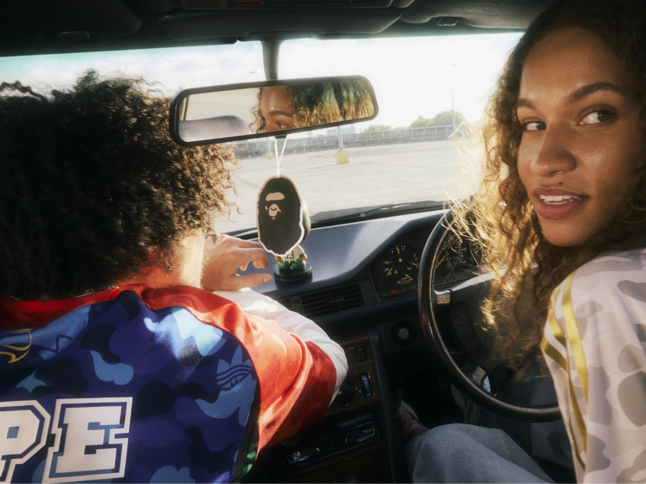
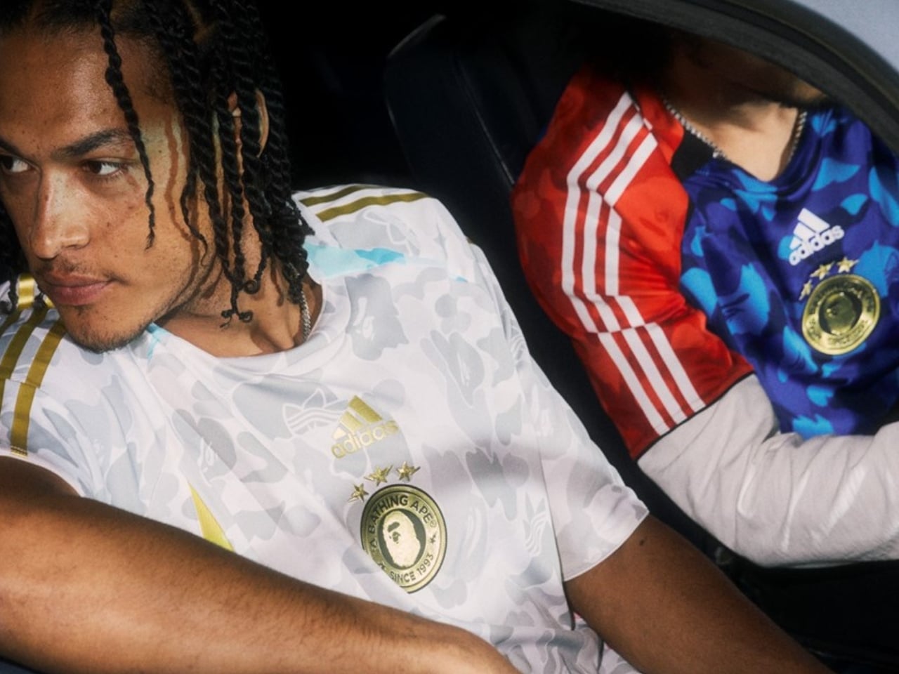
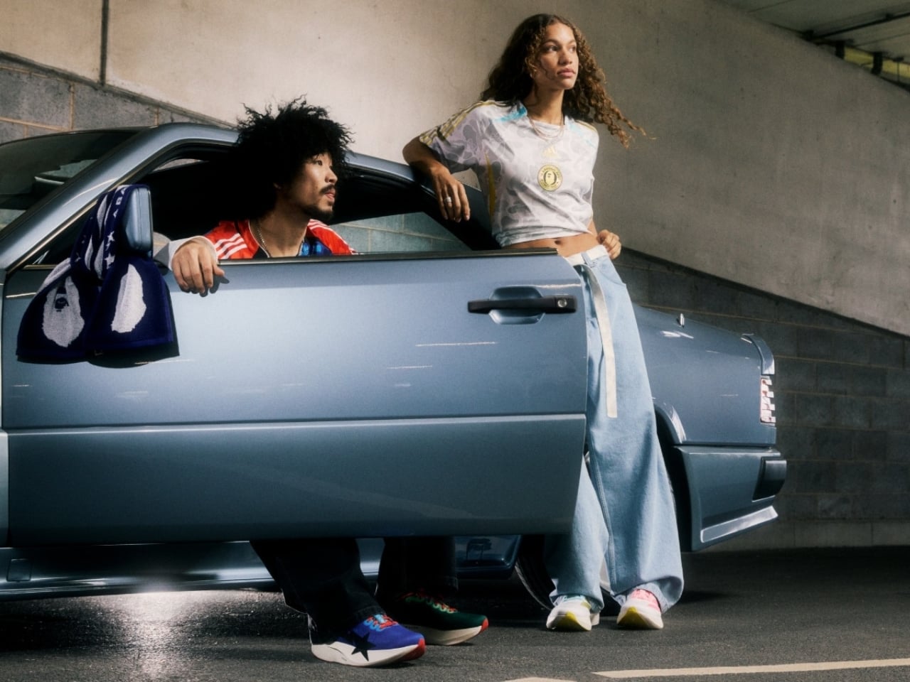
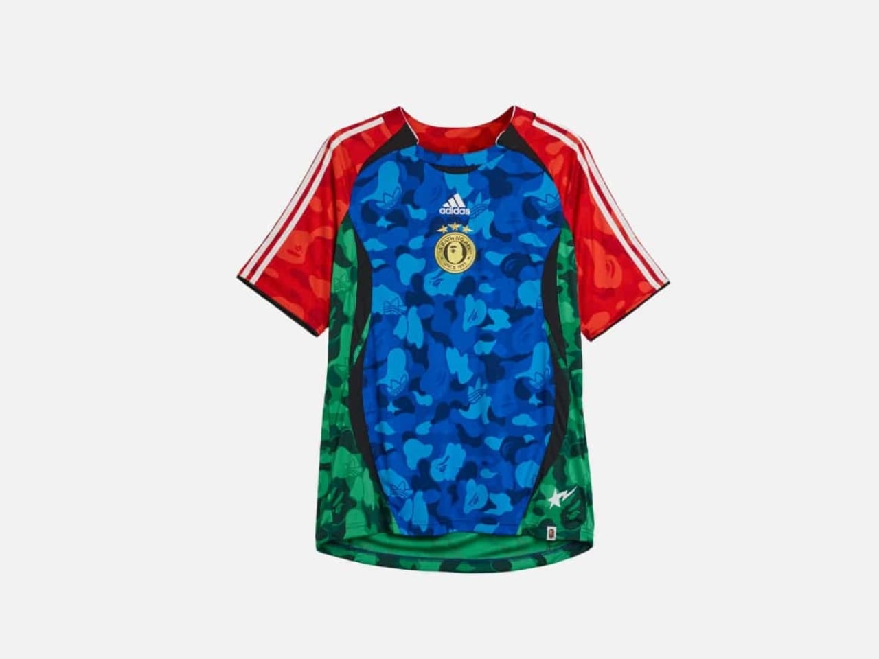
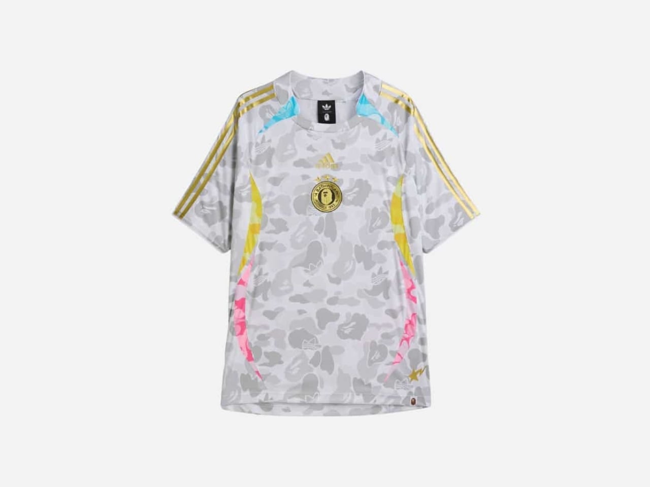
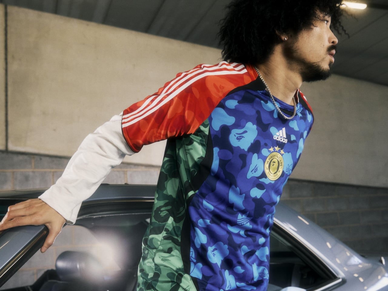
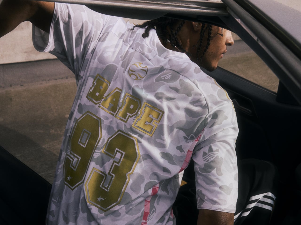
The collection splits into two sets: Home and Away. That familiar football divide becomes the entire creative brief here, and both sides carry it out with real conviction. The Home Set draws from a green, red, and blue Trefoil ABC Camo palette inspired by the World Cup host nations, and looking at the jersey up close, it earns every bit of that boldness. The body runs ABC Camo in blue and green, the raglan sleeves come in red with white adidas Three Stripes, and the whole thing is anchored by a gold BAPE crest badge at the chest. It’s loud in exactly the right way, like something designed to be spotted from three rows back in a stadium. The Away Set takes a gray, gold, and pink Trefoil ABC Camo palette for a more tonal result. The grey camo runs across the entire body, broken up by gold Three Stripes at the shoulders and flashes of yellow and pink at the sides. It’s the quieter of the two, but quieter is relative when BAPE’s involved.
Designers: adidas x BAPE

Both jerseys share the same Teamgeist base, which brings a mid-2000s football silhouette into the picture. The curved panelling and construction feel genuinely archival, not in a nostalgic way, but in the way that certain shapes simply never stopped working. Tucked into the details are BAPE STA™ branding on the chest, the number 93 referencing the year the Japanese brand was founded, and a release-specific code “2W0G2M6” inscribed on the lower back. Those kinds of details matter. They’re the difference between a collab that’s worn and one that’s kept.
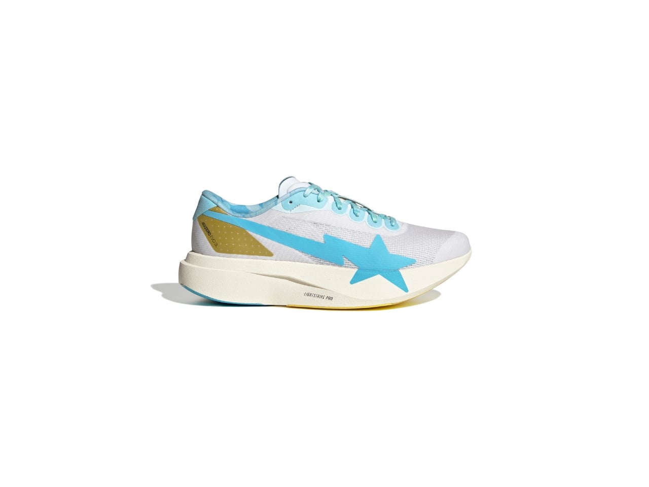
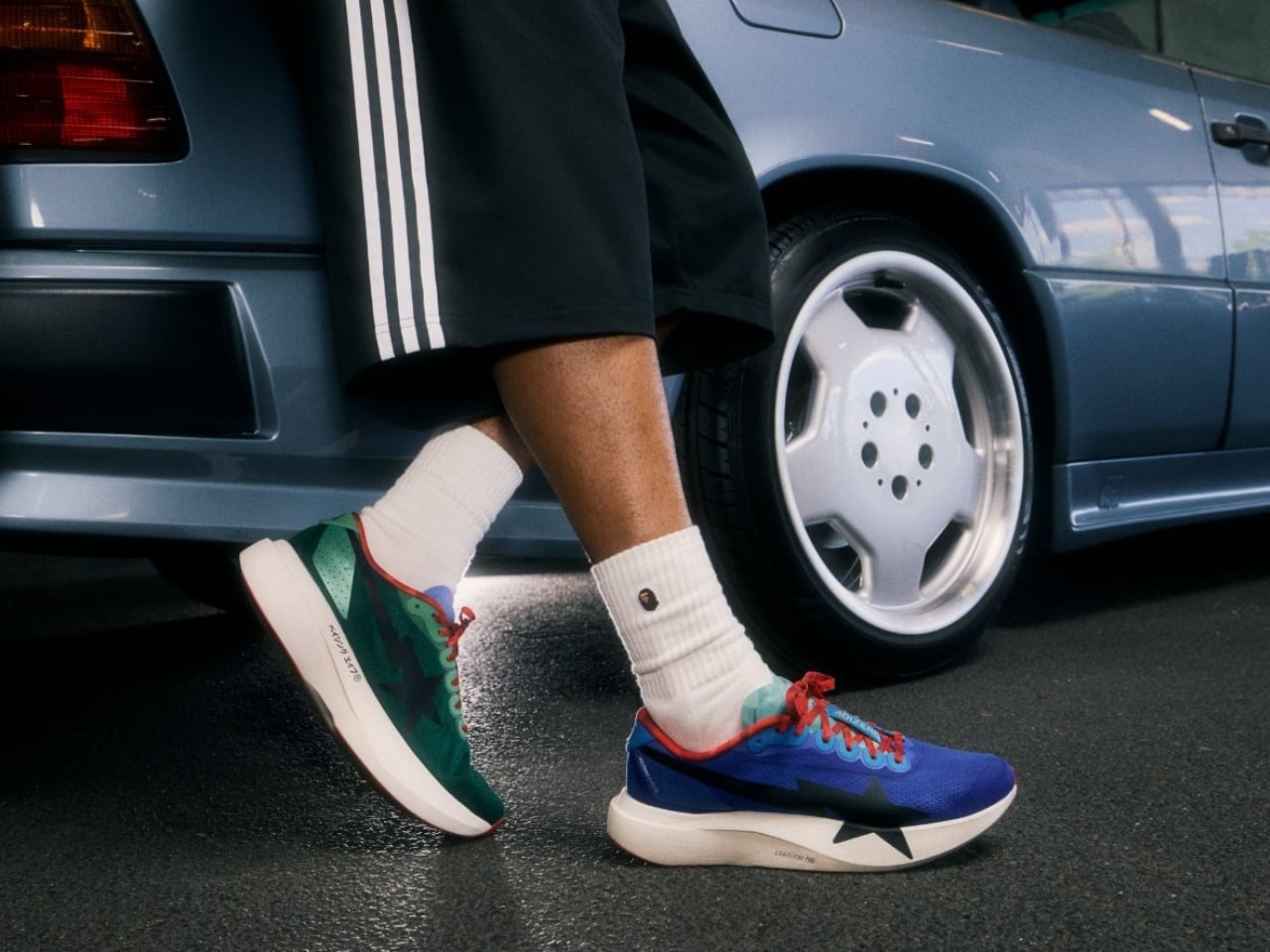
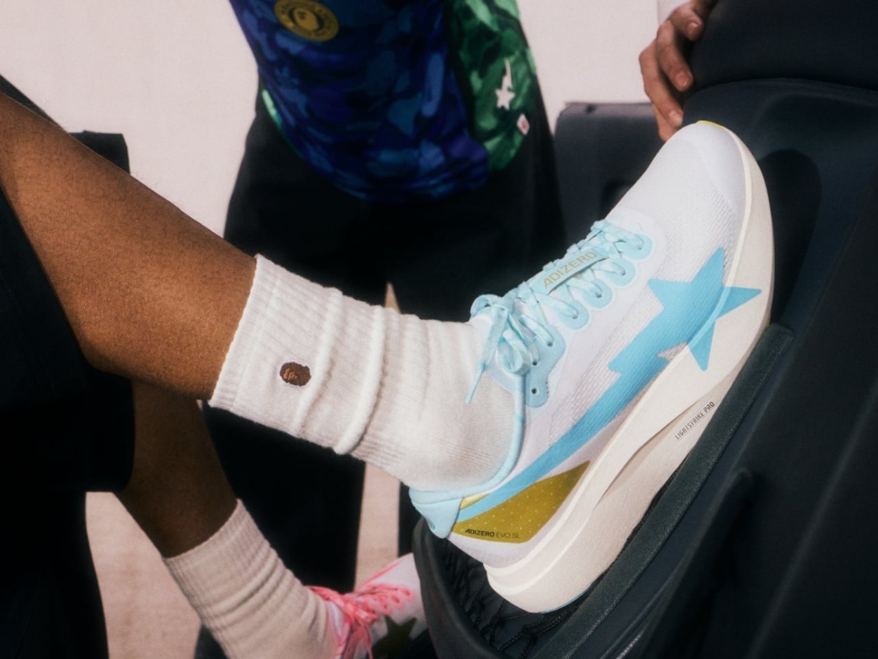
Then there are the shoes, and the shoes might be the real story. The EVO SL follows a deliberate mismatched design formula, with the Home colorway dressing the left shoe in pine green and the right in royal blue. BAPE’s ABC camo appears on the red shoelaces, the tongue, and sockliners, while a white Lightstrike Pro midsole sits below. The Away colorway takes a completely different approach. The right shoe runs in sky blue with BAPE’s Shooting Star on the lateral, the left goes pink with the Three Stripes taking the lead, and ABC camo hits the laces, collar, and liner on both shoes with gold accents running through the branding details. The bilingual touch is one of my favorite things about the Away pair specifically: “A Bathing Ape” appears across alternate feet in English and Japanese, which feels like a genuinely considered design decision rather than a detail added at the end.
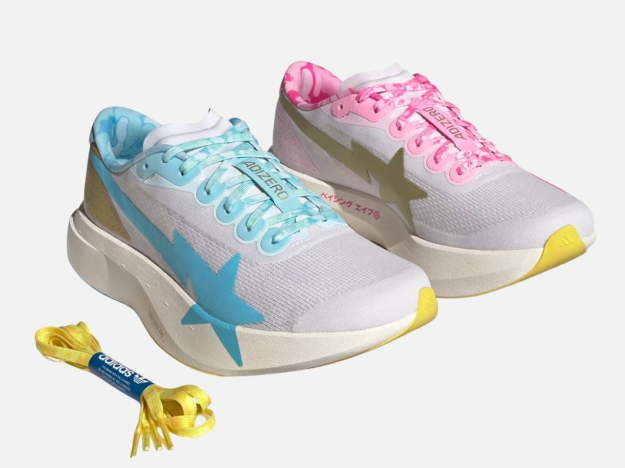
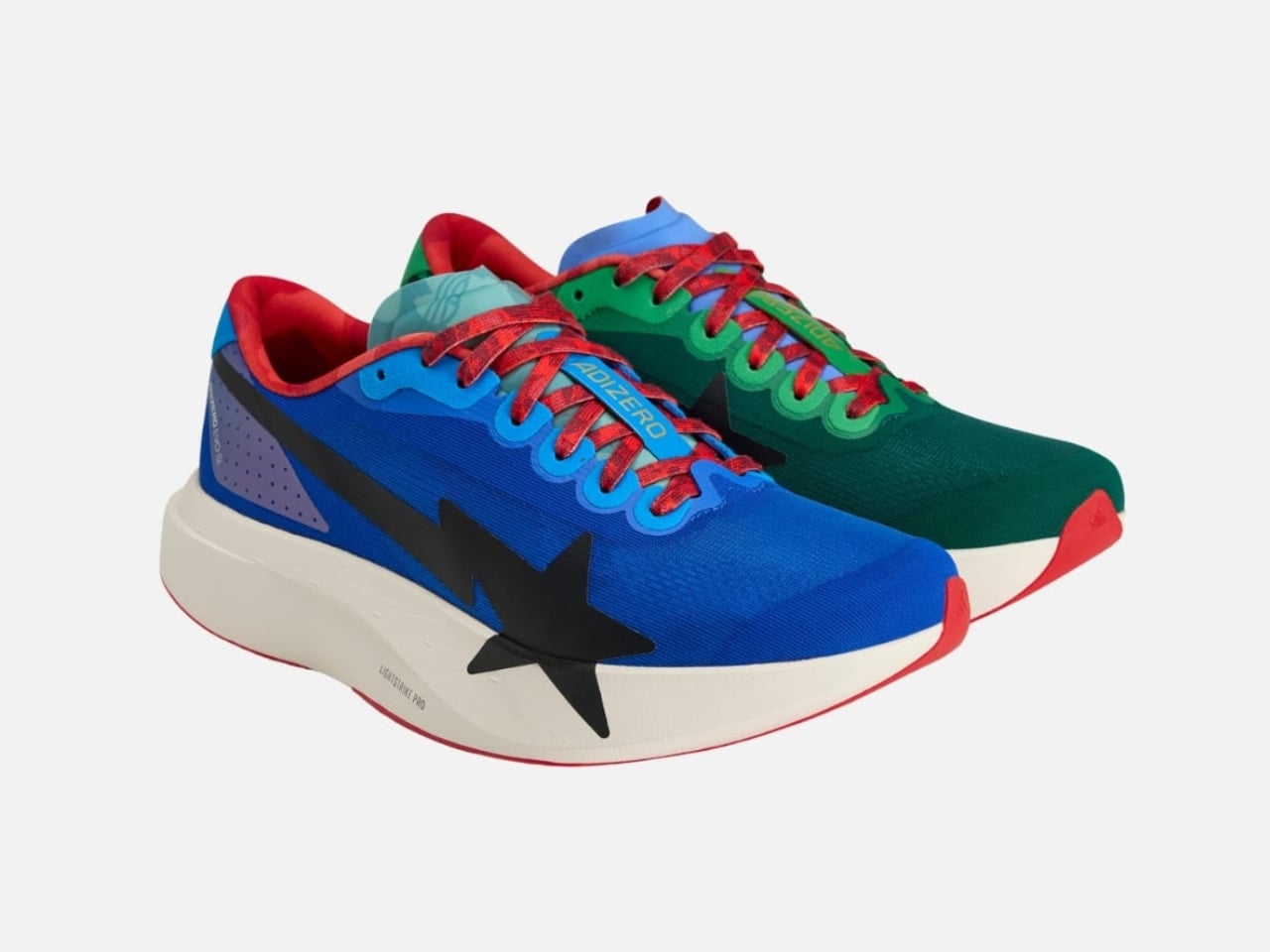
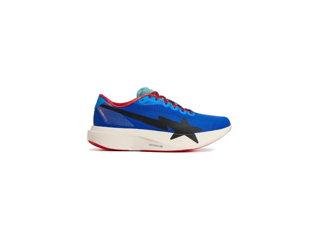
The mismatched format is worth sitting with for a moment. Sneaker collaborations usually play it safe by keeping both shoes identical. Choosing to make each foot its own thing is a creative risk, and it pays off because it mirrors the home-away split of the collection itself. You’re not just wearing two colors, you’re wearing a concept.
The Home set is only available in North America and Latin America, while the Away set is available worldwide, excluding those regions. That regional exclusivity adds another layer to the storytelling, making geography part of the design language.
BAPE® and adidas have been at this since 2003, which means they’ve had more than twenty years to develop a shared creative vocabulary. You can feel that here. Neither brand is overexplaining itself or trying to dominate the other. The ABC Camo sits comfortably inside the Teamgeist template. The BAPE STA lives naturally on the EVO SL’s lateral. Two very distinct design languages, sharing space without either one losing its voice. At $200, the shoes aren’t a casual purchase, but as a design object tied to a specific cultural moment, they make a strong case for themselves.