
If you’ve ever tossed a plastic bottle cap into the recycling bin and wondered where it actually ends up, the Bit Stool might be the most satisfying answer the design world has offered in a while. Created by Neetica Pande for Normann Copenhagen, it’s a piece of furniture that reframes the entire conversation around sustainable design. Not because it comes with a manifesto, but because it’s genuinely, undeniably beautiful.
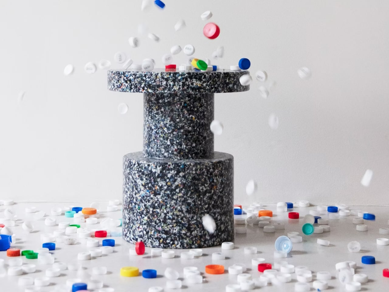
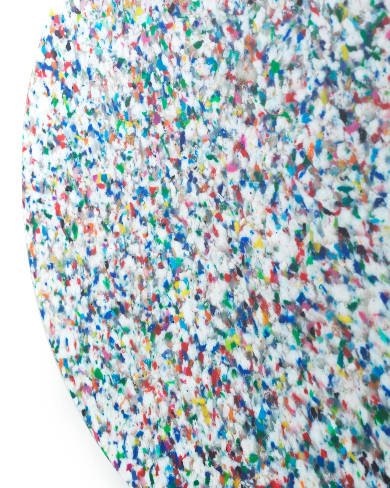
The design brief was built around a deceptively simple tension: familiar forms, surprising materials. Pande took 100% recycled household and industrial LDPE, the kind of low-density polyethylene that shows up in your everyday plastic packaging and bottle caps, and compressed it into dense, speckled cylinders and discs. The result looks, at first glance, like granite or terrazzo. The texture is almost painterly. Get close enough and you see the whole story: a surface made up of color fragments, each one a former piece of something that would otherwise have been thrown away.
Designer: Neetica Pande
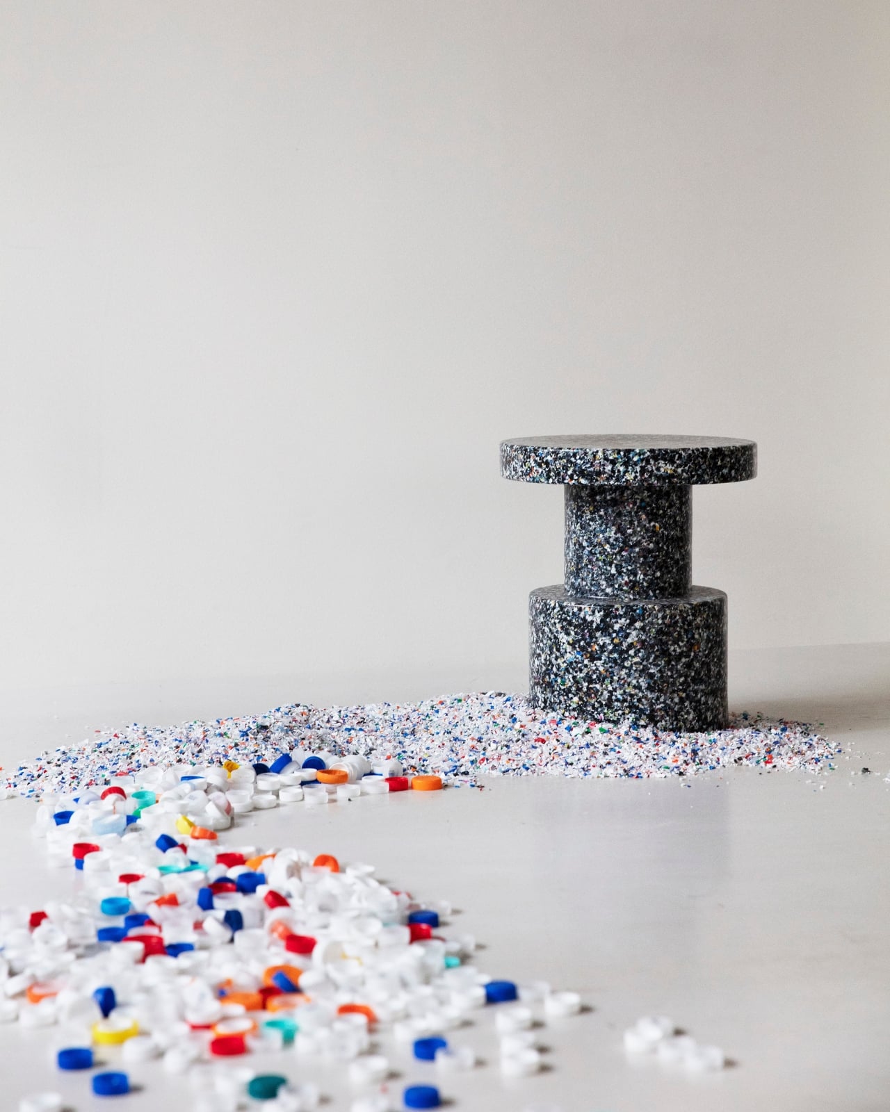

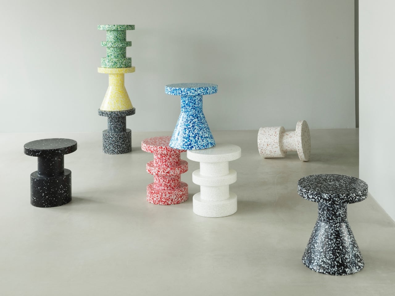
What the Bit range gets right, architecturally speaking, is restraint. The three variants, the Bit Stool, Bit Stool Stack, and Bit Stool Cone, all work with stacked geometric volumes: cylinders, discs, cones widening toward the base. The silhouettes feel ancient, like something lifted from a Roman column or a mid-century Scandinavian furniture catalogue. That familiarity is intentional. Pande, working under the mentorship of Simon Legald and Saskia Huebner alongside collaborator Marie Bal-Fontaine, leaned into shapes the eye already trusts, then let the material do the unexpected.

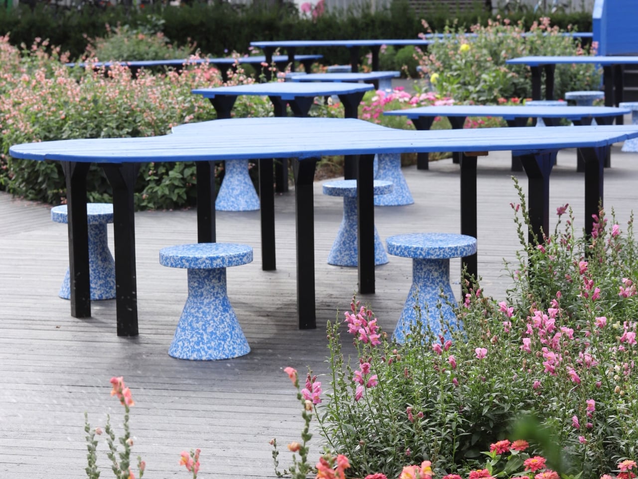
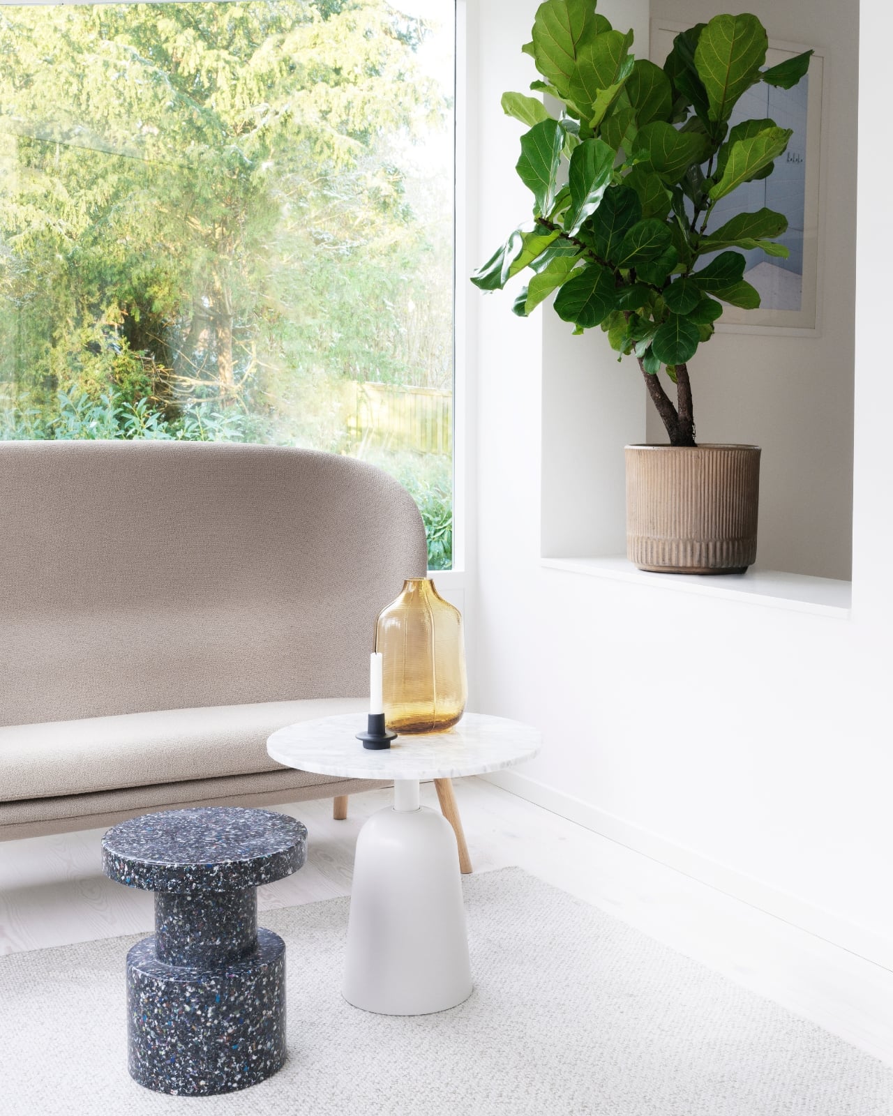
And that material does a lot of heavy lifting, literally. The Bit Stool handles temperatures from -10°C to +50°C, making it equally at home on a sun-drenched outdoor terrace and inside a living room. It’s also genuinely multifunctional in a way that doesn’t feel forced. Use it as a seat. Park a vase on top. Slide it next to the sofa as a side table, or push it over when an unexpected dinner guest shows up. That kind of quiet adaptability is something I appreciate more and more in furniture right now, especially as living spaces keep shrinking and every object in the room has to justify its footprint.
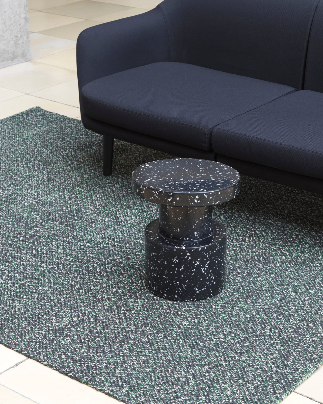
The color palette is where the collection really hits its stride. The range comes in black, white, red, yellow, blue, green, and a confetti-speckled multicolor that leans directly into the recycled identity instead of downplaying it. These aren’t muted, apologetic tones. They’re bold and deliberate, treating sustainability as something to celebrate rather than something to compensate for. That shift in framing matters more than it might seem. Sustainable design has spent a long time wrapped in neutral linens and earthy tones, as though beauty were somehow incompatible with responsibility. The Bit Stool proves otherwise.
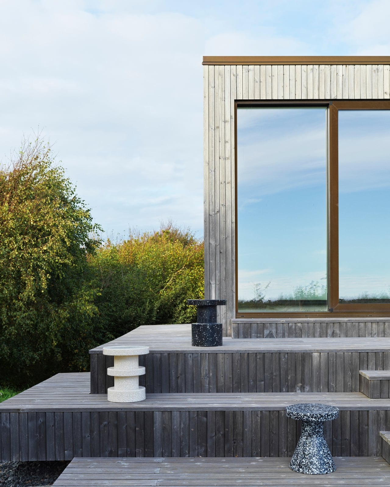
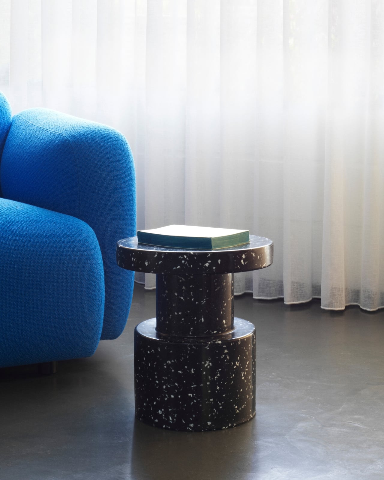
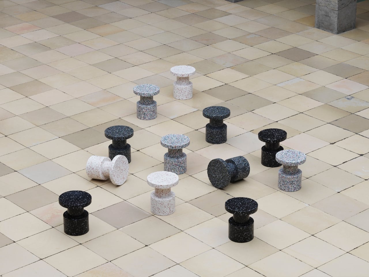
The campaign photography makes a compelling argument too. Seeing the stools scattered across tiled floors like oversized chess pieces, or sitting quietly on a wooden outdoor deck with open countryside behind them, or propping up flower arrangements in a well-lit interior, you get a clear sense that these are objects designed to be looked at just as much as used. The sculptural confidence the collection carries earns its place in any room.
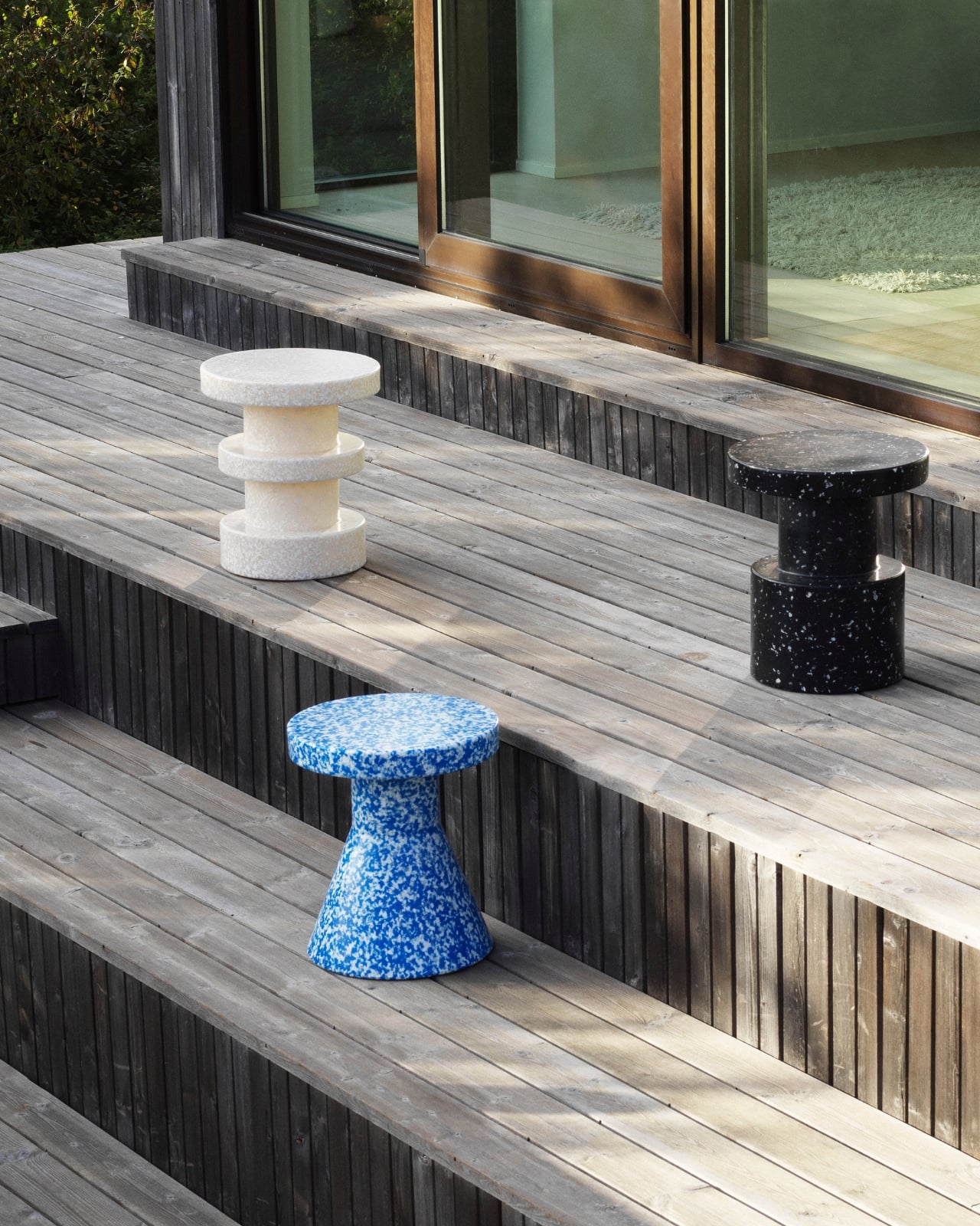
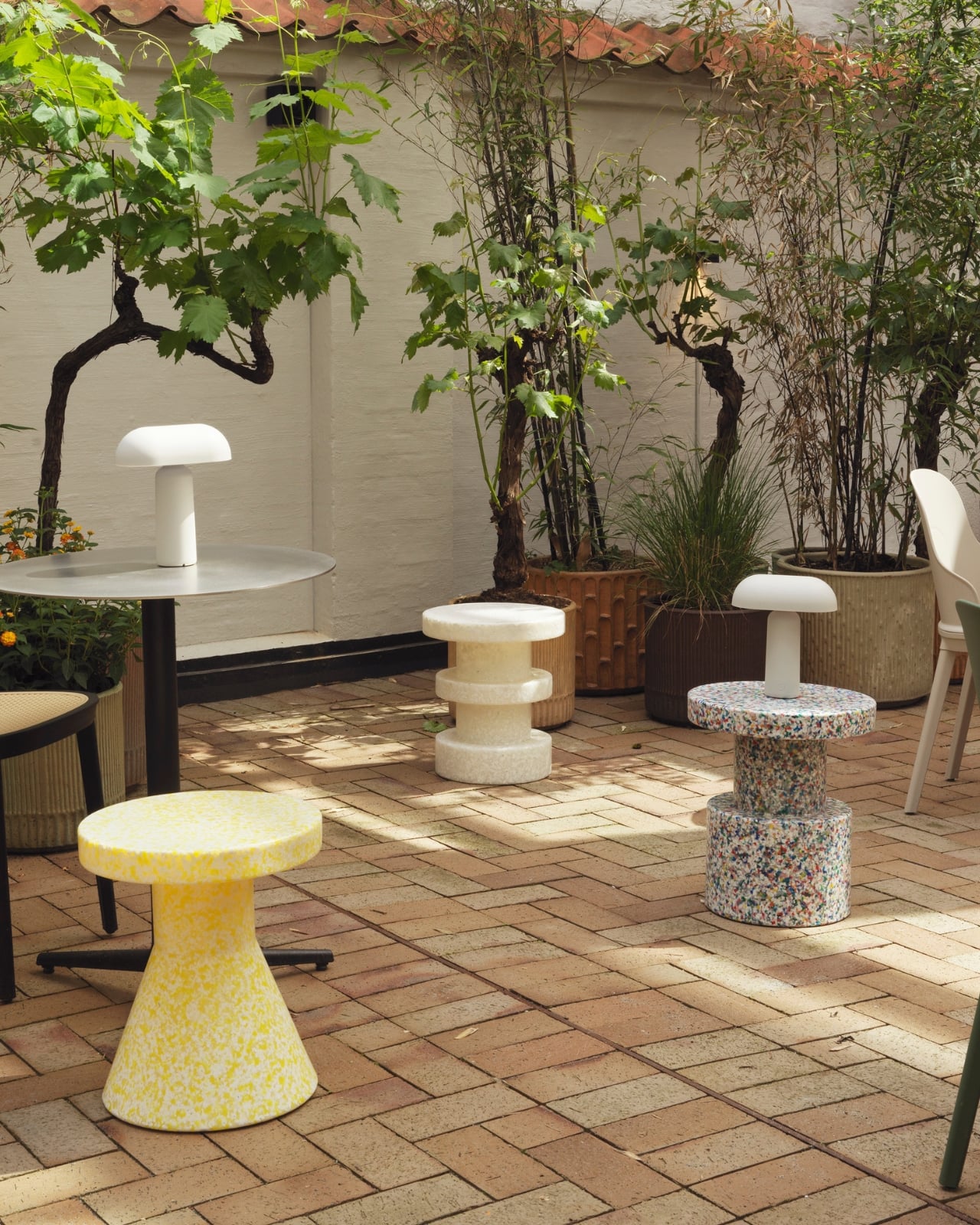
Pande never tried to hide what the Bit Stool is made of, and that honesty is the crux of why it works. The speckled surface isn’t a flaw to be corrected or a quirk to be tolerated. It’s the entire aesthetic argument. Every fragment of compressed plastic embedded in those cylinders is evidence of the process, proof that something discarded became something worth keeping. Making recycled material feel genuinely desirable, without dressing it up as something it isn’t, is a much harder design challenge than it appears. This collection handles it quietly and confidently.
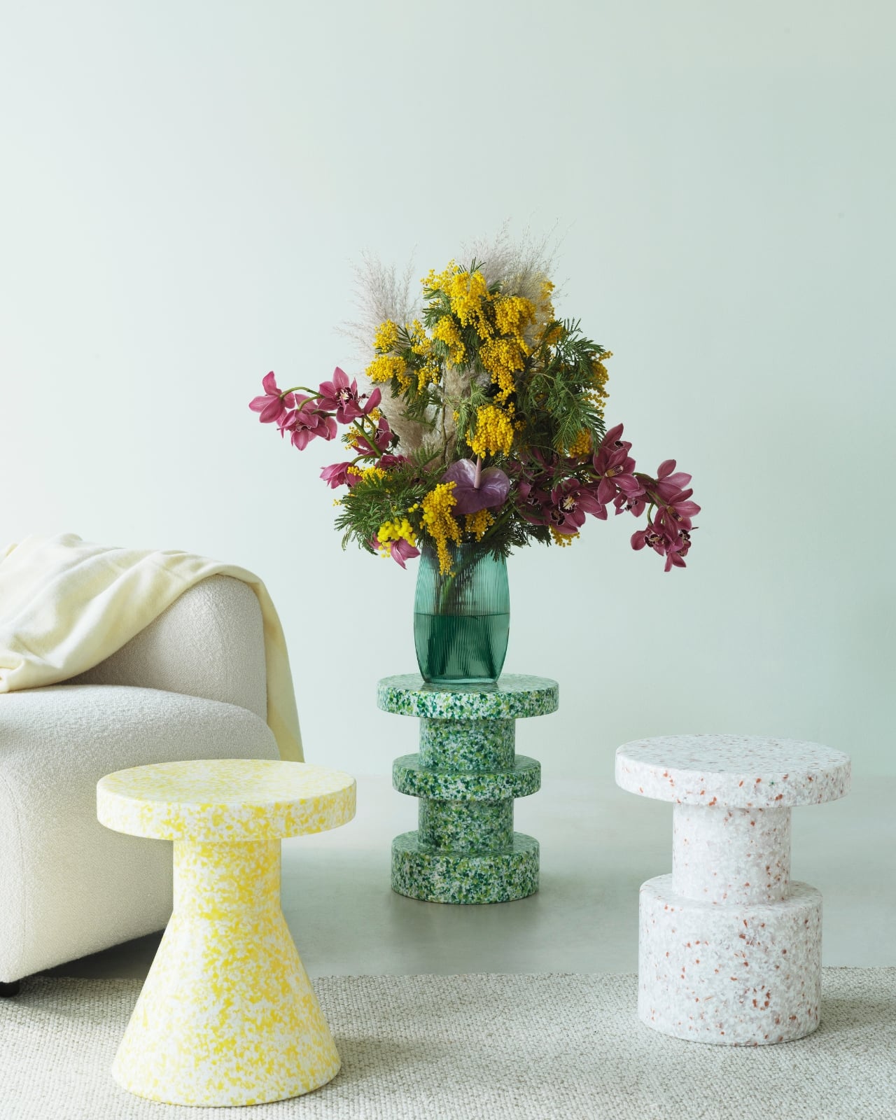
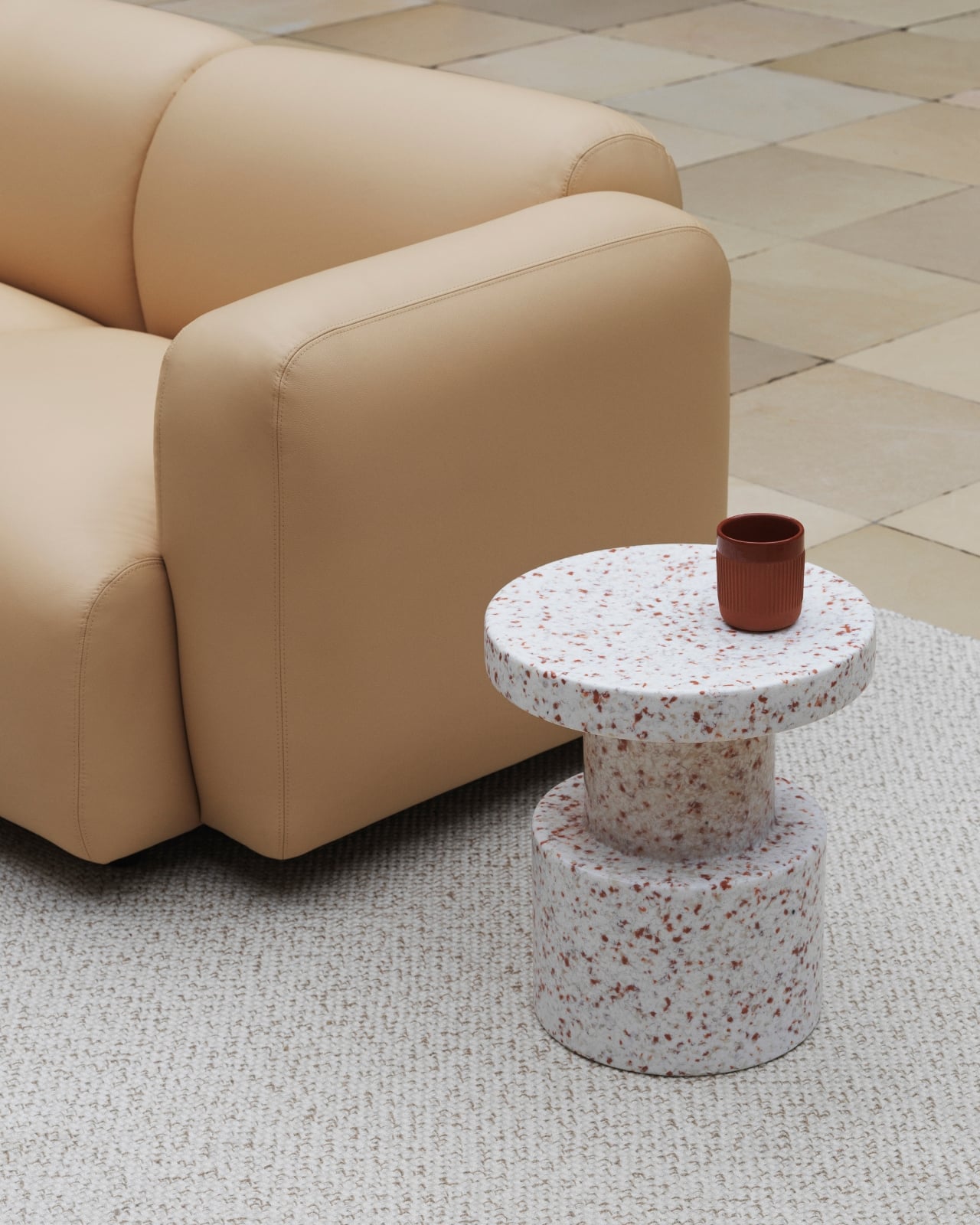
Normann Copenhagen has long had a reputation for functional objects that also happen to be beautifully considered. The Bit Stool sits well within that lineage, while also feeling like something new. The conversation around sustainable design doesn’t have to be earnest or beige. Sometimes it gets to be speckled, sculptural, and exactly what your terrace was missing.