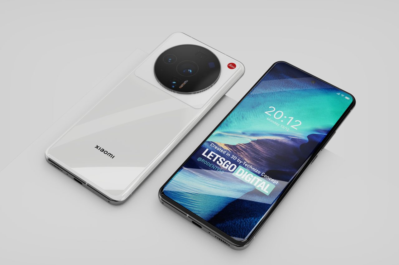
Phone designs have become increasingly common these days, so it’s not surprising to see some try to set themselves apart, one way or another. Some are met with much success, like the OPPO Find X5 Pro’s futuristic minimalism and the Realme GT2 Pro’s fashionable Paper Tech design. Others seem to still be trying to come to terms with their design language, while still others are apparently stumbling in their efforts to stand out from the crowd. Xiaomi’s next flagship will attempt to flaunt Leica’s massive brand to appeal to mobile shutterbugs, but it might be doing the camera maker a slight disservice considering how controversial the Xiaomi 12 Ultra’s camera design is so far turning out to be.
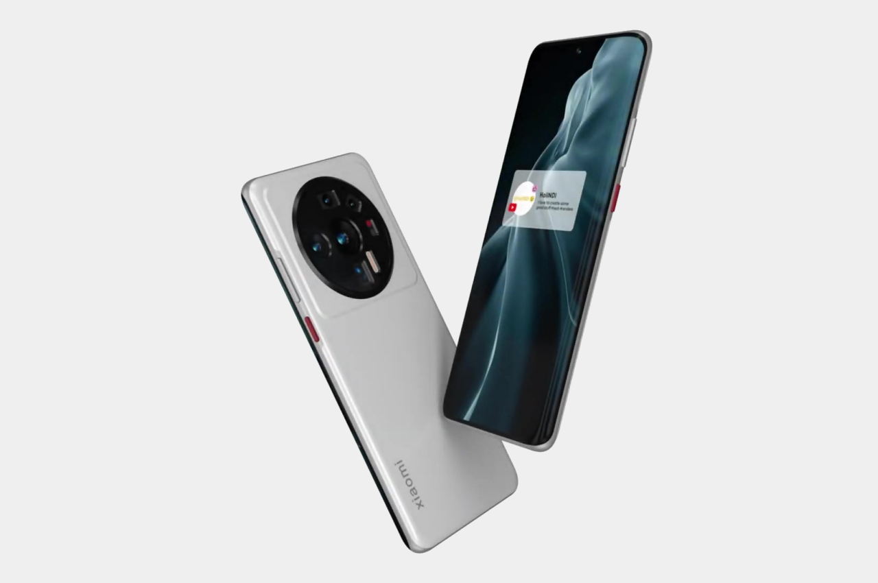
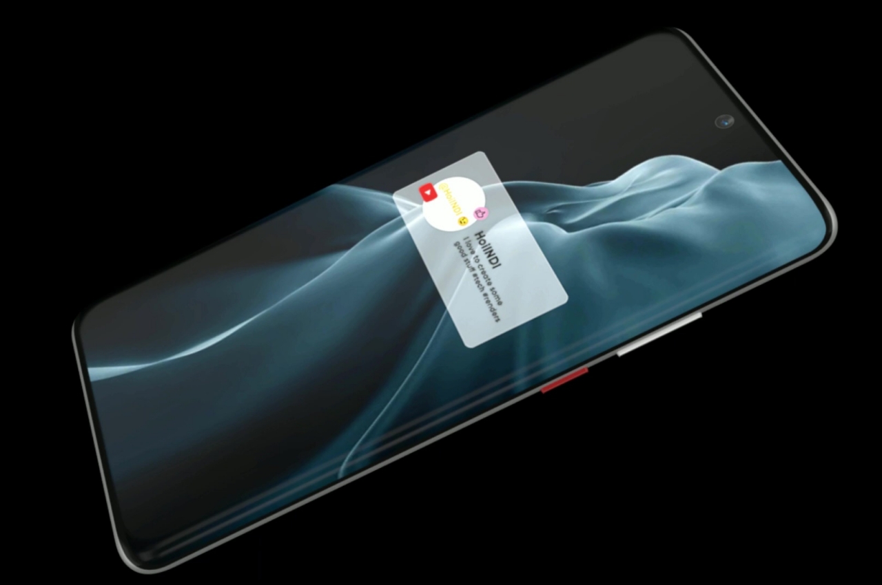
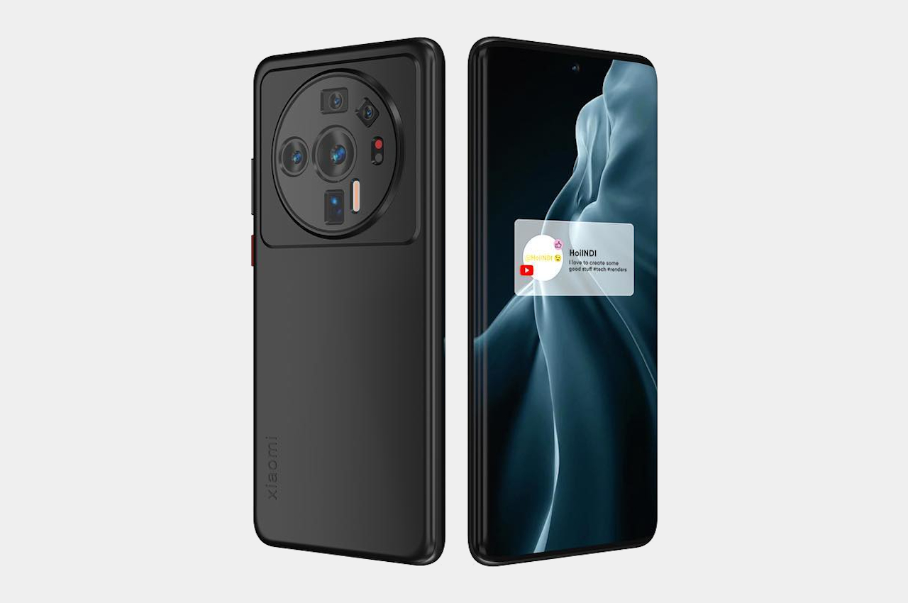
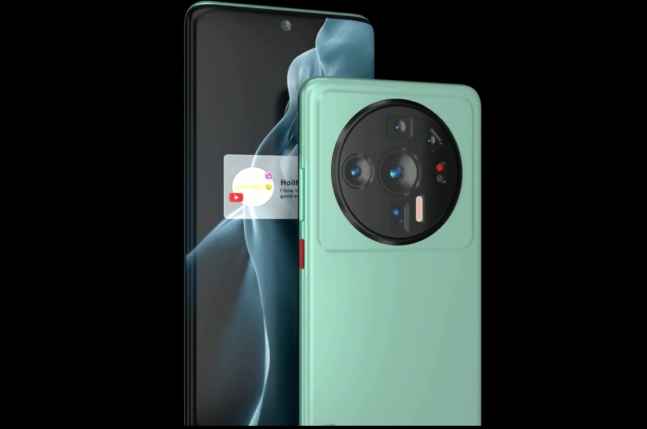
Designer: HoiINDI

Smartphone designs have mostly gravitated towards emphasizing the most important part of a smartphone next to its display. Trends come and go, but the importance of cameras in our smartphone-centric culture has never wavered. But as those camera sensors become more powerful and bigger, the space they occupy has also become larger, forcing designers to think of ways to balance looks and function. In the Xiaomi 12 Ultra’s case, it seems that only one side won, at least based on renders made from leaked information.
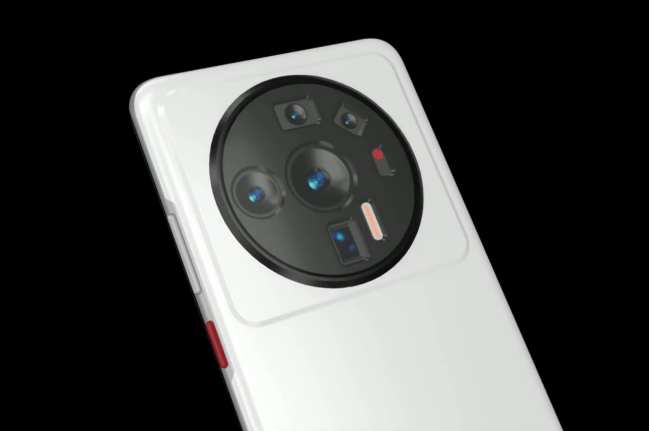
This isn’t the first phone that uses a circular enclosure to house the camera in a group, with the Huawei Mate 30 coming out with that design back in 2019. It might, however, be the biggest by a wide margin, occupying nearly a third of the phone’s height and leaving little room on its sides. If Xiaomi intended to call attention to the Xiaomi 12 Ultra’s cameras, this definitely does it, but not in a flattering way. Despite marketing materials, Leica’s iconic circle logo might not even be immediately visible, which is probably the best for the brand.
The Xiaomi 12 Ultra is in the running for the most divisive camera design this year, going head-to-head with the Honor Magic4 Ultimate from March. Xiaomi’s camera bump doesn’t feel like it’s about to jump out at you, sitting on the phone’s back in a static manner. In contrast, Honor’s design has the entire phone’s rear elevated from four directions to meet the height of the larger circular camera bump, potentially creating some unevenness that would affect the phone’s stability on a flat surface or even in your hand.
Designer: Parvez Khan (Technizo Concept) for LetsGoDigital
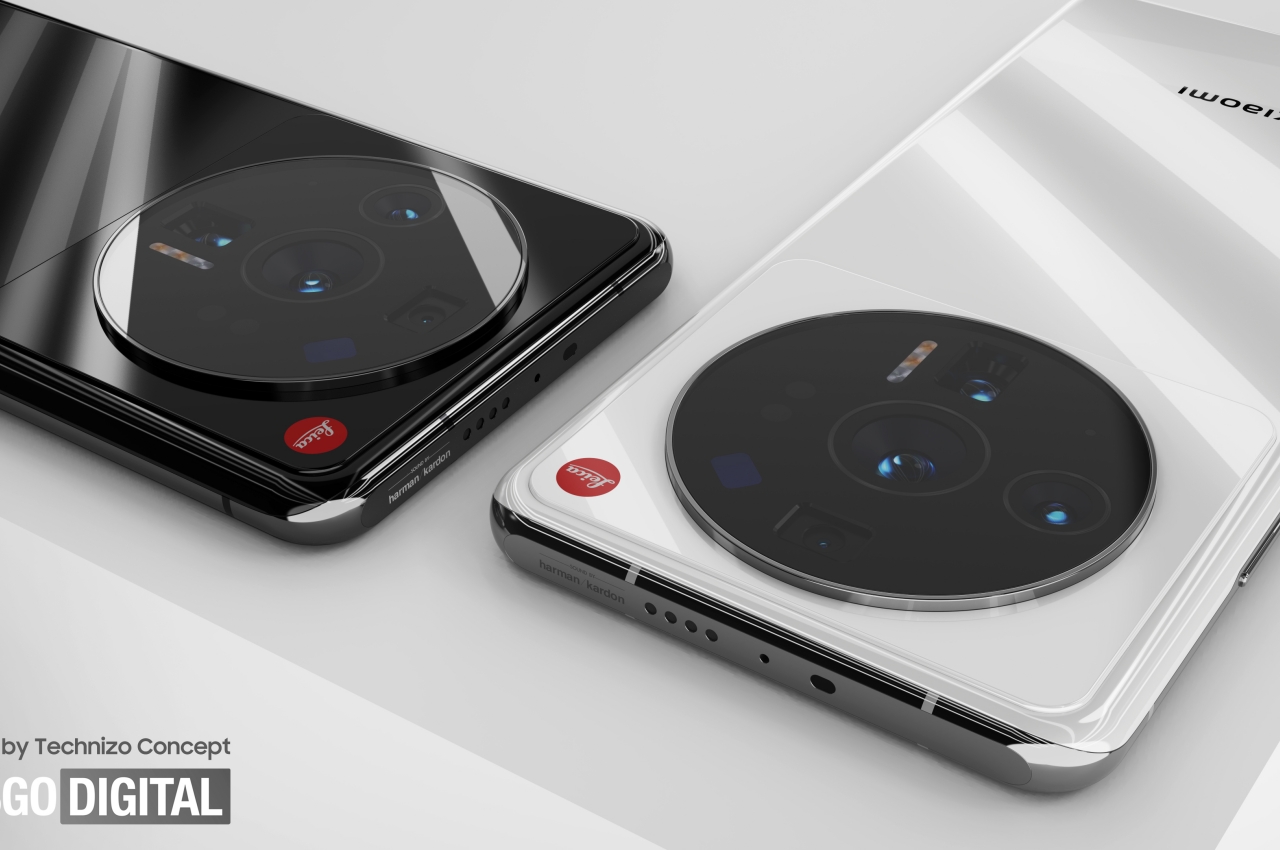
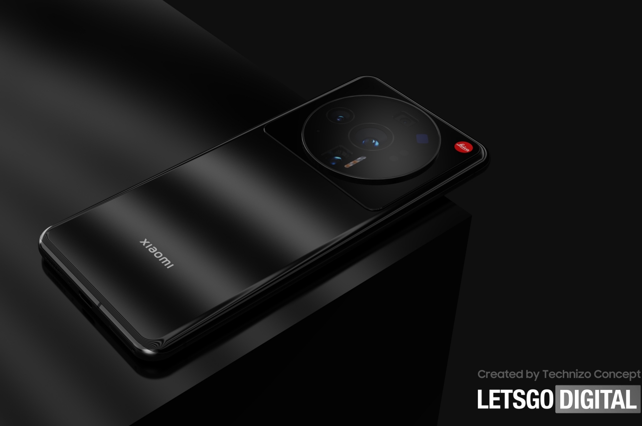
That said, Honor arranged its camera lenses in such a way that they look a bit more symmetrical and balanced. Most likely due to technical considerations, Xiaomi’s lenses are all over the place, creating an almost disorganized appearance. It could even trigger certain psychological conditions in people because of the clearly visible and uneven holes. It’s definitely going to be a head-turner, but not everything that calls attention does so in a good way.
Admittedly, smartphone design is a delicate balancing act between opposing forces and directions. At the same time, it’s a problem created by manufacturers themselves. As they cram more and larger hardware inside phones, they will be forced to figure out a smart design for them. More doesn’t always mean better, especially from a design perspective, and the Xiaomi 12 Ultra proves it.