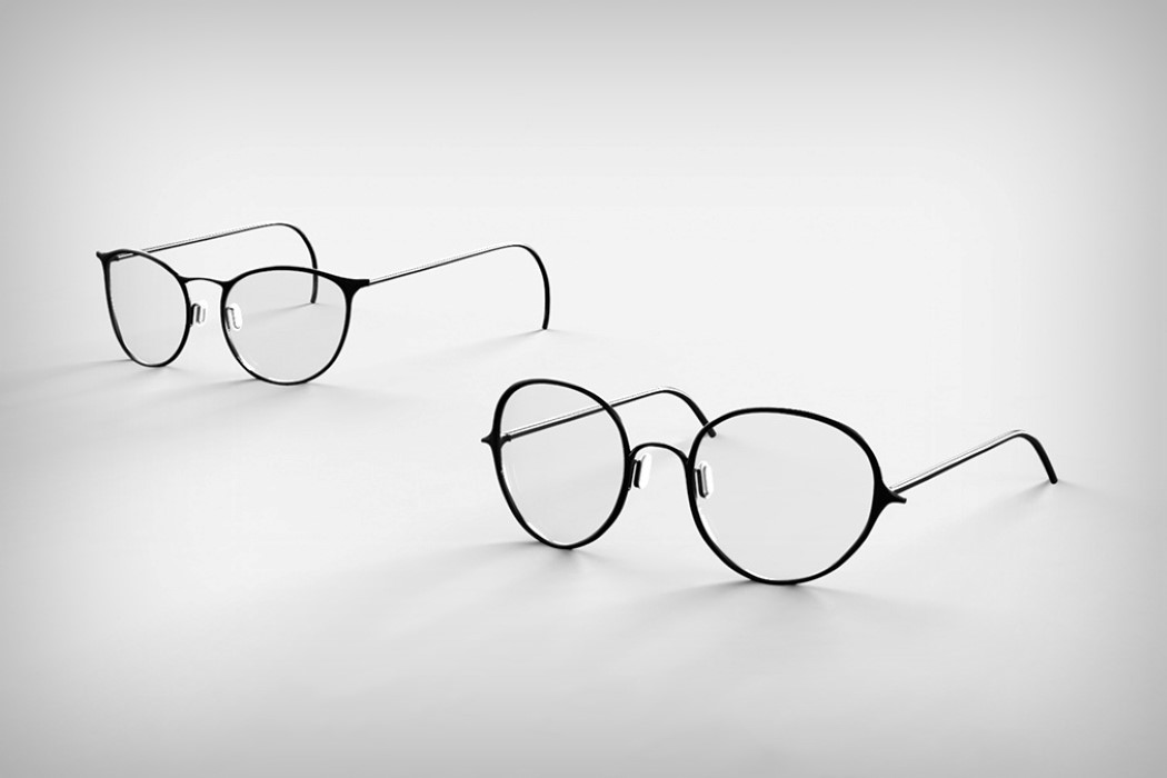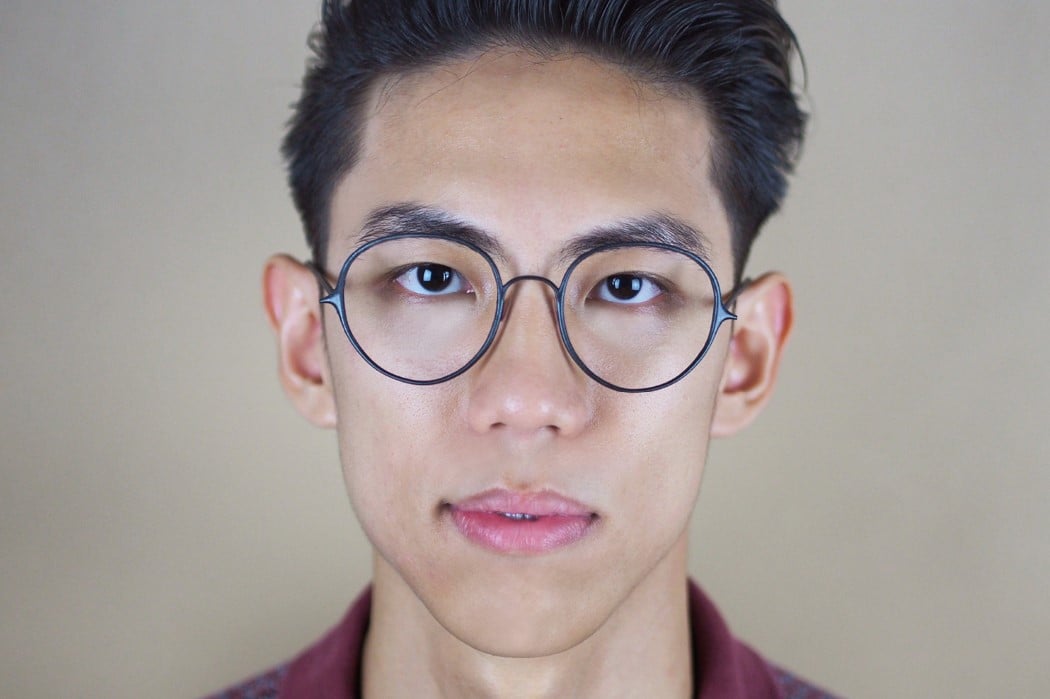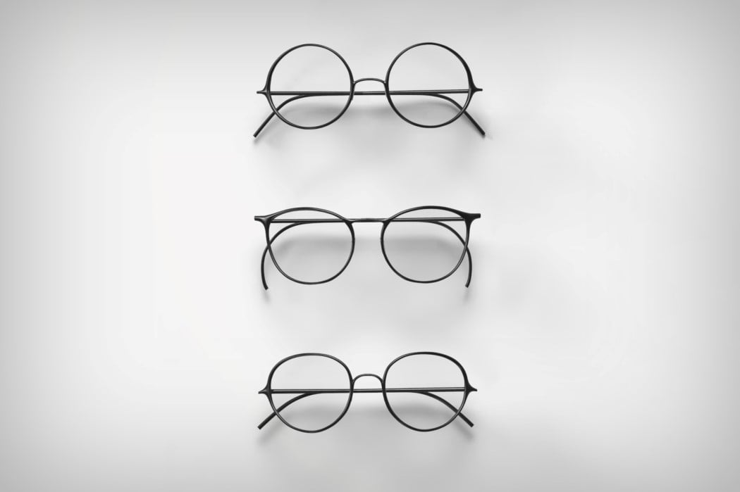
Maggie’s clever attention to detail results in one of the most unusually beautiful design crossovers in recent times. Typography and spectacle design have quite a bit in common. Small details make up a design and any changes to these small details usually results in a dramatic change to the overall design itself. Sometimes you can’t pin-point what’s exactly different, but you know there’s a difference.
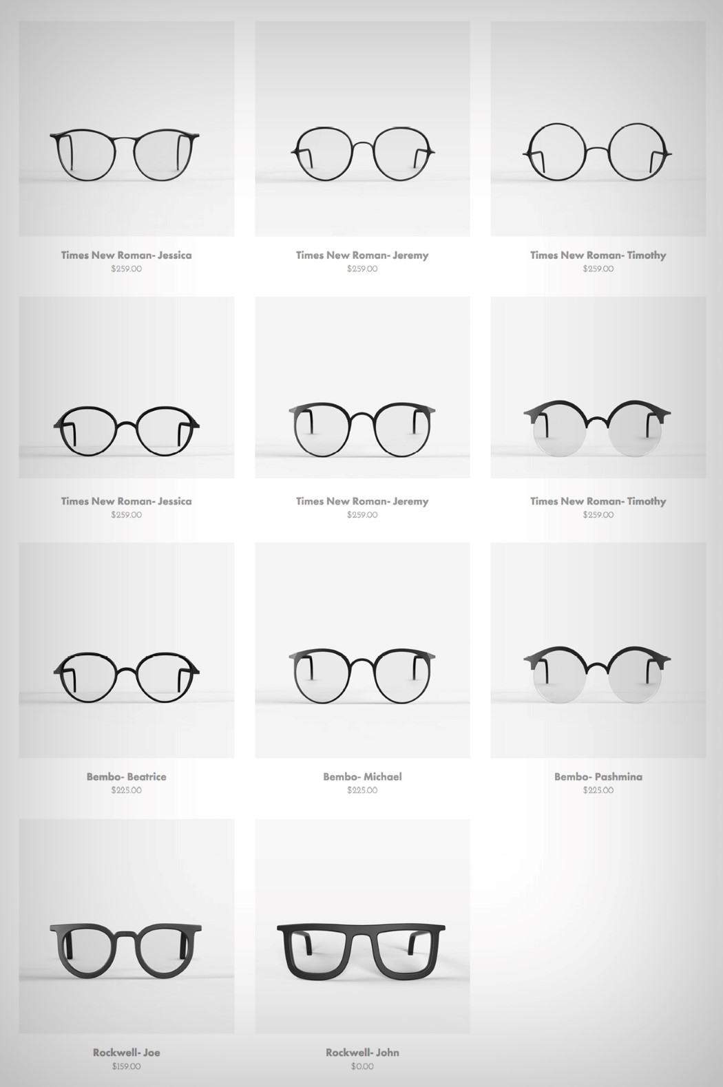
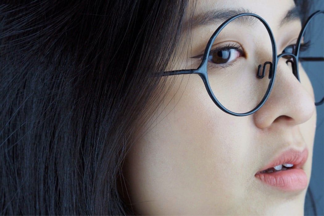
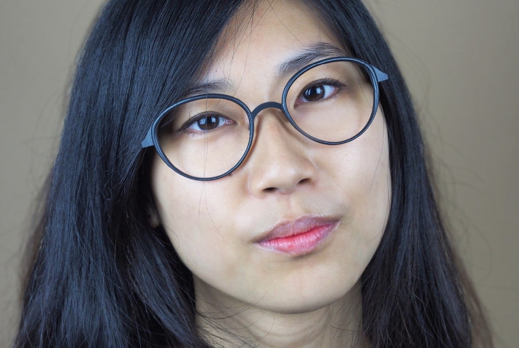
Taking inspiration from serifs in typefaces, Maggie developed a new range of eyewear that’s as attentive to delicate detail as its typefaces. Picking up inspiration from fonts like Times New Roman, Bembo, and Rockwell, it’s easy to see how the spectacles look very much like their respective font families. Serif Eyewear should be the newest hot trend in eyepieces. It’s a celebration of typography like no other, and I really can’t stop admiring these spectacles! Maggie, if you’re reading this, I want one!
Designer: Maggie Seah