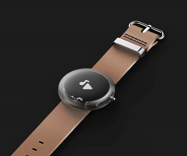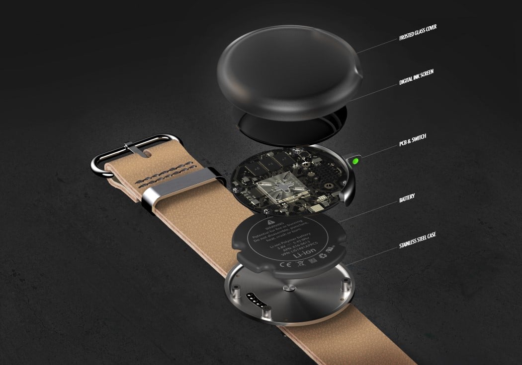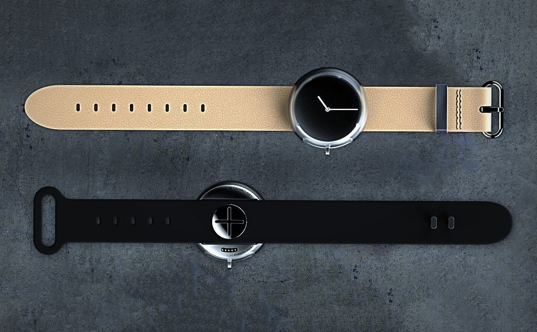
The Pebble 2017 concept watch is a champion of our very own #TactileOverTouch movement. It ditches the fiddly tiny touchscreen for a UI with one single control, a sliding switch that allows you to navigate through the entire interface.
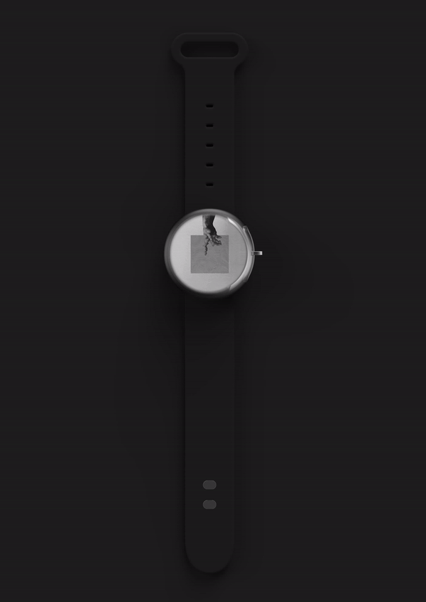
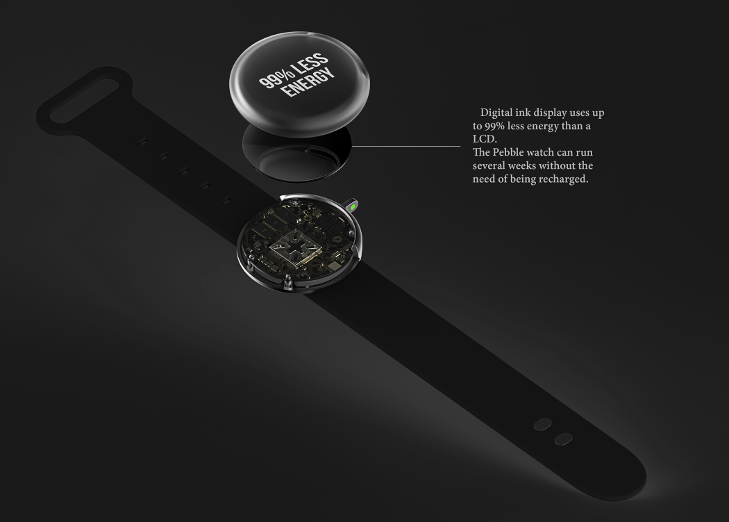
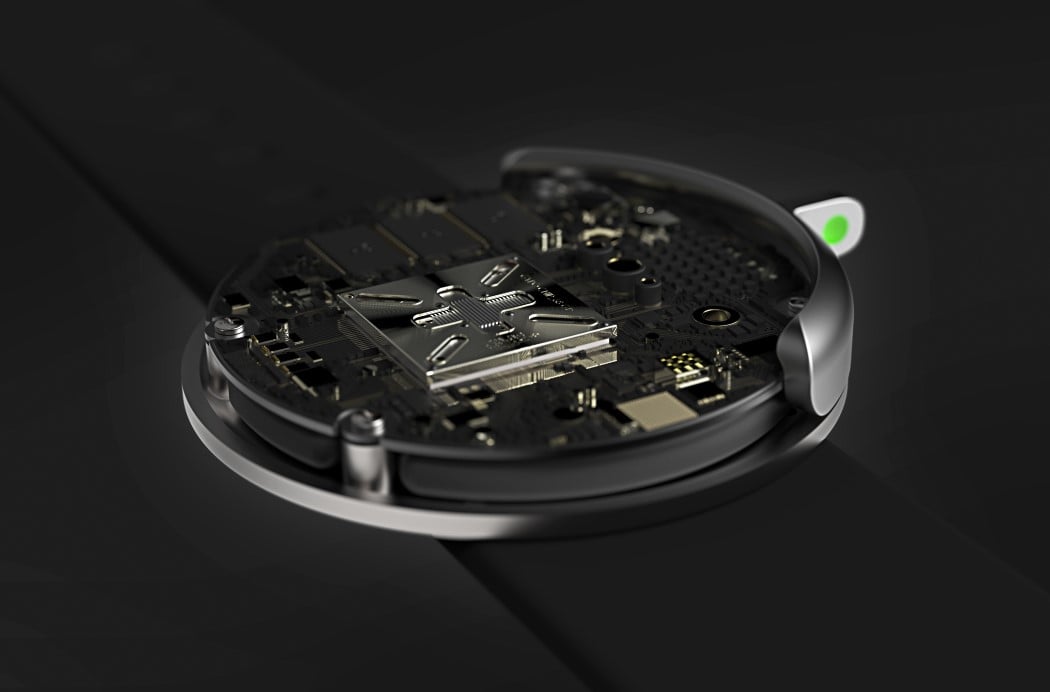
The Pebble 2017 watch is designed to be as self-sustainable as possible. Unlike other smartwatches that need charging every other day, the Pebble 2017 edition sports an e-ink screen, known to consume 99% lesser energy than an LED Display. The entire UI of the watch is designed in brilliant contrast, and shows wonderfully on the black/white display. The display sits beautifully under a mildly frosted transparent casing that blurs out the electronics, but showcases the screen vividly. Beside the dial, where one would normally find the crown of the watch, sits the only switch you’ll ever need. It slides upwards and downwards while also clicking, giving you full control of the redesigned interface that still achieves everything your regular smartwatch does… from playing music, to answering calls, to being your ultimate fitness wearable.
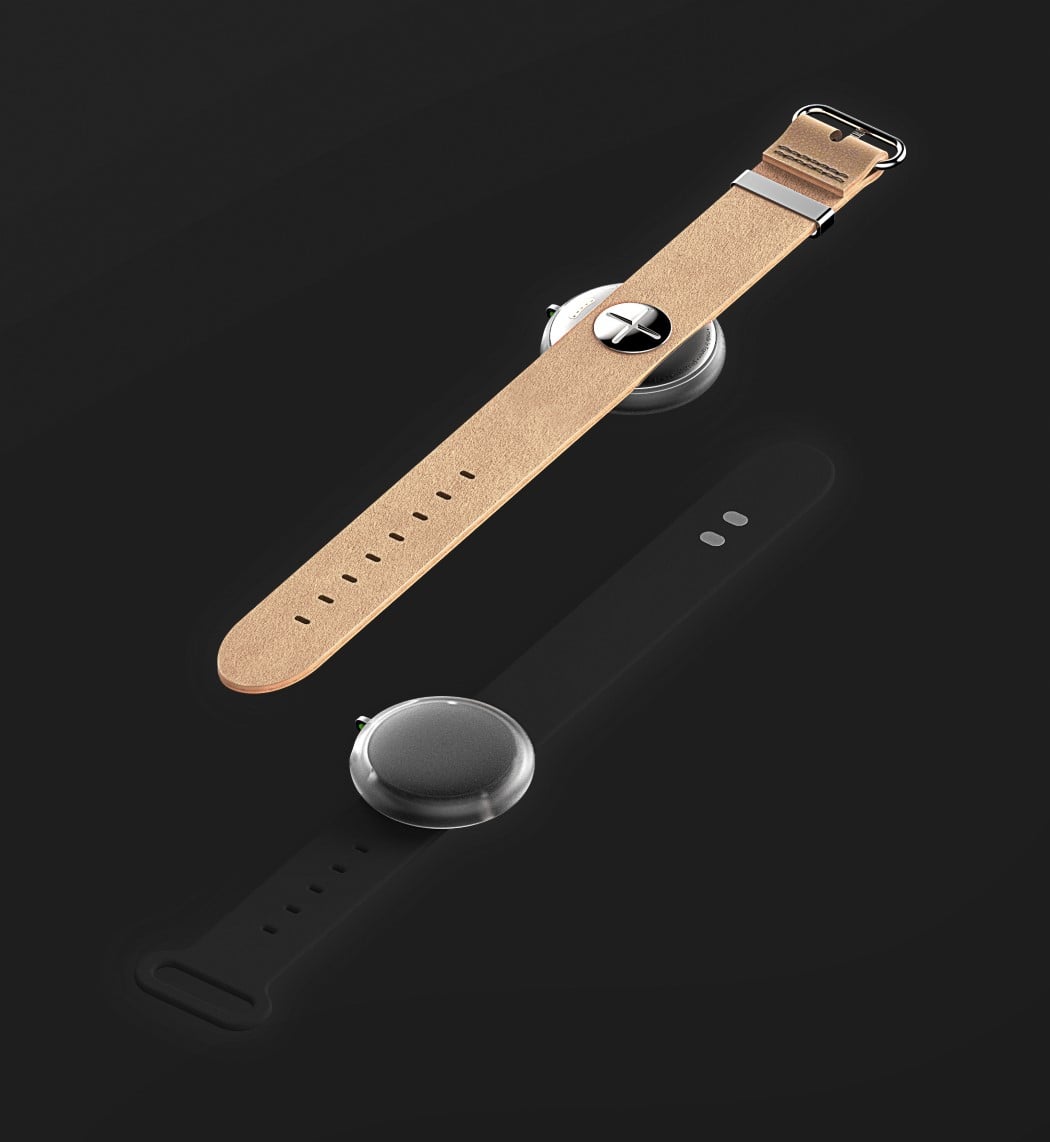
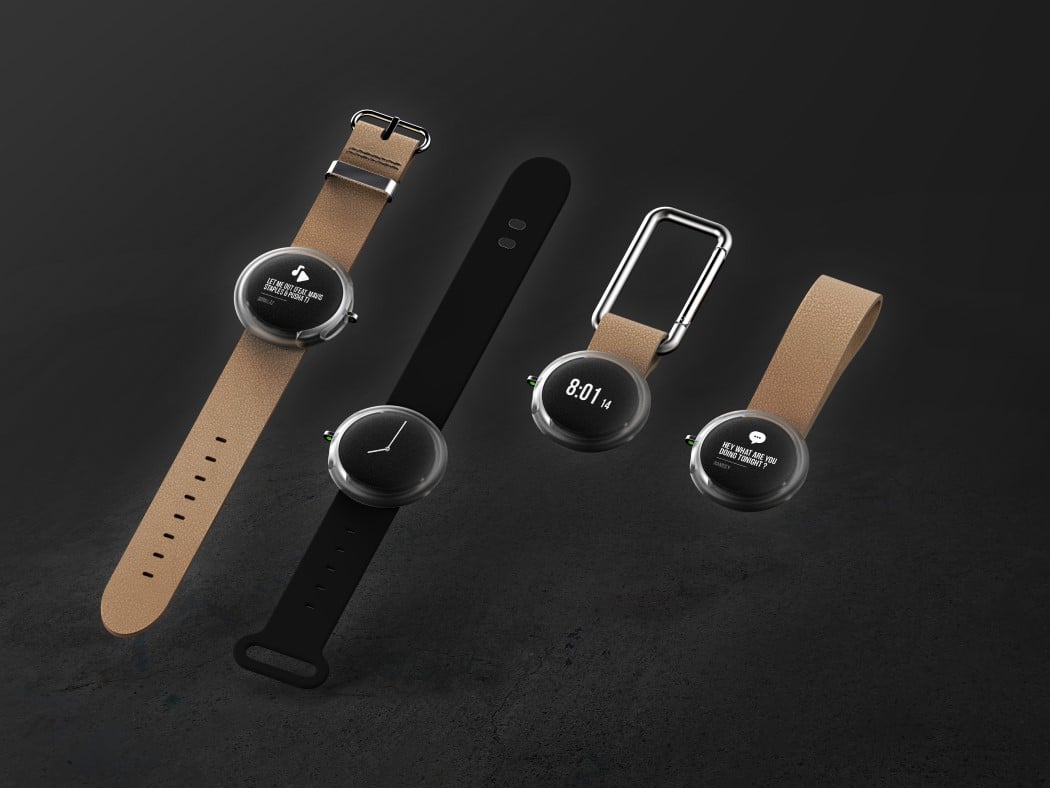
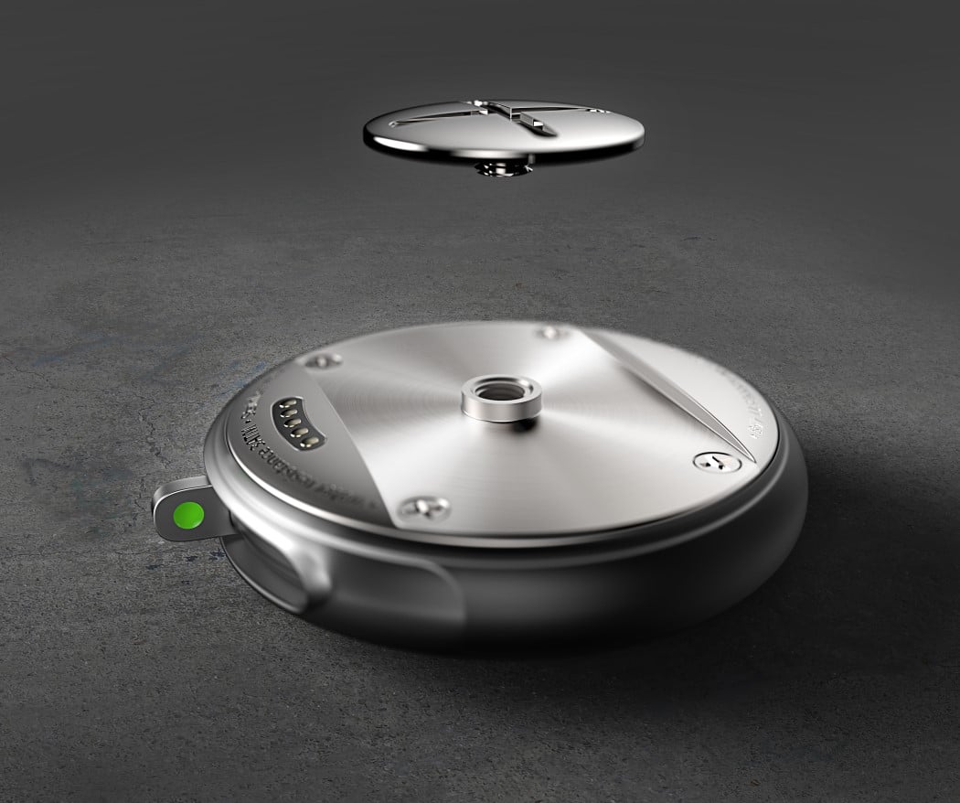
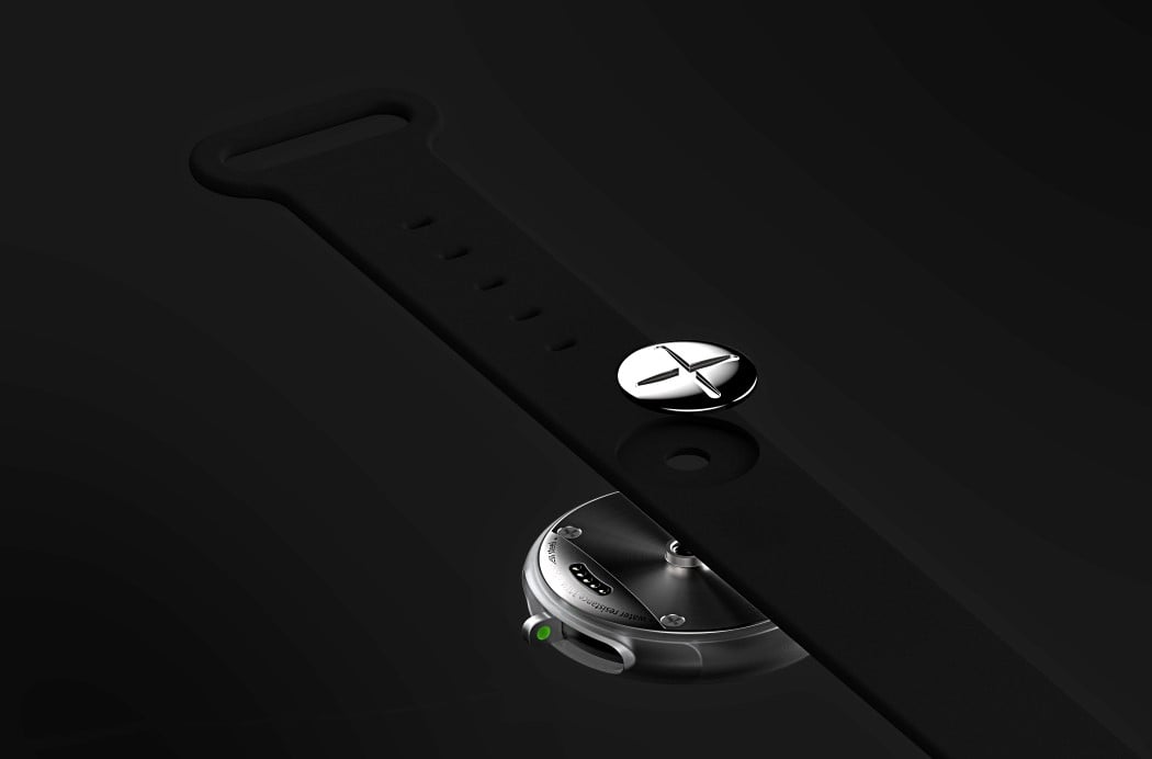
If simplicity is what drove the design of the Pebble’s user experience, it carried forward to the design too. The straps sit beautifully beneath the watch, being screwed into place using just one simple flat screw. The straps can even be simply switched for a pocket-watch style loop or a loop with a carabiner clip. Now would be a good time for Pebble to re-launch itself in the market, don’t you think??
Designer: Antoine Giard