Aside from the Soundsticks and their transparent glory, Harman Kardon’s design language is rather established, and easy to point out. Once you get that, superimposing their design values on any product can make it “belong” to Harman Kardon, or any brand for that matter. In design parlance, we call this the product or the brand semantic. Or in simpler terms, the visual language.
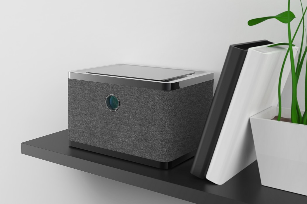
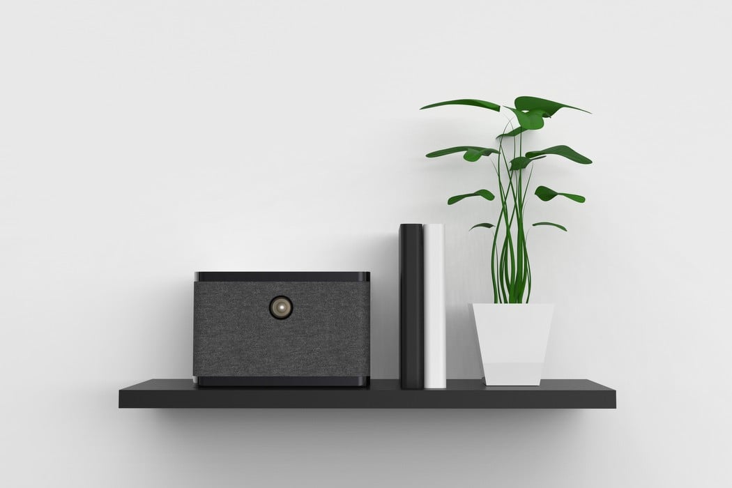
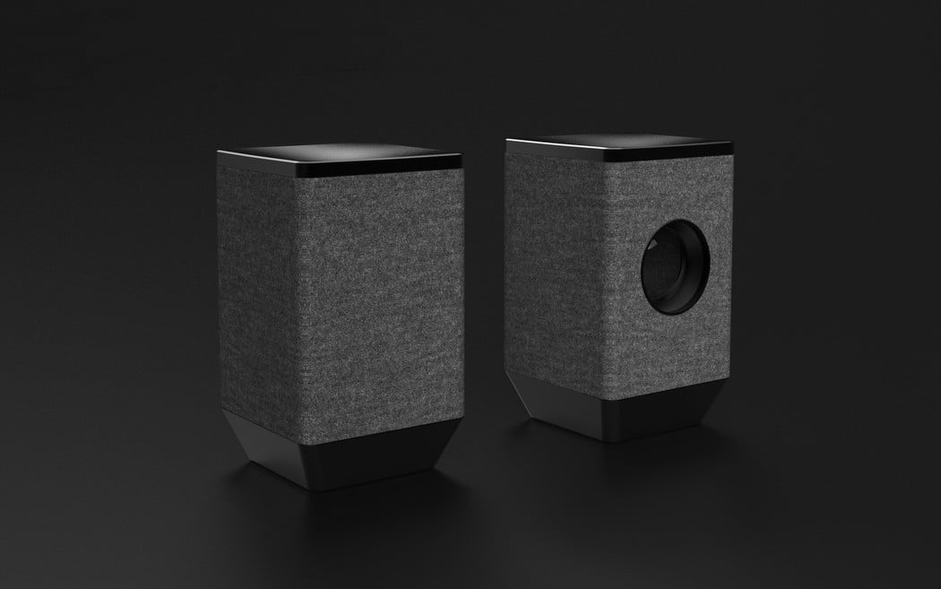
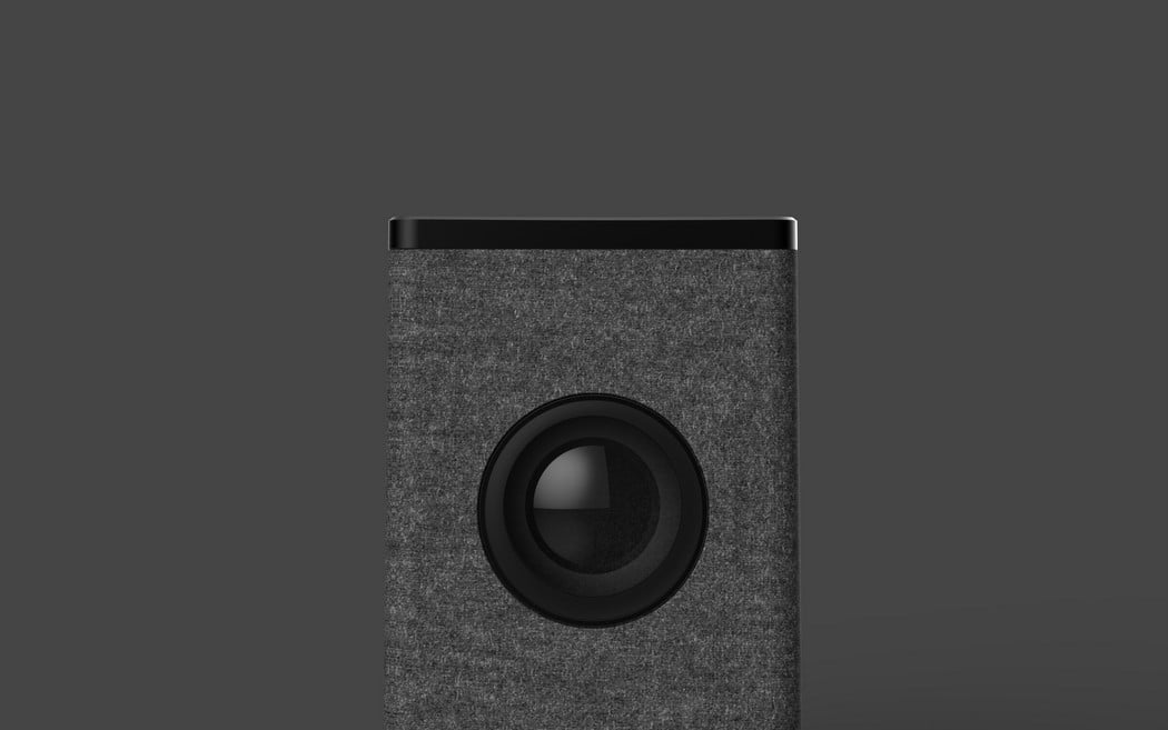
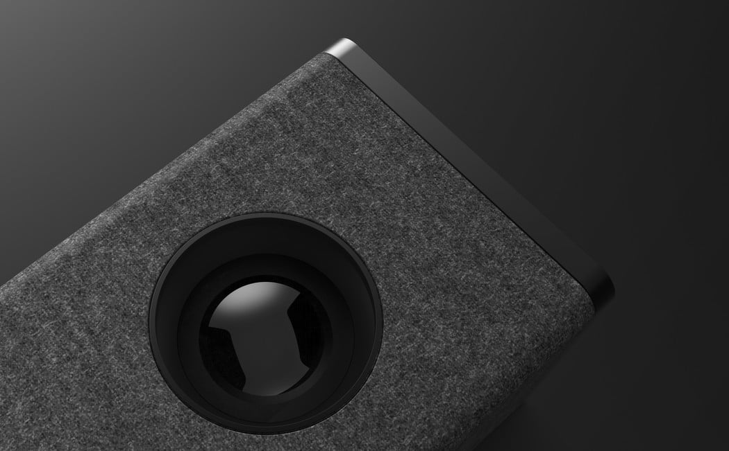
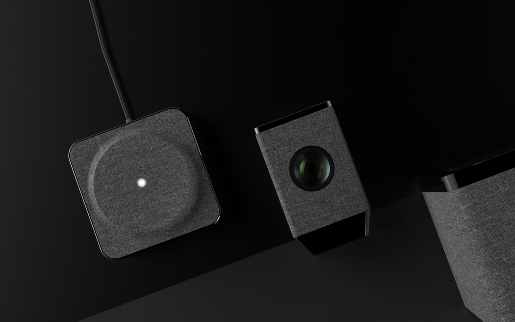
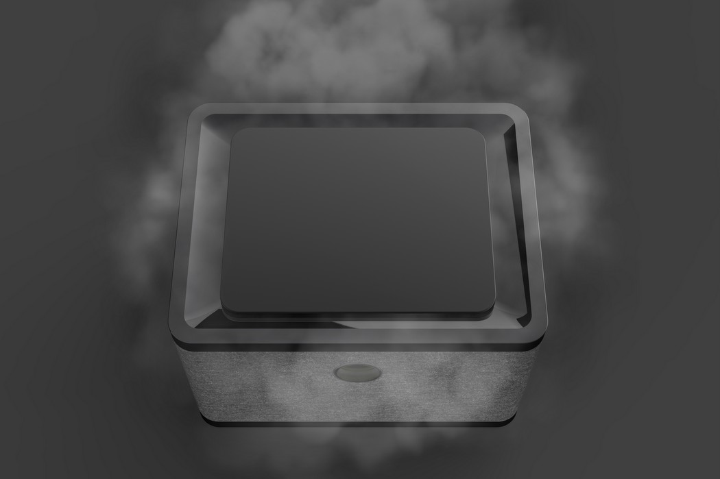
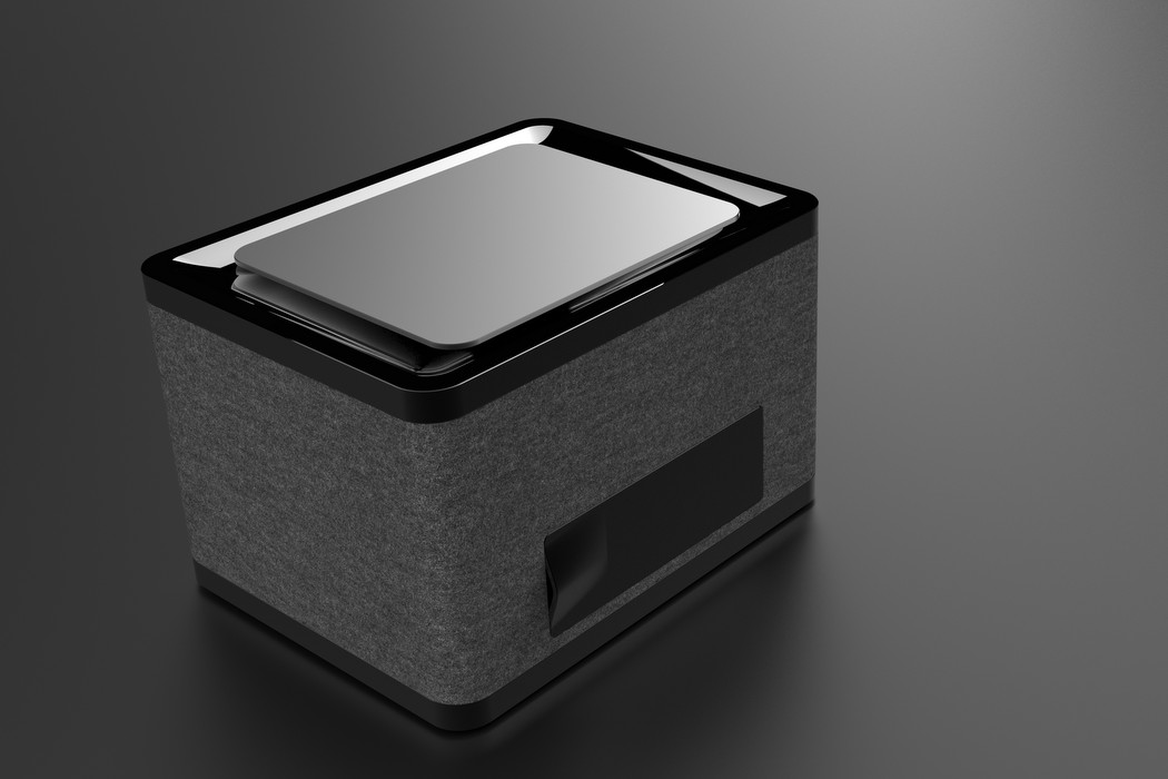
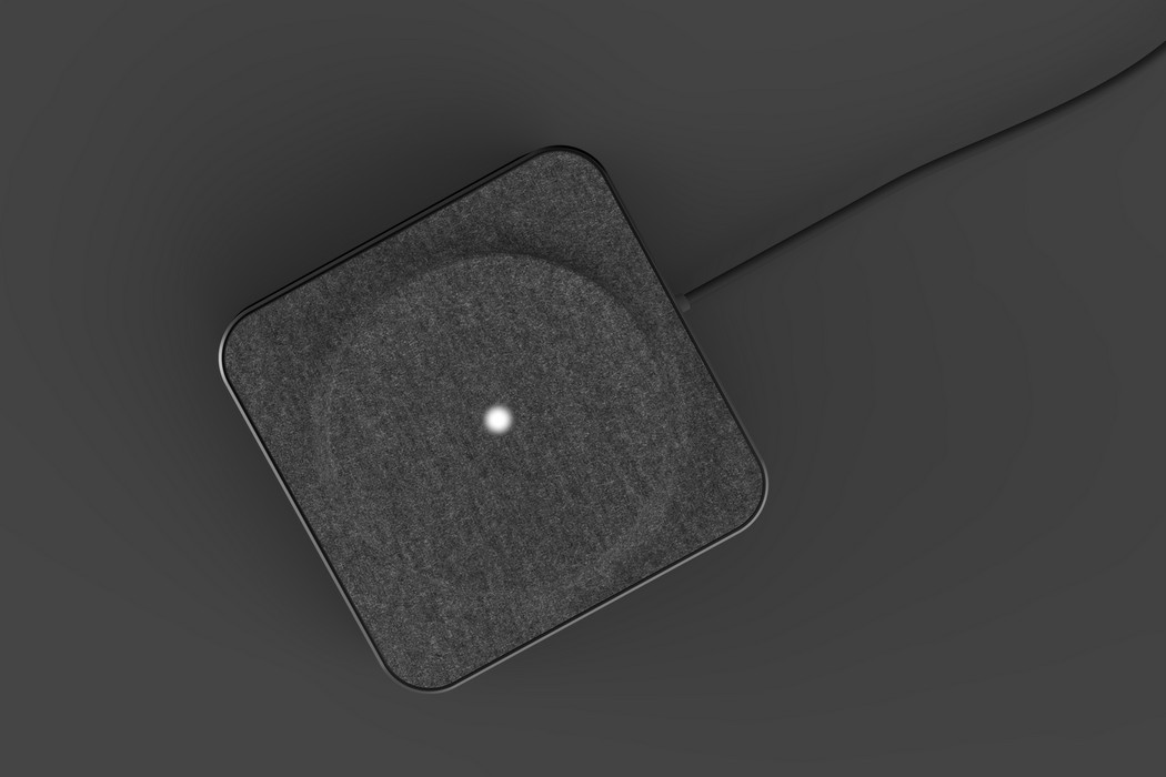
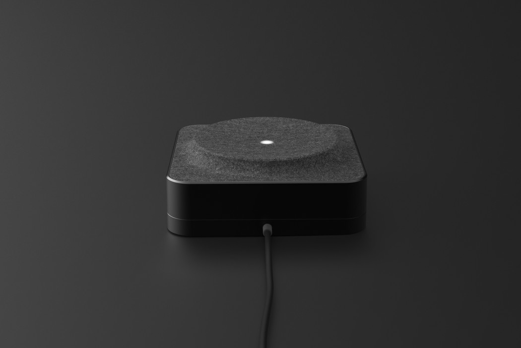
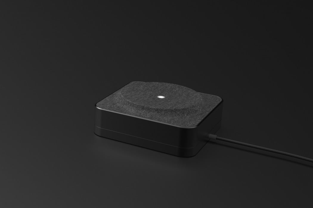
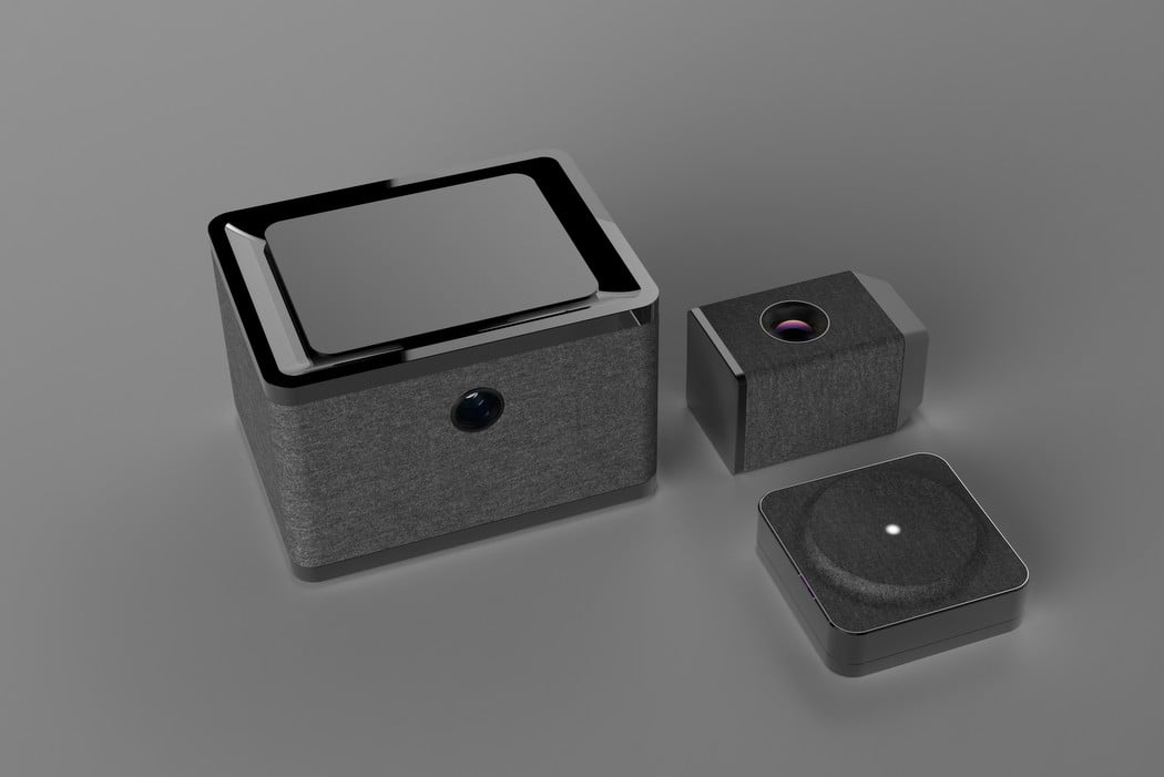
The products designed by Gary Chang encapsulate Harman Kardon’s visual style well. However they aren’t audio devices! The products in question are an aromatizer, a projector, and an AI listening assistant. Just like Harman Kardon’s signature style, these products make use of cuboidal shapes with circular elements. The achromatic color scheme is strong, with use of gray fabric, black plastic, and a hint of anodized matte metal to add a premium touch to the gadget/appliance. All that’s left is Harman Kardon’s branding!
Designer: Gary Chang