2008 Designer Glass Competition Finalists
What is it about martini glasses that people find so attractive? Is it the precarious nature of their original design, forcing you to step ever-so-gently and methodically as to not lose a single drop of alcohol goodness? Makes you wonder if the original martini glass silhouette was not purposefully awkward. If you are forced to treat something like it is a precious cargo, will you start to believe it actually is precious cargo? Therefore, psychologically elevating its value? As if drinking martinis was not fun enough, the makers of Bombay Sapphire Gin have rounded down their “Designer Glass Competition” to ten finalist and they want you to pick the winner. Check out them out and let us know how you take it. I don’t want to influence the vote, so I will just wait here at the bar crying over the bill.
[ Vote Here ] Thank you Michael Roller!

“Blue is the New Green” by Jonathan Knodell / “Star by Matthew Dollinger

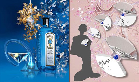
“Of the Vine” by Evan Detskas / “Geisha to Go” by Kazumi Tanimura & Miyuki Habiro

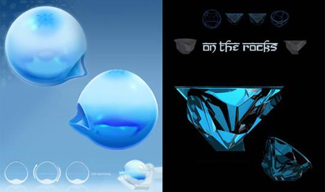
“Ms. Pickford’s Glass” by Micah Bowers / “On The Rocks” by Mia Ferrera Wiesenthal

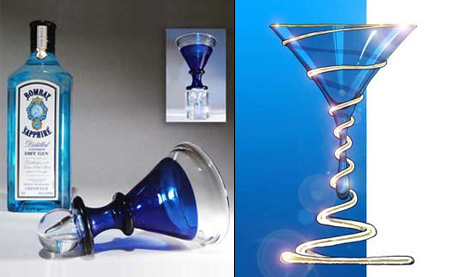
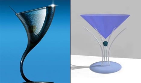
“Maelstrom Martini” by Theo Keller / “Sapphire Drop” by John Vajda

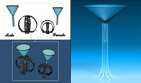
“Untitled” by Rogelio Aguirre / “Vapour” by Michael Roller
If you liked this design, you would also be interested in:
- London Tap Water, Now With 100% More Glass
- 2007 Bombay Sapphire Design Discovery Finalists
- Fallen Angel Cocktail Glass by Adam Pockette
- Last Entires For 2008 Bombay Sapphire Award
- 2007 Electrolux Design Lab Finalists
Keep up with the latest designs by subscribing to our RSS or Newsletter.


8 Comments »
Statan says
one more time… it’s ugly. Perhaps two or three are not bad and pretty but this is not real product design.
ModuleS says
I agree, the renders are on the weak side and I am somewhat very surprised that Bombay Sapphire would post such weak images on their site.
I voted for “Vapour” by Michael Roller.
GL says
What’s real product design for a martini glass? examples?
Michael says
Thanks for your support, ModuleS and thanks to Yanko for promoting the competition!
Grim says
We should pick the worse? That’s a hard task.
The least weird ones are Knodells’s and Vajdas’ ones. I think I prefer “Sapphire Drop”. It’s a shame it’s a drawing, but I think it would look good in real life.
Christopher says
My favorite by far is “On The Rocks” by Mia Ferrera Wiesenthal. The faceted glass speaks to the sapphire connection and also looks like it would feel good in the hand. The rest all look outdated and quirky/craftsy.
carl says
tell me this was the 16 and unders attempts. ? on the rocks is a clear winner.
markus says
This contest is really horrible. It´s getting worse year by year. Maybe the jury have to sellect something from a crowd of bad proposes, but the jury (formed sometimes by ex-winners) isn´t as professinal as should be.